3 WAYS WE USED COLOUR TO CREATE (EVEN MORE) CHARACTER IN THIS APARTMENT RENO
Hello colour, hello character 🤎
We were SO excited to finally take on our very first apartment renovation, and the second we stepped inside, we just knew she was going to be a goodie.
Tall ceilings, original timber windows, the sweetest little balconies with ornate balustrades… even with the tired walls and dated finishes, she had SO much charm. The kind of place that instantly gets your brain ticking with ideas. Small, yes — but packed with potential.
Right from the start, we knew the magic of this reno would come from leaning into the apartment’s character, not ripping it all out. We wanted to keep all the beautiful original details, embrace the little quirks, and add modern touches that still felt true to the bones of the space.
So naturally, we named her The Petite Pad — because cute apartment, cute name. Then came the vision boarding stage (obvs!), and one thing became very clear, very quickly: colour was going to completely shape the feeling of this home.
Not bright, bold, look-at-me colour. But layered, earthy, nostalgic colour that made the apartment feel warm, soulful and full of personality.
Here are the three ways we used colour to bring even more character into The Petite Pad.
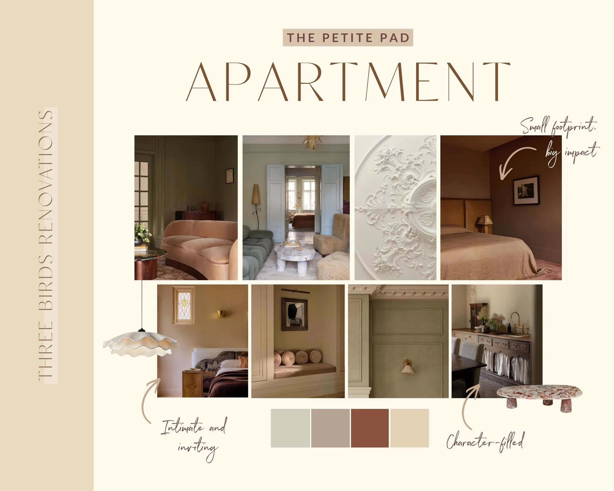
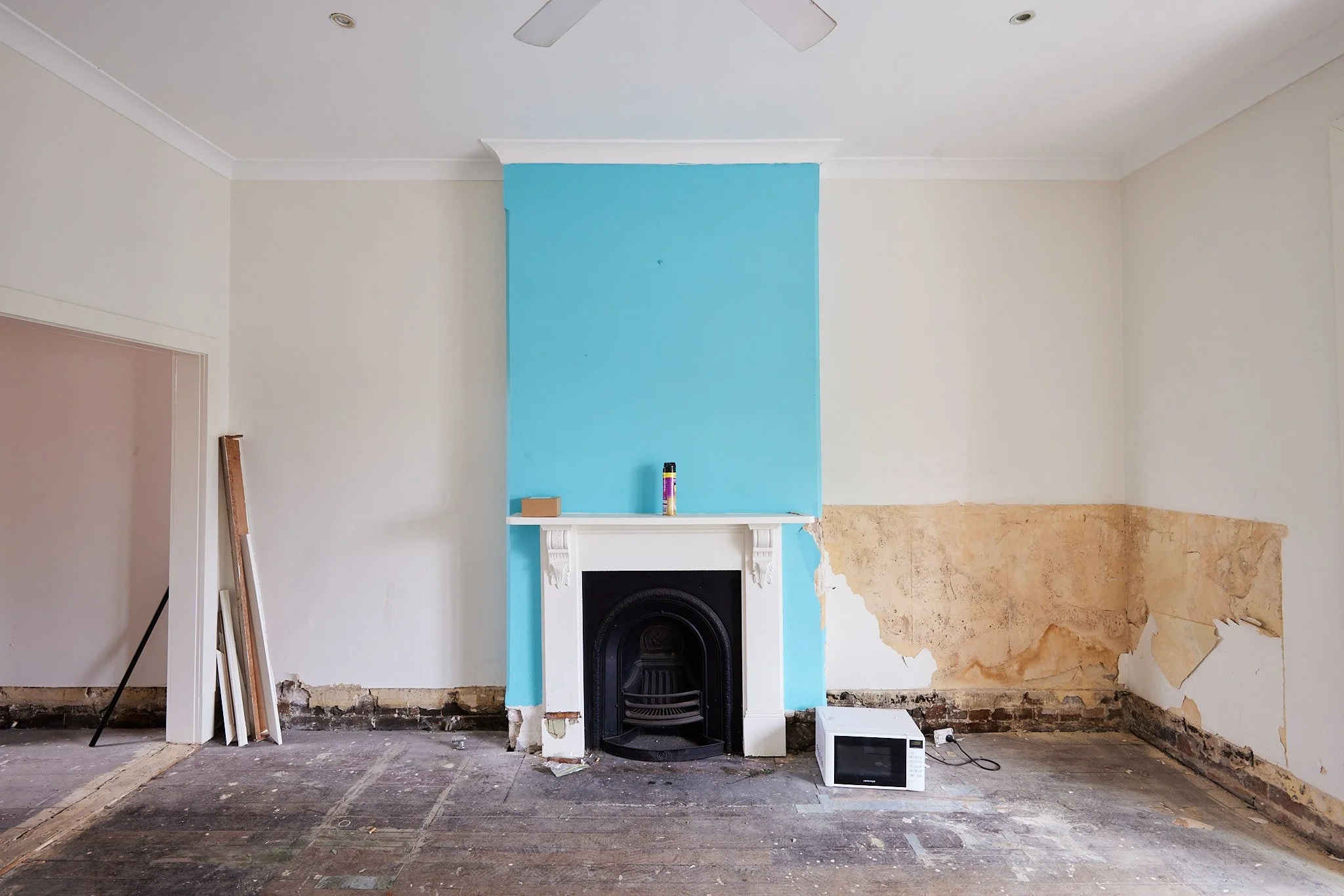
From vision board…
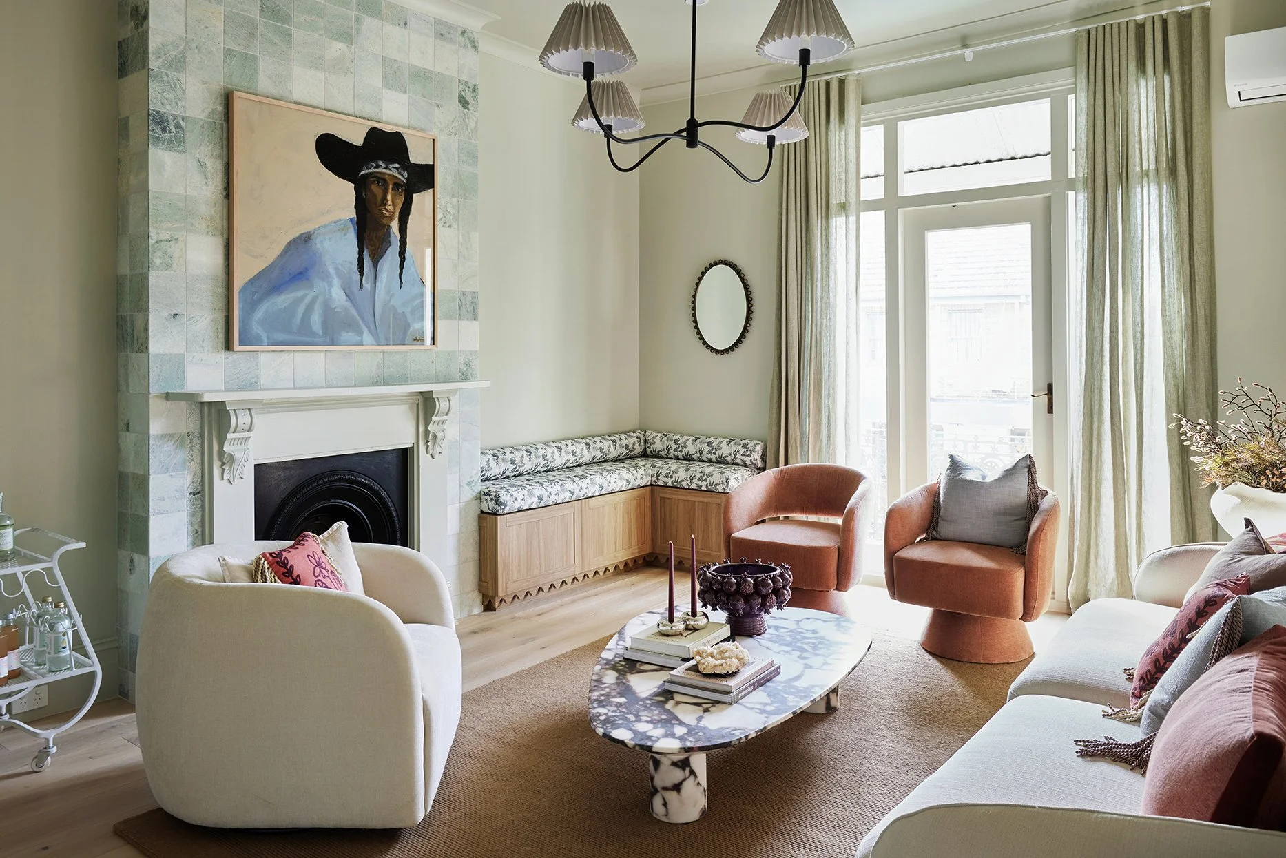
… to reality.
THE DREAMIEST PAINT PALETTE
When you’re working with a smaller home, paint colour does SO much of the heavy lifting.
It changes how bright a space feels, how calm it feels, how connected it feels… even how spacious it feels. Which is why we approached the apartment palette as one big story, rather than thinking about colours room by room.
We wanted the whole home to feel soft, warm and nostalgic, so we built a palette of beautiful muted tones that flowed effortlessly from space to space.

The Dulux colour palette of our apartment dreams, officially locked and loaded.
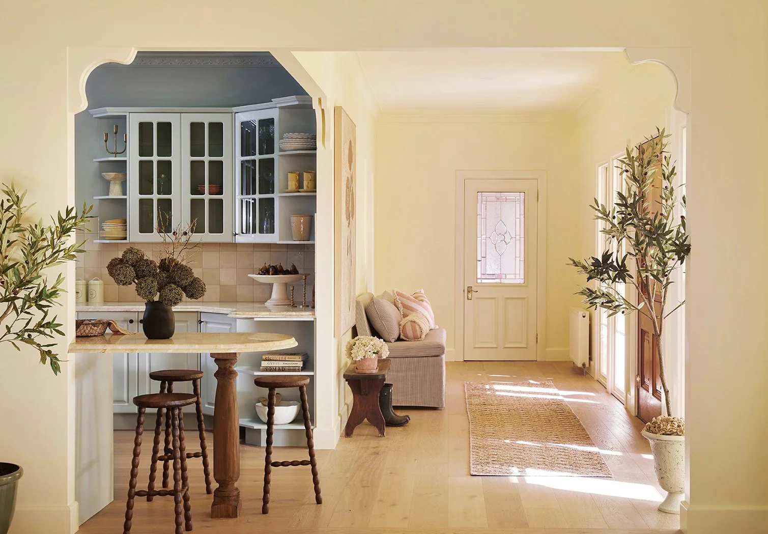
We landed on Dulux Berkshire White as the go-to neutral throughout the kitchen, hallway and bathrooms. It has this beautiful creamy warmth that instantly softens the apartment without ever feeling too yellow or too stark.
Then came Dulux Pale Tendril… and OH. MY. GOODNESS. We’re in love.
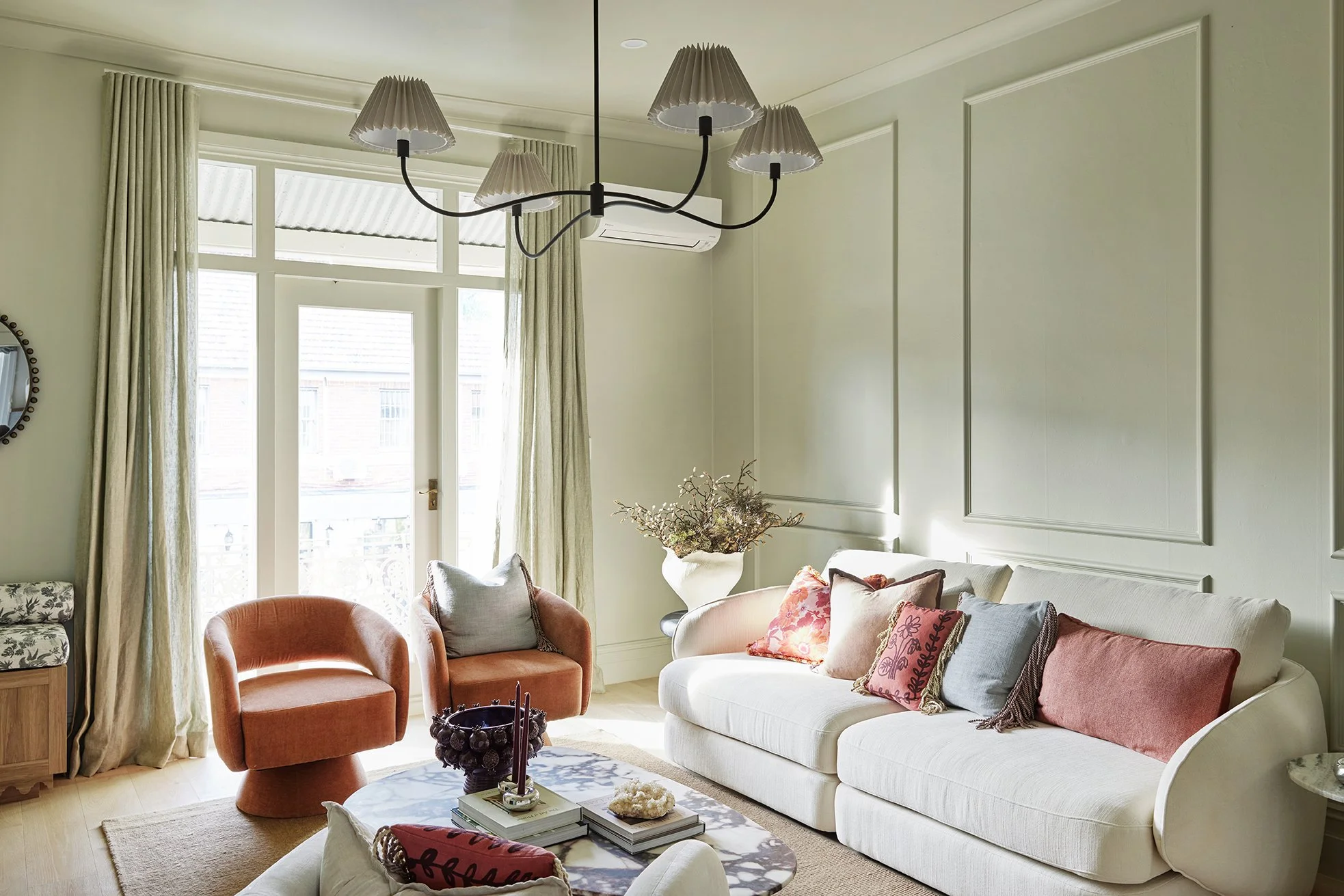
The vision board said “intimate & inviting”, Dulux Pale Tendril understood the assignment 💚
We’re complete suckers for green, and the second we laid eyes on this subtle sage, it quickly became one of the defining colours of the apartment.
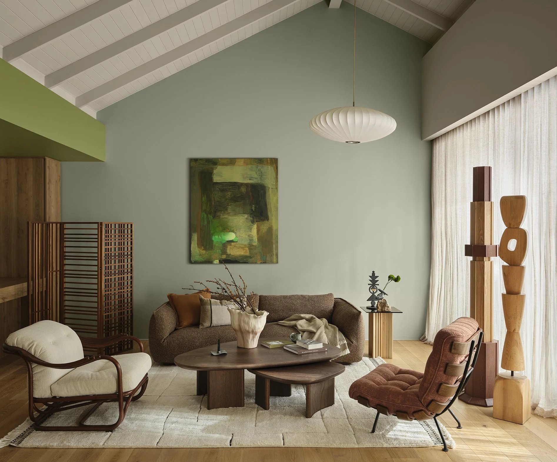
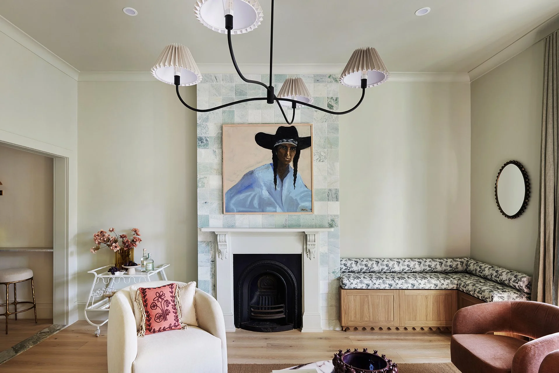
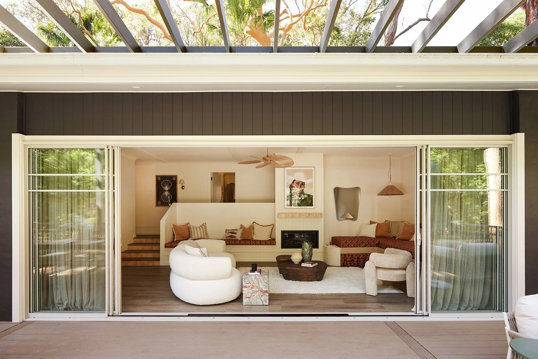
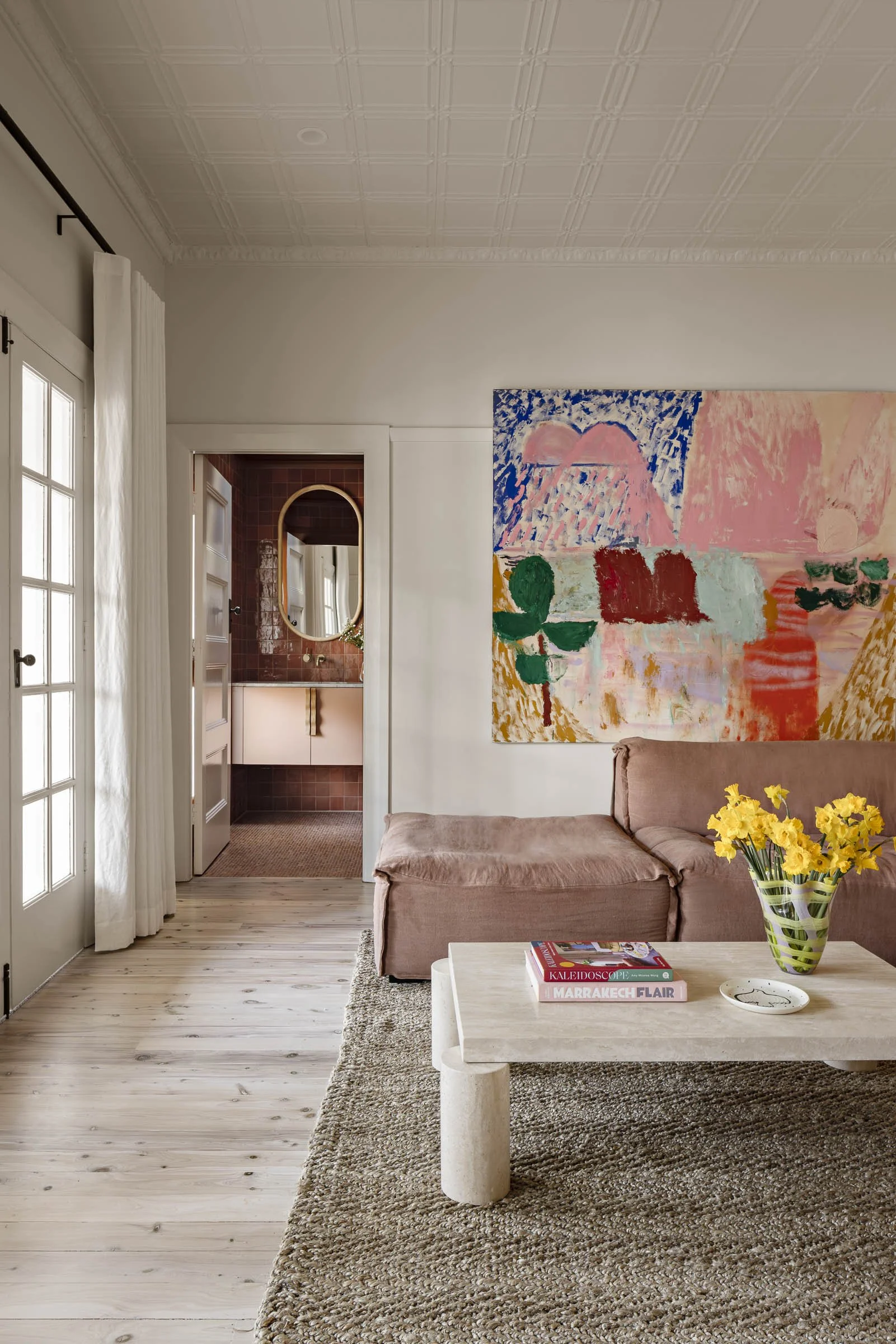
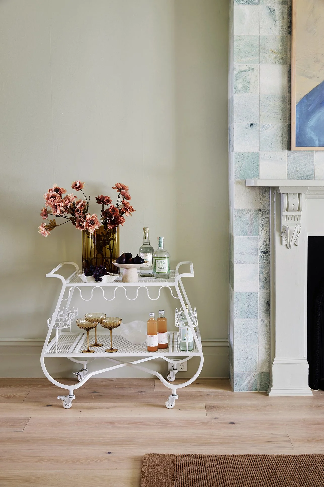
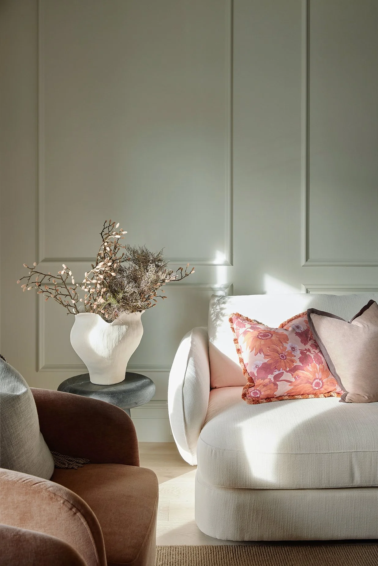
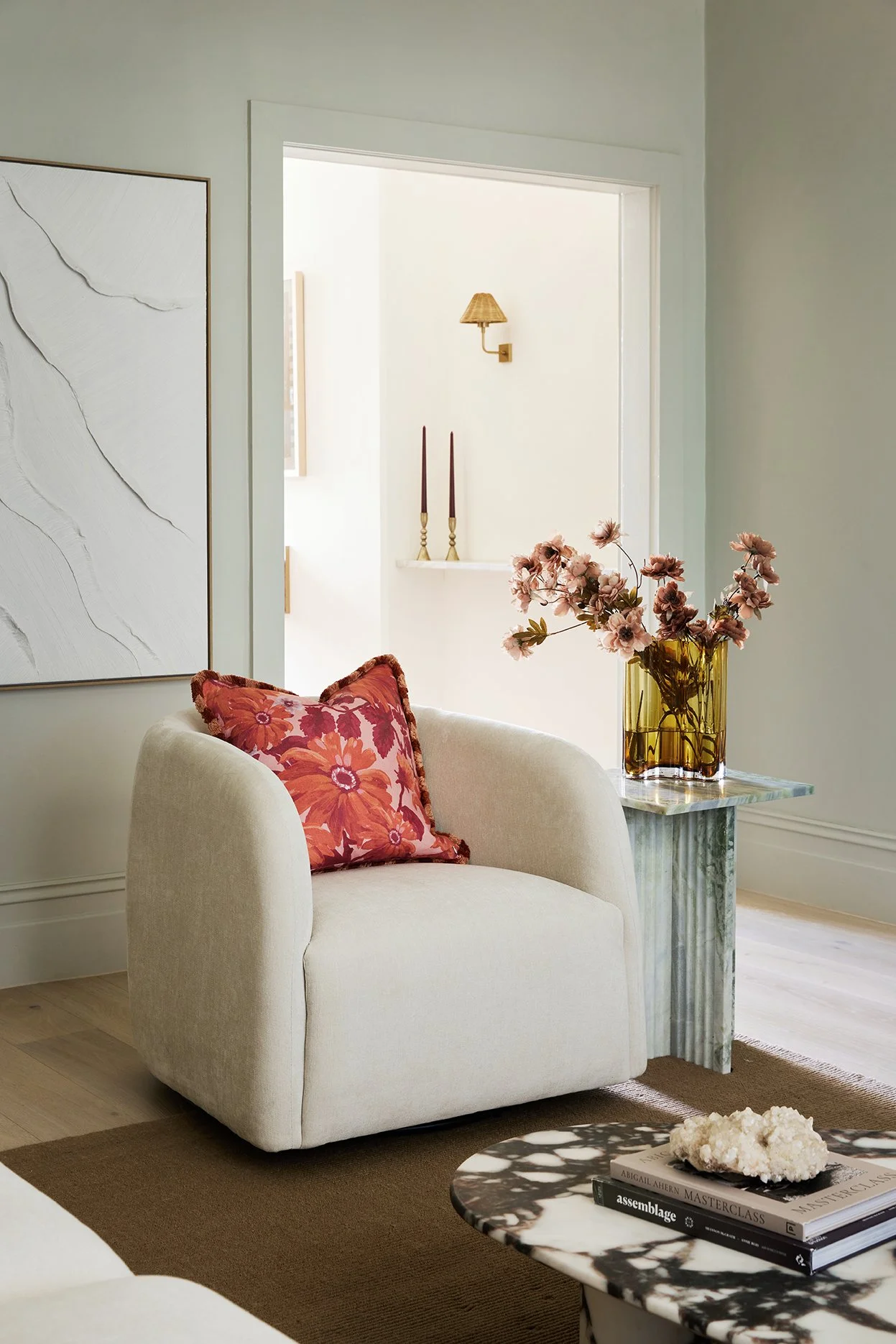
In the living room, we colour-drenched the entire space — walls, ceiling, cornices, architraves and skirting — in Dulux Pale Tendril, which now gives the room the dreamiest cocoon-like feeling. It instantly makes the space feel calm, cosy and elegant while also highlighting all the beautiful character details, from the original fireplace mantel to the wall mouldings we added to bring in even more charm.
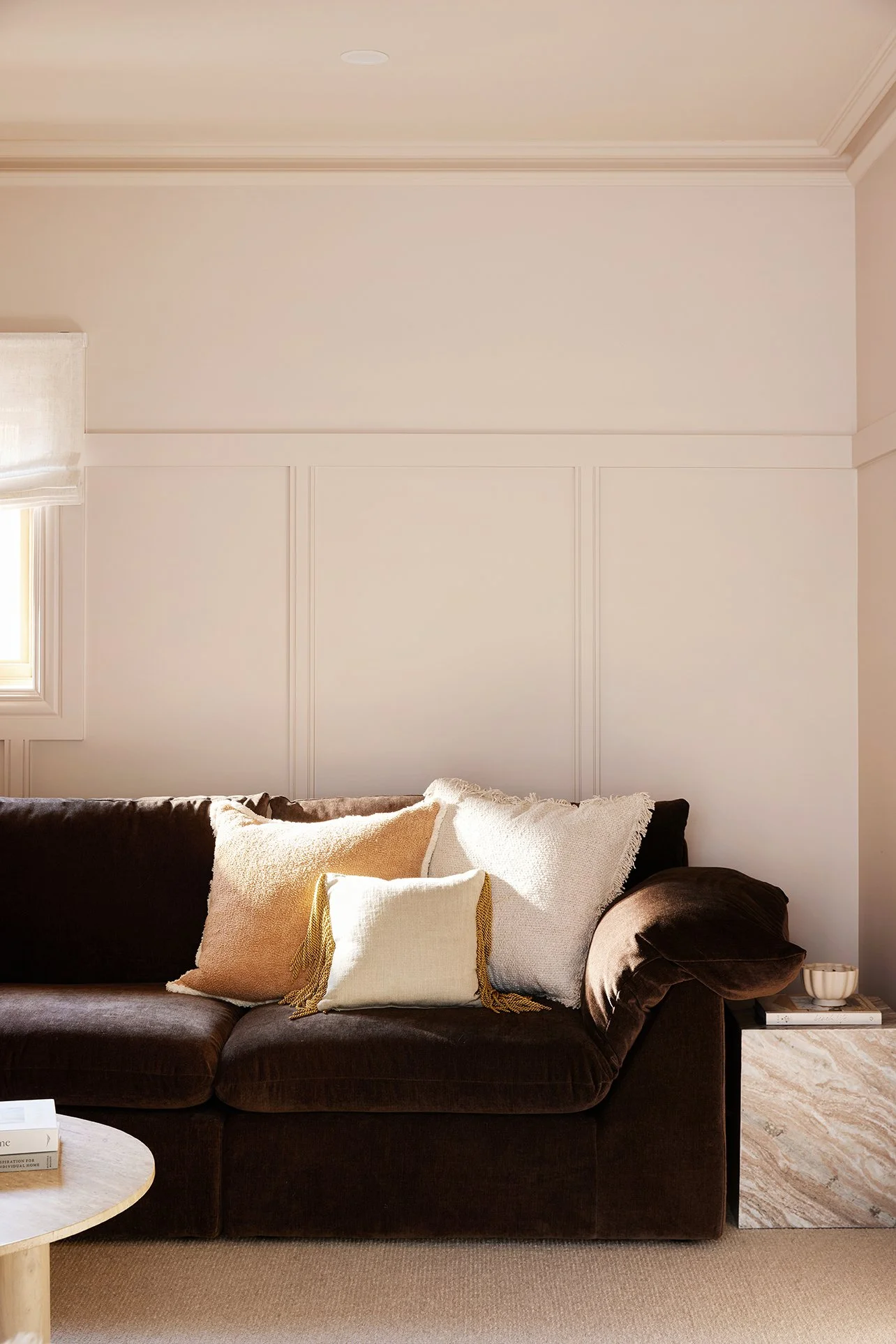
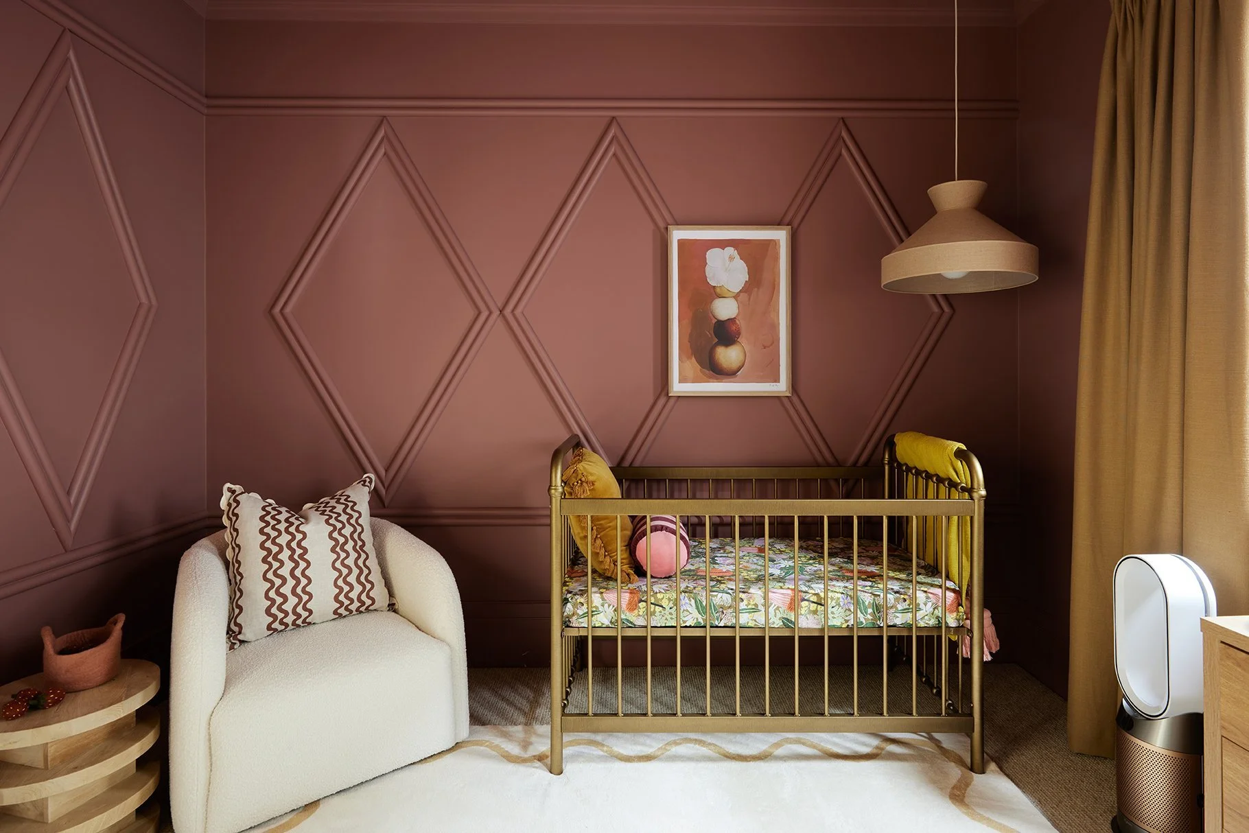
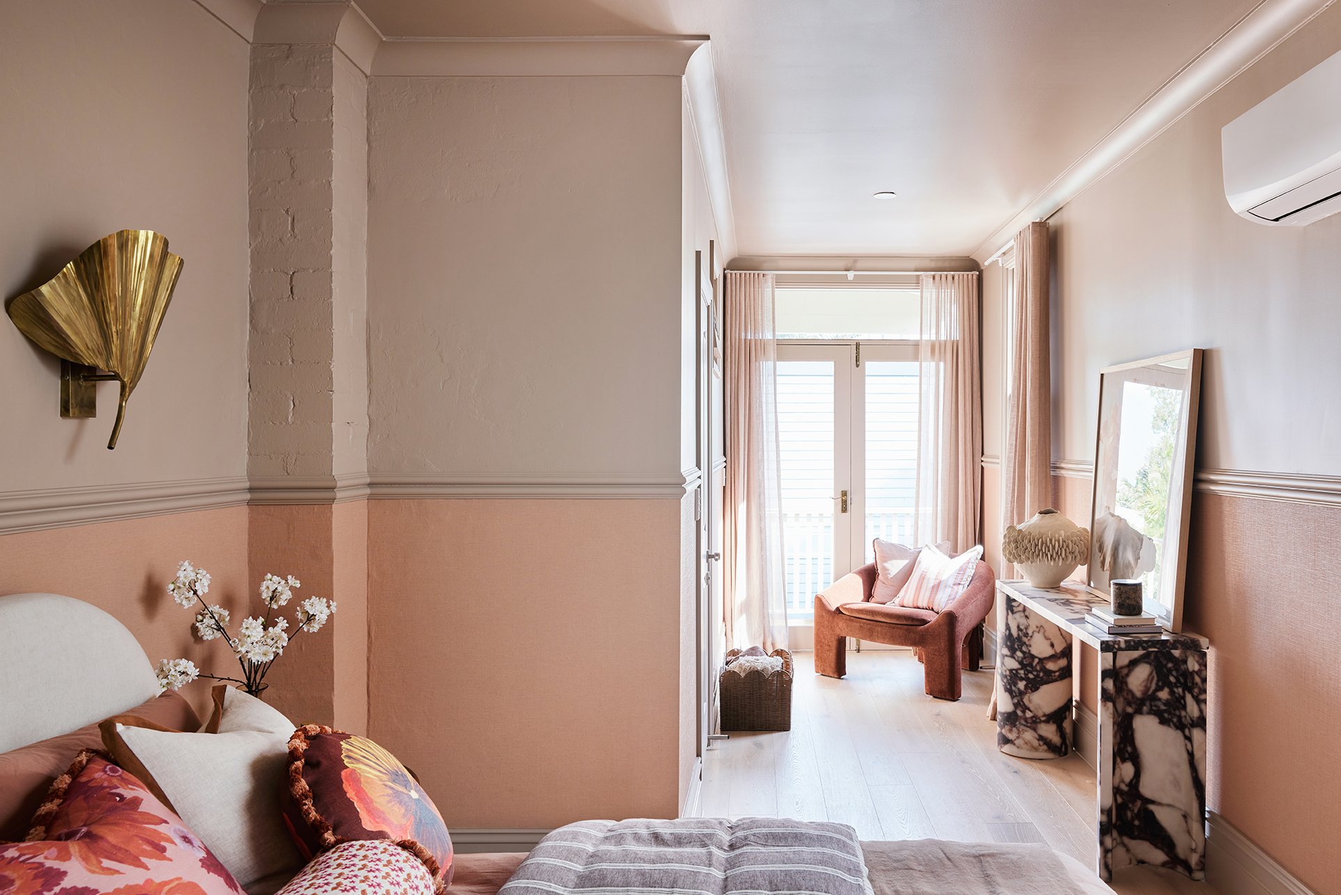
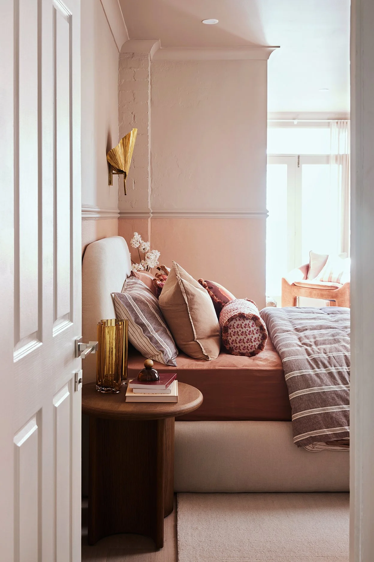
In the main bedroom, we shifted into moodier territory with Dulux Tavern, a rich brown-toned neutral that makes the space feel intimate and grounding without feeling too dark or heavy. It pairs beautifully with the textured Eurowalls wallpaper we used along the lower half of the walls (it’s Antigua Plain Satisfaction in Clay Pink), which adds another soft layer of warmth and character to the space.
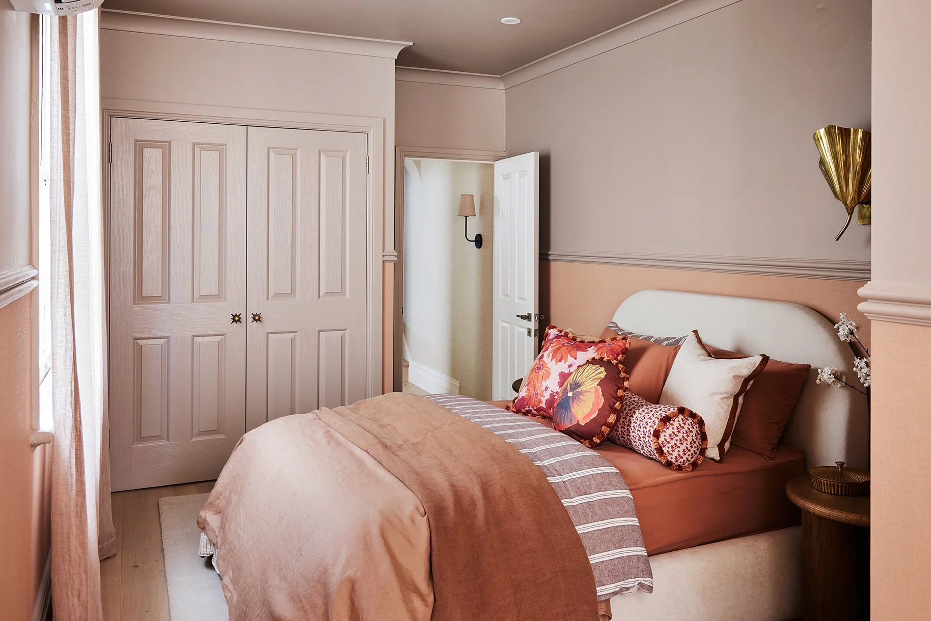
Dulux Tavern wraps the main bedroom in the dreamiest warm, cosy glow 🤎
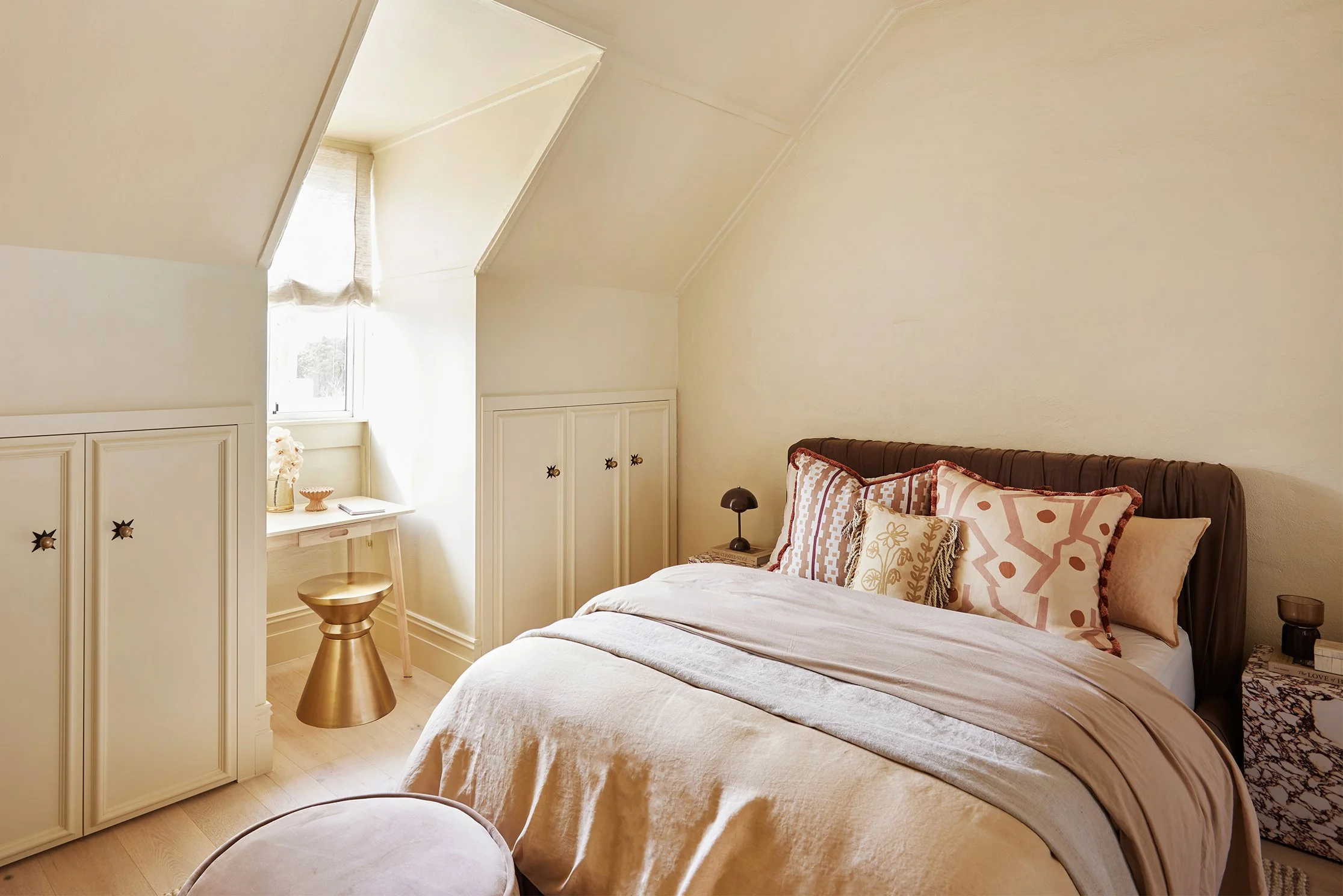
Then up in the loft bedroom, we introduced Dulux Gentle Touch — the softest muted yellow that adds warmth and sunshine in the sweetest, most subtle way.
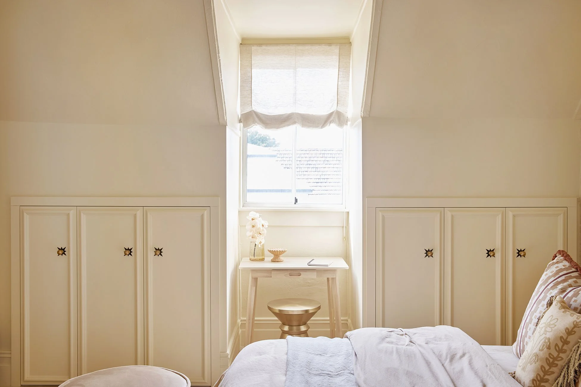
Dulux Gentle Touch brings the softest buttery warmth to this little loft.
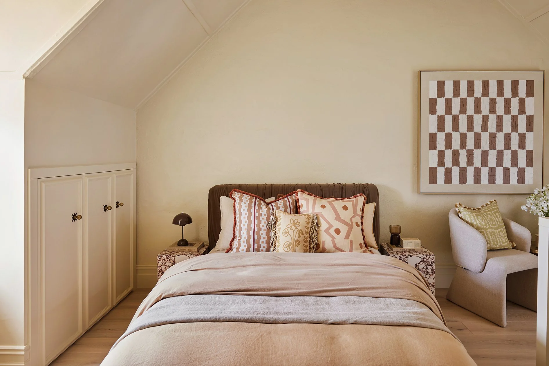
Soft layers, warm tones and a whole lot of Gentle Touch goodness.
Even though each room has its own identity, all the colours still feel beautifully connected because they share the same earthy, muted softness. And that’s the secret to making a colourful home still feel calm and cohesive.
2. TILES WITH ALL THE CHARACTER
Okay, now can we PLEASE take a moment for the tiles?!
Because honestly, so much of the colour, warmth and personality throughout The Petite Pad comes from these selections.
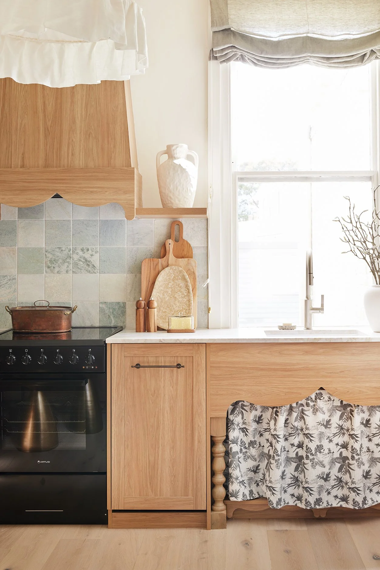
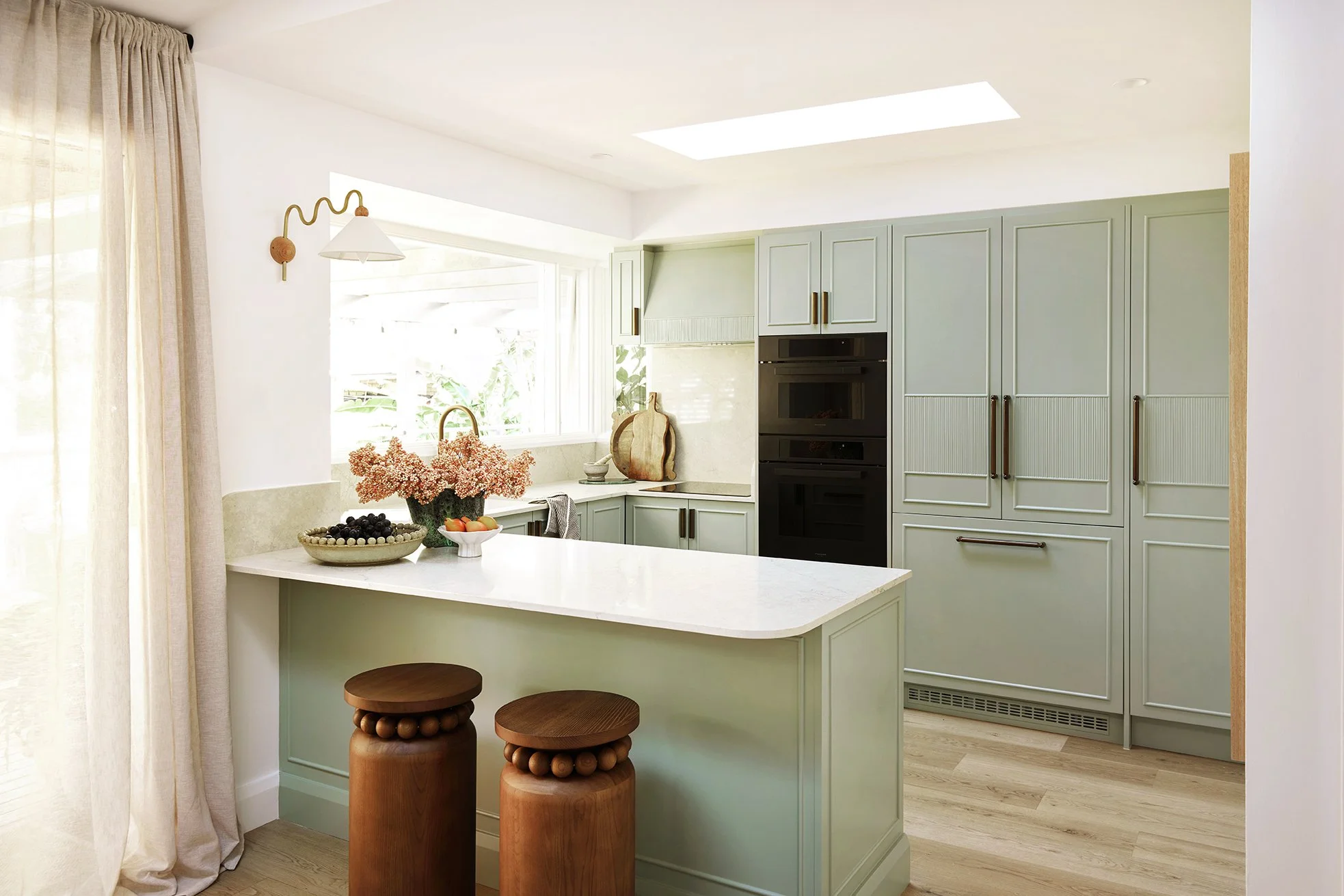
Spot the Amber Verde Marble Ming Green tile… kitchen edition.
From the very beginning, we knew we didn’t want anything too polished or perfect. Our vision board was filled with phrases like “small footprint, big impact”, “intimate and inviting” and “character-filled”. We wanted tiles with texture, movement and variation. Tiles that felt like they had a story to tell.
And OMG did Amber deliver.
One of our absolute favourite selections was the Verde Marble Ming Green tile, and once we saw it installed, we became slightly obsessed.
It started in the kitchen splashback… then made its way into the main bathroom… and then onto the living room chimney breast to create a full feature moment because when we’re onto a good thing, we COMMIT. 😂
But seriously, repeating materials and colours throughout a home is one of the easiest ways to make everything feel balanced and cohesive. That soft green tone now acts like this beautiful little thread running throughout the apartment, making the spaces feel intentionally connected rather than every room trying to do its own completely different thing.
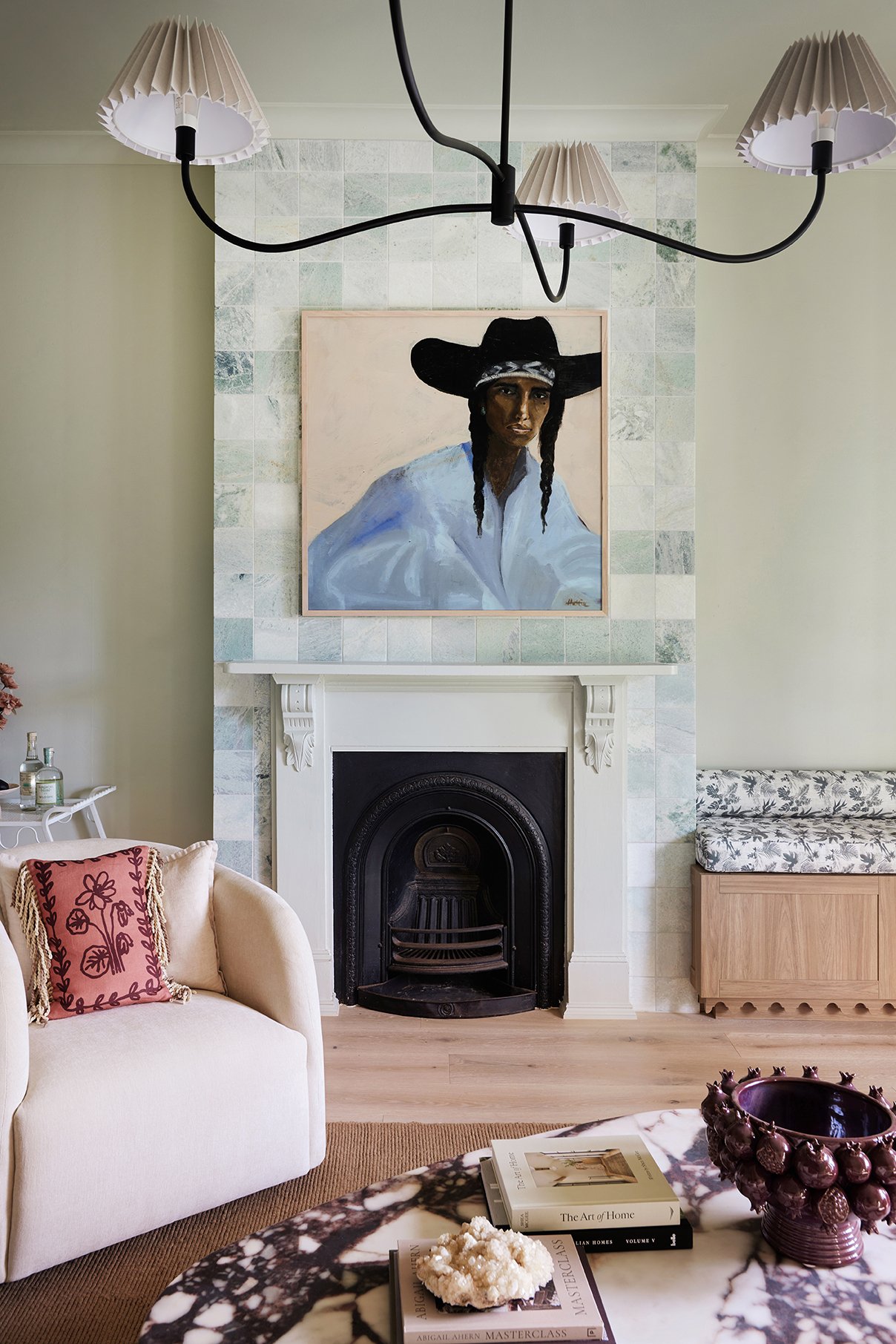
Amber Verde Marble Ming Green tiles… living room edition.
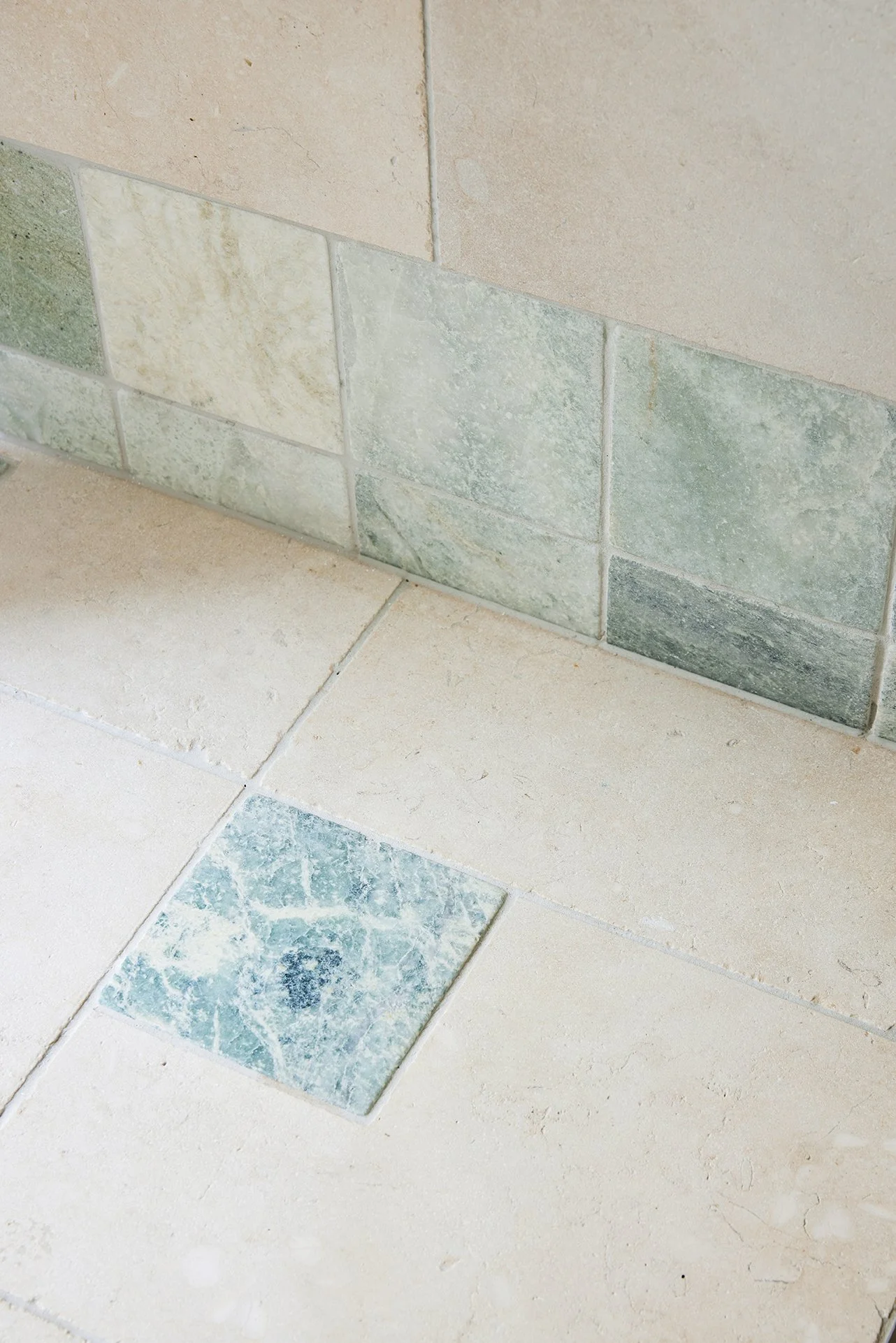
Déjà vu yet?

Amber Verde Marble Ming Green tiles… bathroom edition.
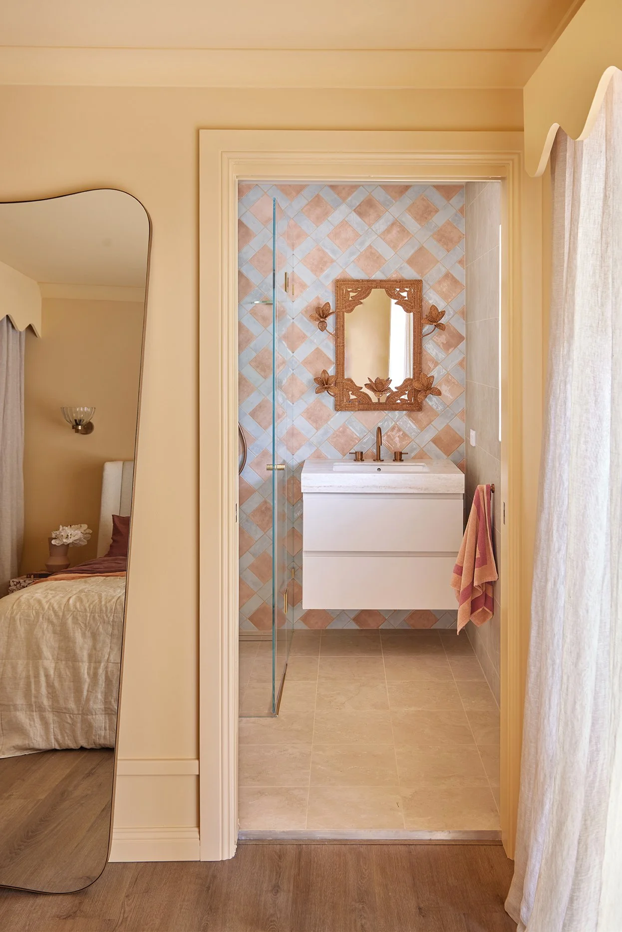
In the ensuite, we leaned into all those warm pinky-brown tones already happening in the adjoining bedroom and brought in rich red travertine tiles to continue that earthy, cosy feeling.
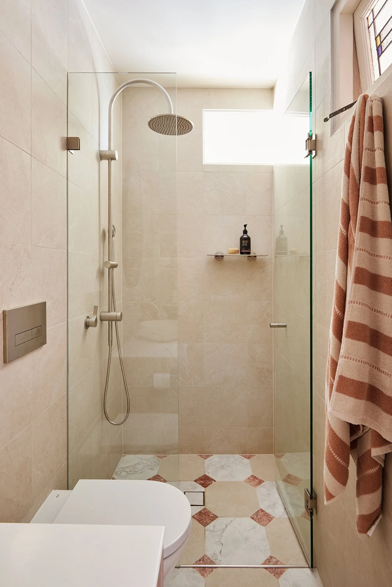
Amber Rosso Travertine Red Tumbled tiles bringing the colour & the pattern.
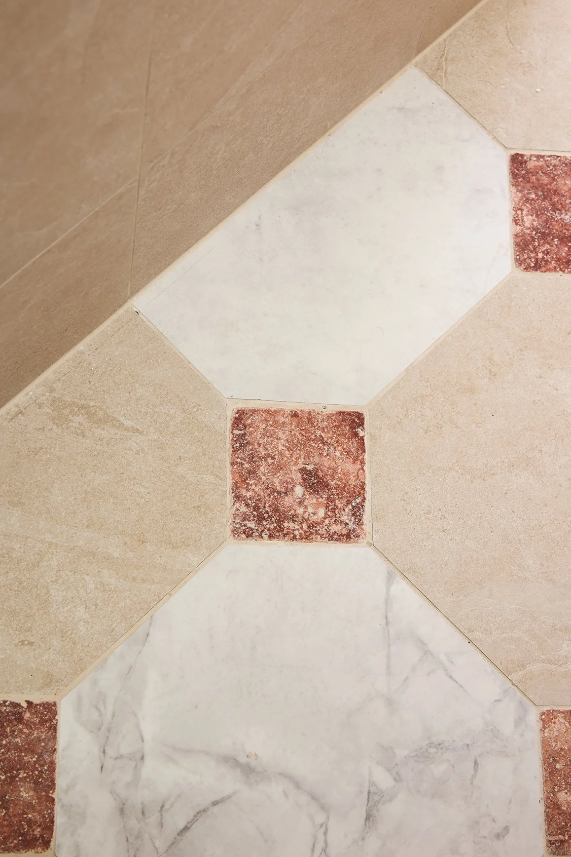
More is more when it comes to warmth, texture and old-world charm.
And across both bathrooms, we chose tiles with loads of natural movement and variation because those imperfect little details are what stop a renovation from feeling flat or overly “new”.
They instantly make the spaces feel softer, more relaxed and way more character-filled — which is exactly the vibe we’re chasing throughout this entire apartment.
3. THE FINISHES & STYLING
Once the paint and tiles were locked in, we focused on introducing additional moments of colour throughout the apartment through our cabinetry finishes, furniture selections and styling pieces.
Because sometimes it’s not the big colour moments that make a home feel special, it’s the subtle repeated details. Hang on, did we say that already? 😉
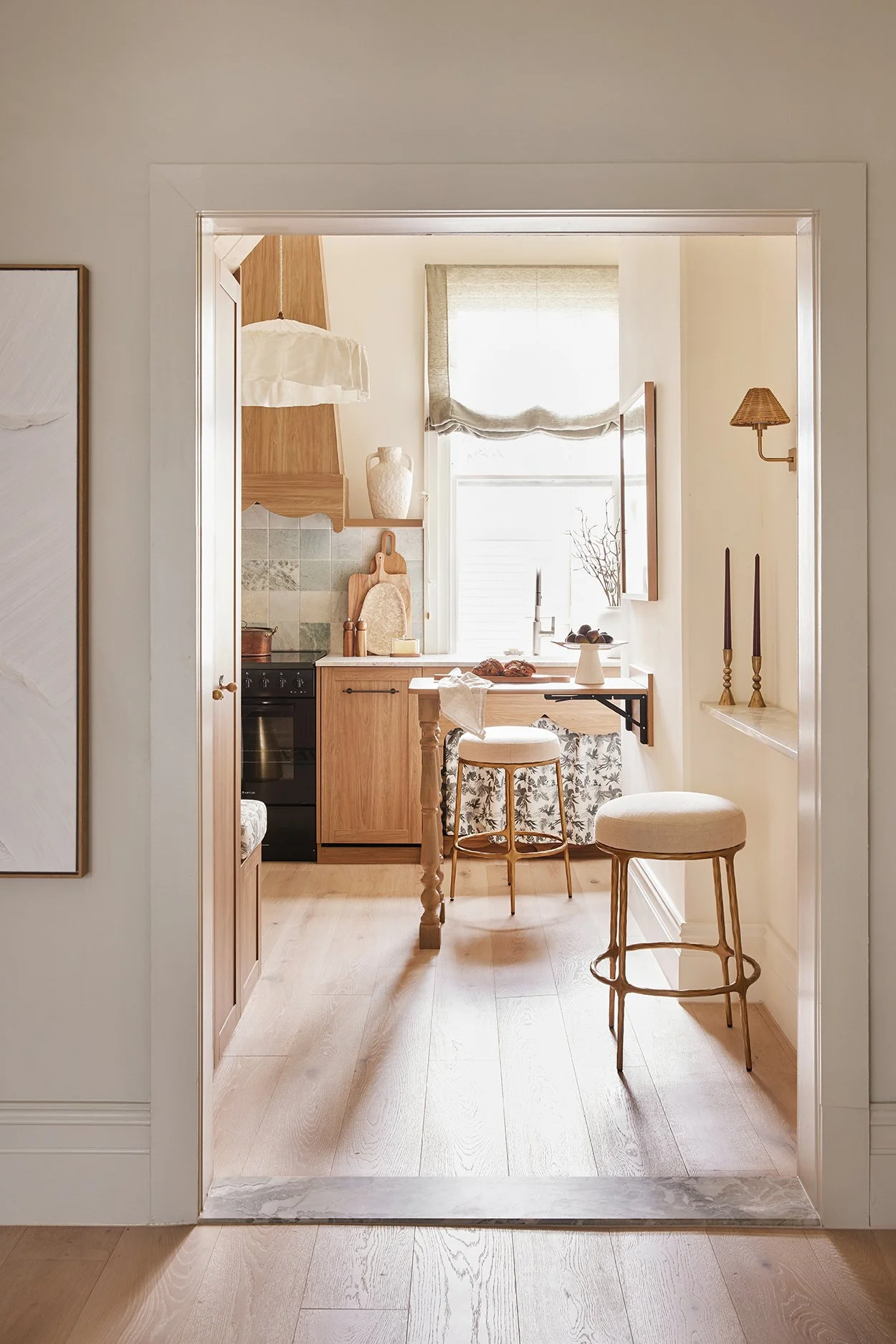
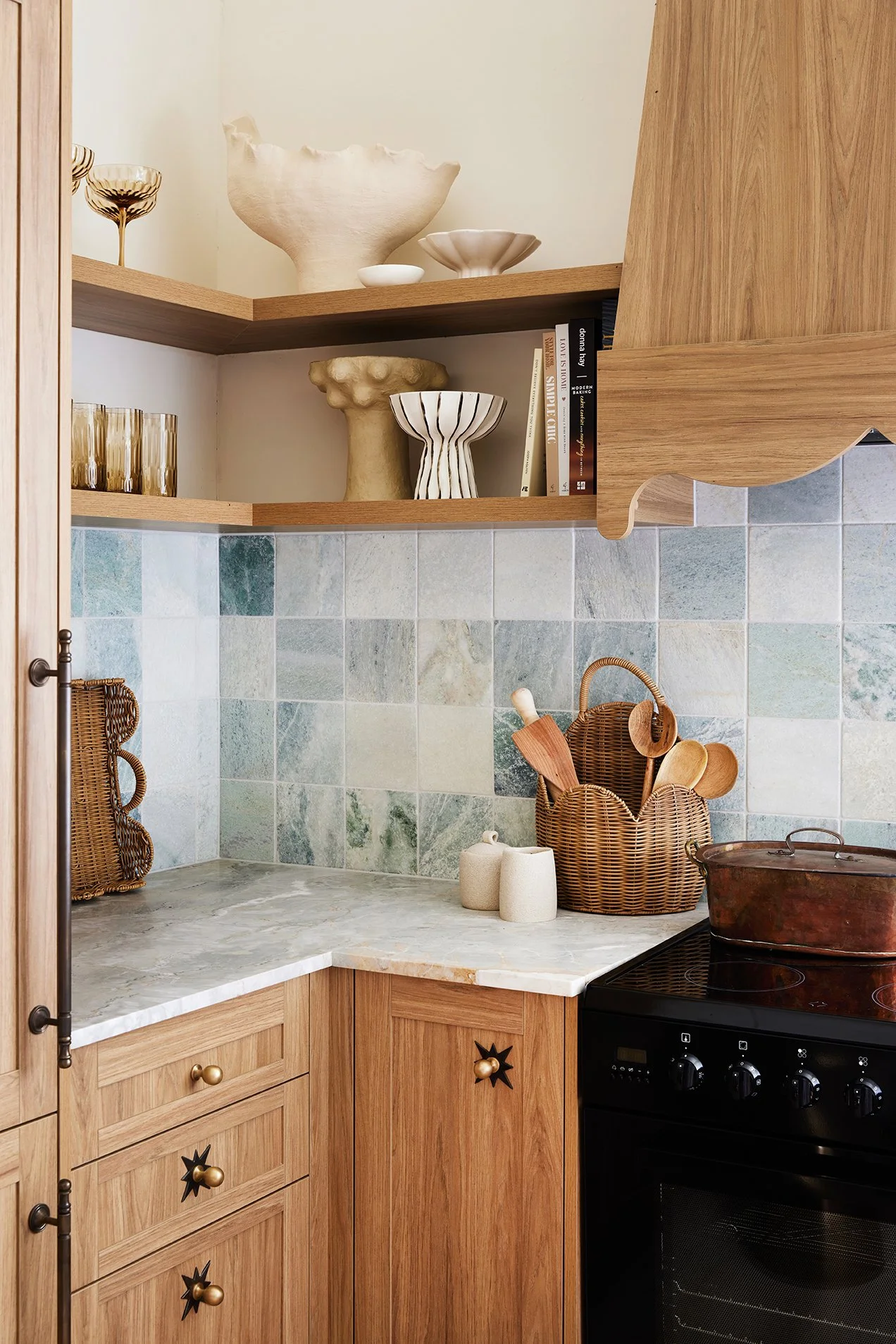
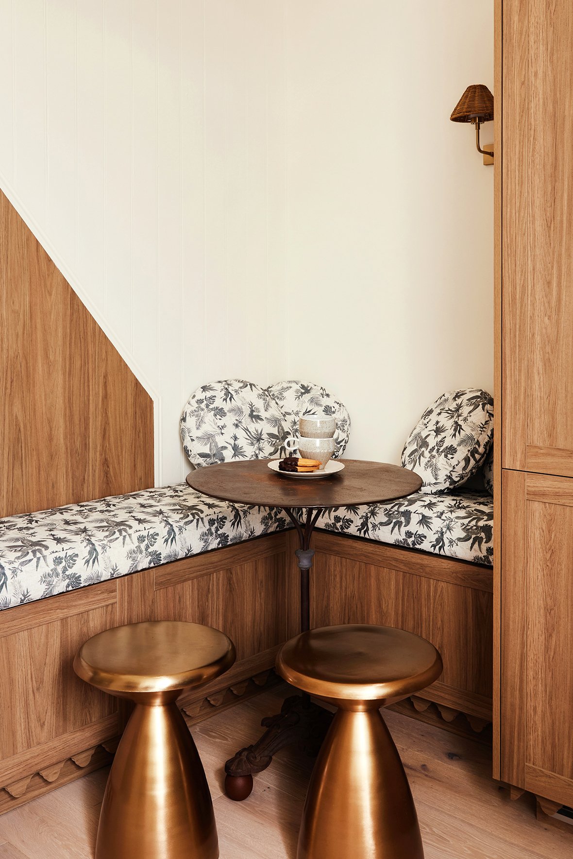
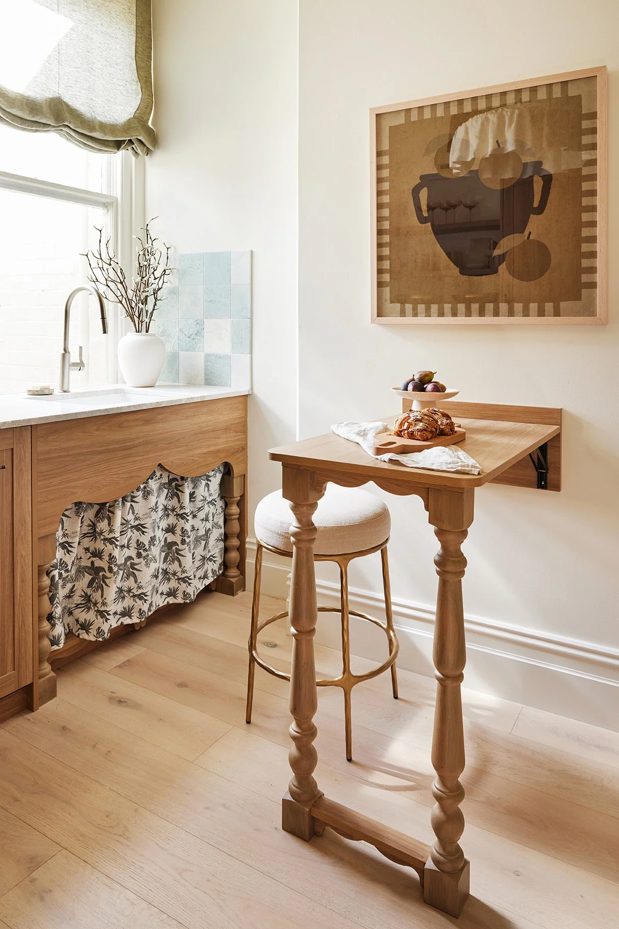
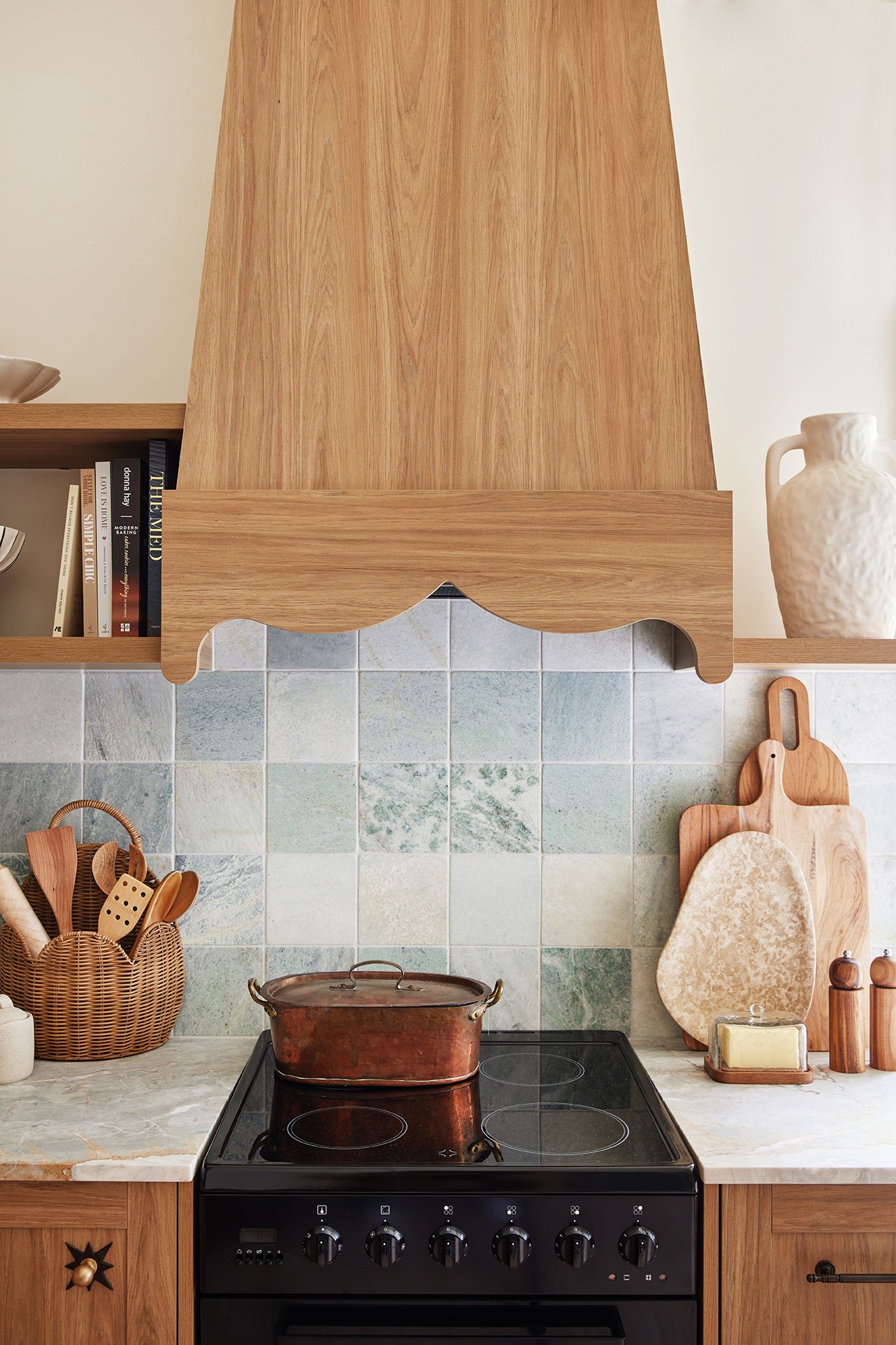
Things like the warm Polytec Prime Oak Woodmatt cabinetry that balances all the cooler tones beautifully, the upholstered seating nook in the kitchen wrapped in the gorgeous Grace Garrett Boheme Paradise fabric, and the little curtain under the kitchen sink that makes the space feel softer and more nostalgic.
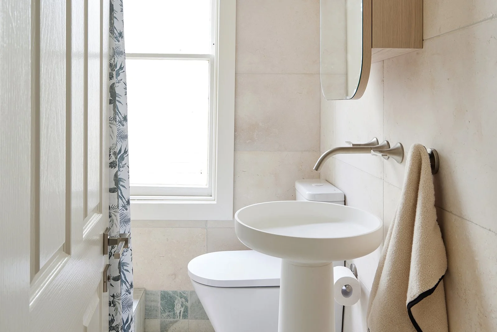
And for the VERY first time ever… we used a shower curtain in the main bathroom. And TBH, we’re completely sold.
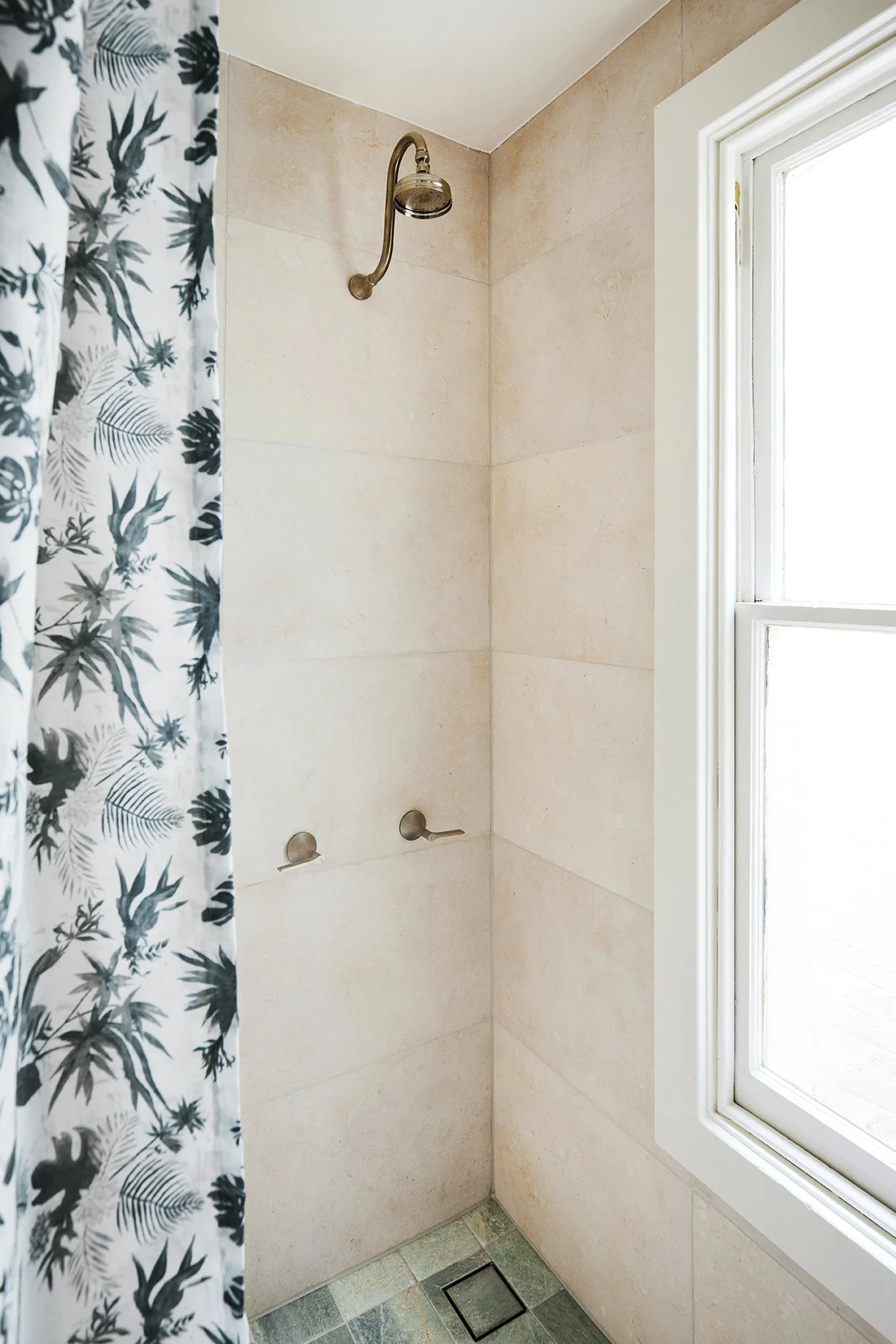
Well well well… who would’ve thought we’d become shower curtain people?
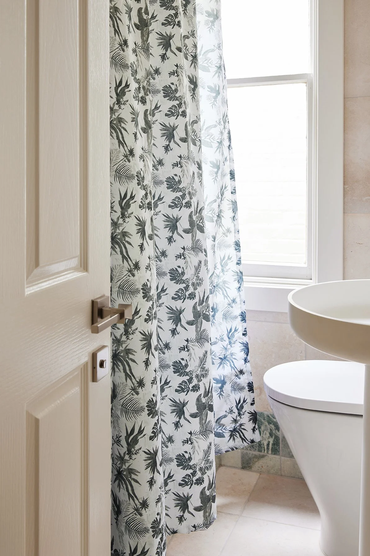
There’s a first time for everything… and honestly, it just works in this space.
Not only was it the perfect practical solution for the tiny bathroom footprint, but it also added softness, pattern and personality in a way a standard glass screen never could. It gives the space a dreamy old-world European feel that honestly makes the whole room.
Throughout the apartment, we continued repeating all those earthy colours and tones we’d already established through the paint palette and tiles — sage greens, rusty terracottas, warm browns, creamy whites and soft timber tones.
You’ll notice them popping up again and again through cushions, artwork, ceramics, joinery, vintage lighting and styling pieces.
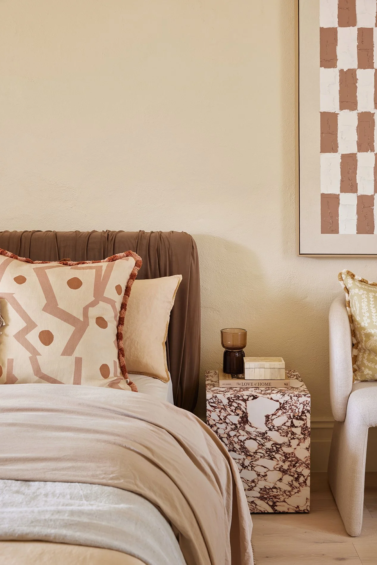
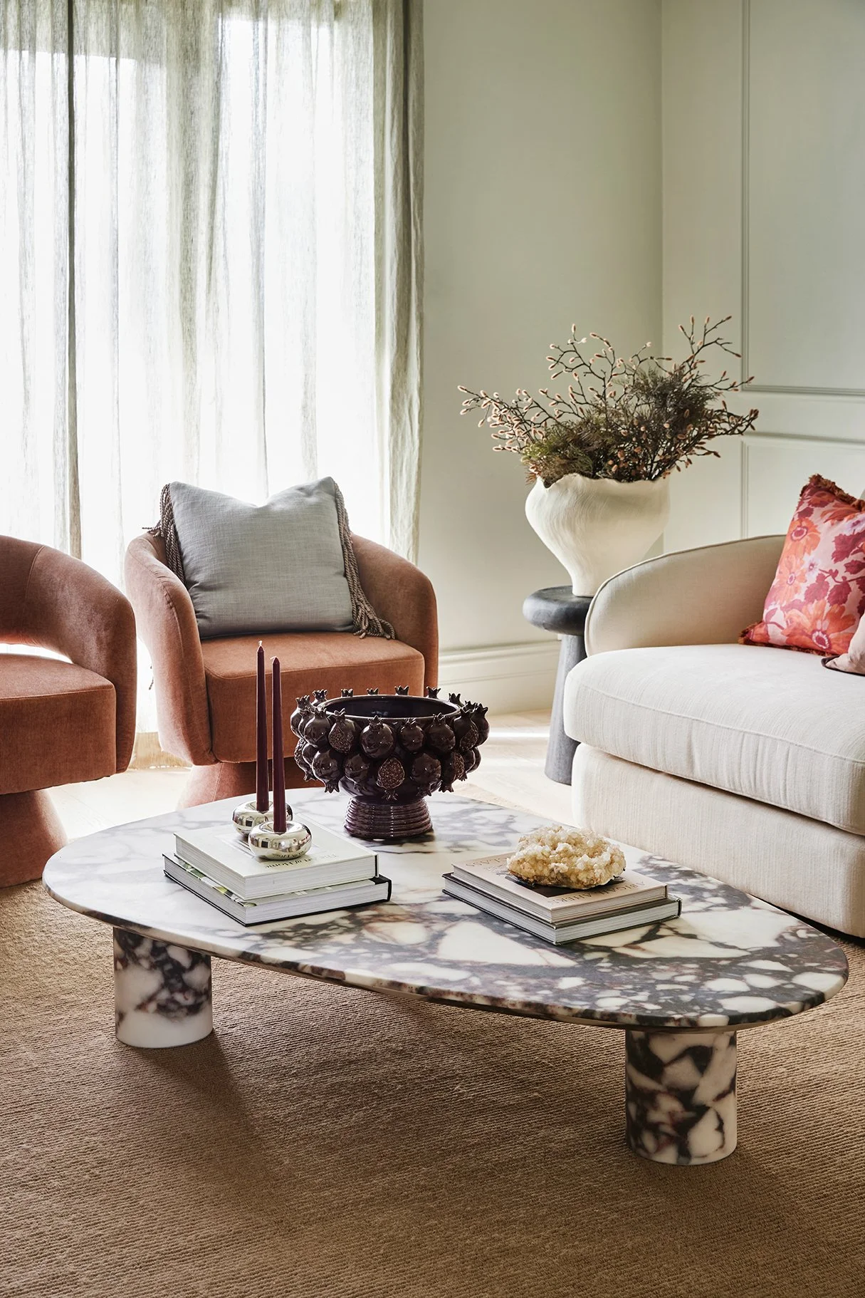


Because when colours subtly repeat throughout a home, everything starts to feel connected, consistent and thoughtful. Like the home has evolved naturally over time, rather than being decorated all at once.
And THAT is what gives a home character and soul.

GET THE LOOK FOR YOUR HOME
We’ve popped all the details of the products, colours, finishes and styling pieces we used throughout this reno into one handy place. Click below to explore every detail.

WANT TO FEEL MORE CONFIDENT USING COLOUR IN YOUR OWN HOME?
Choosing colours that flow beautifully throughout your home can feel SO overwhelming — but it doesn’t have to be.
Inside Three Birds Reno School, you’ll learn exactly how to confidently choose paint colours, finishes, materials and styling pieces to create a home you love.
Whether you’re renovating, building or simply refreshing a room, we’ll help you bring your vision to life with confidence.