HOW WE USED COLOUR TO BRING THIS CUTIE TO LIFE
Tucked away from the hustle and bustle of city life, this little holiday house has always been a special place for its owners. It’s their summer base – the kind of home made for family time, slow mornings and a steady stream of friends popping in to stay.
But years of coastal weather (plus one wild storm that sent a huge tree crashing through the roof 😳) meant the house was well overdue for a refresh. If you haven’t already, you need to watch the episode to see what we mean!
Along with replacing the leaking roof and repairing water-damaged kitchen, bathroom and flooring throughout, the layout needed to work harder too. And honestly, it felt like the perfect opportunity to bring some fun, colour and personality back into the space.
You know the drill. The owners handed us the keys, the budget and full creative freedom, with just one rule: no red allowed.
Game on!
STARTING WITH A COLOUR VISION
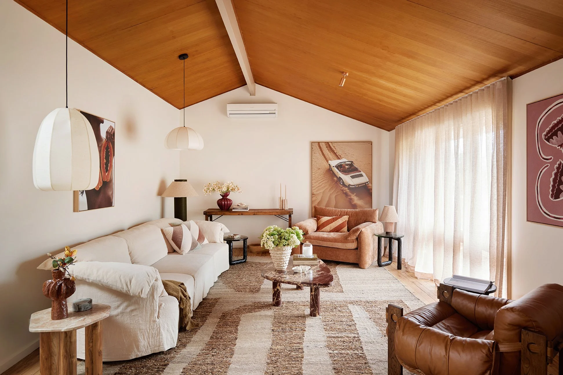
Every Three Birds project starts with a vision board, and for The Eclectic Escape, pops of colour were part of the plan from day one. We wanted the house to feel relaxed, layered and happy – a true holiday escape where time slows down and summers seem to stretch on forever.
From that feeling, the colour palette fell into place. Warm neutrals and coastal pastels were layered with tactile finishes, pattern and texture to create a soft, sun-kissed feel throughout. Each room has its own personality, but the colours flow effortlessly from space to space, giving the whole home that easy, breezy ‘Vacay Vibes at Home’ feel we love.
Paint and tiles sat right at the top of the list when it came to bringing colour into this home – and here’s how we did it…
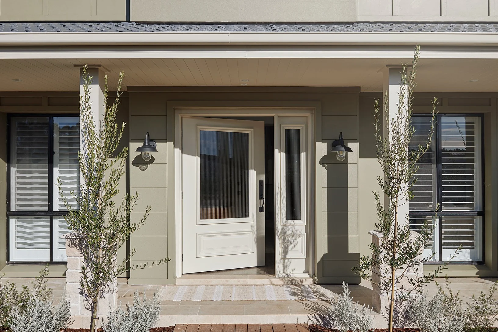
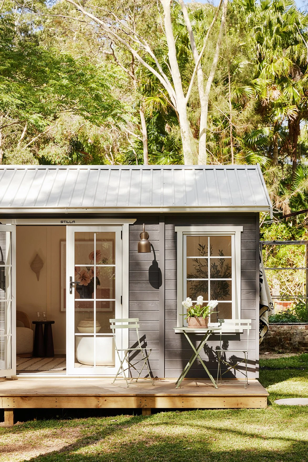
SETTING THE TONE FROM THE OUTSIDE IN
We started outside, giving the exterior a full refresh using Dulux Weathershield in Grey Master. It’s a calm, confident grey that instantly grounds the façade and gives the house so much presence. The trims were finished in Dulux Berkshire White, a gorgeous creamy white that freshens everything up and helps the home sit beautifully within its leafy surrounds.
Together, these colours set the tone for the relaxed coastal vibe waiting inside.

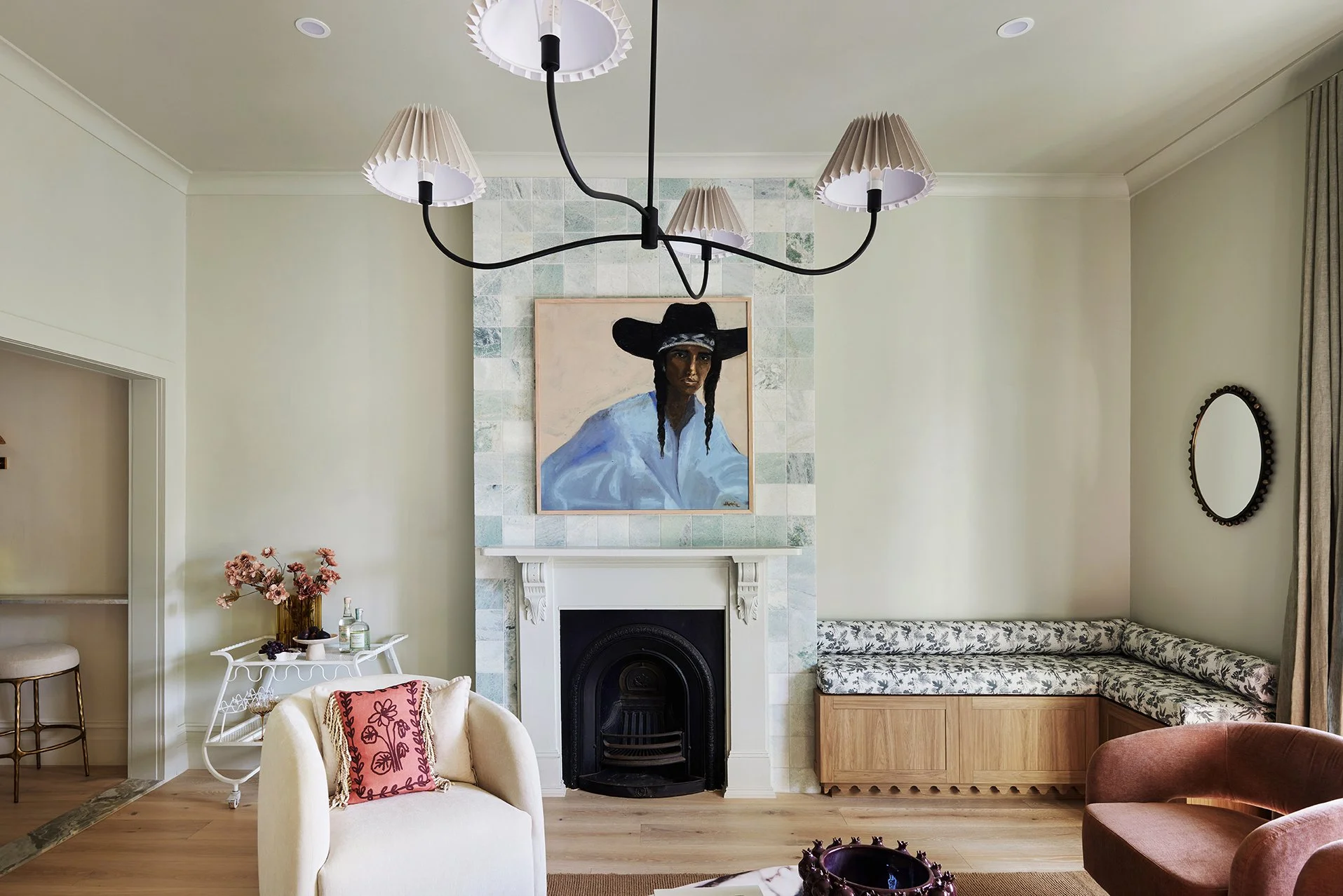
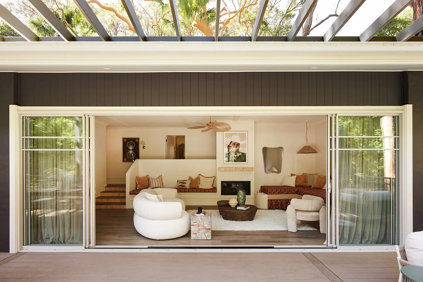
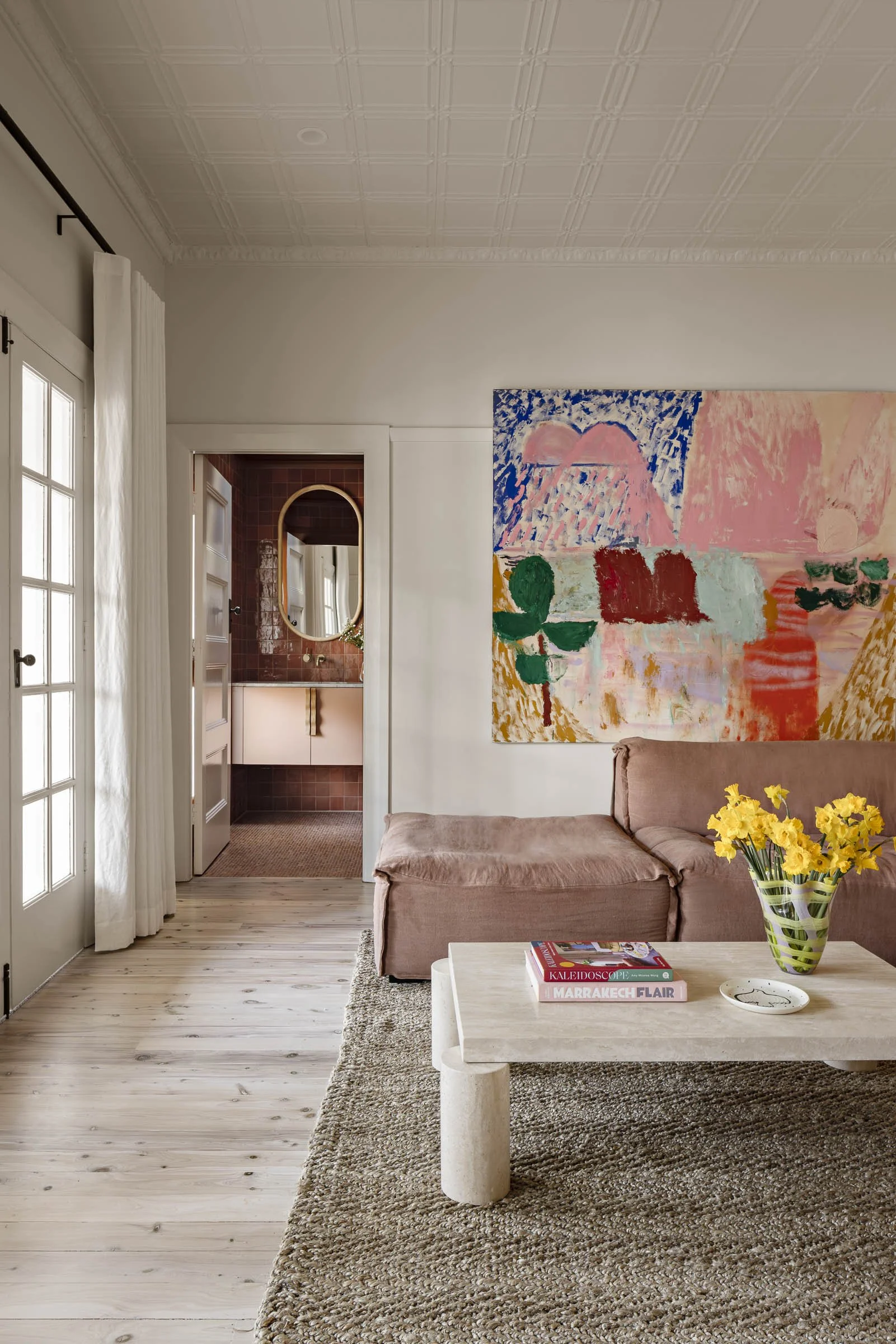
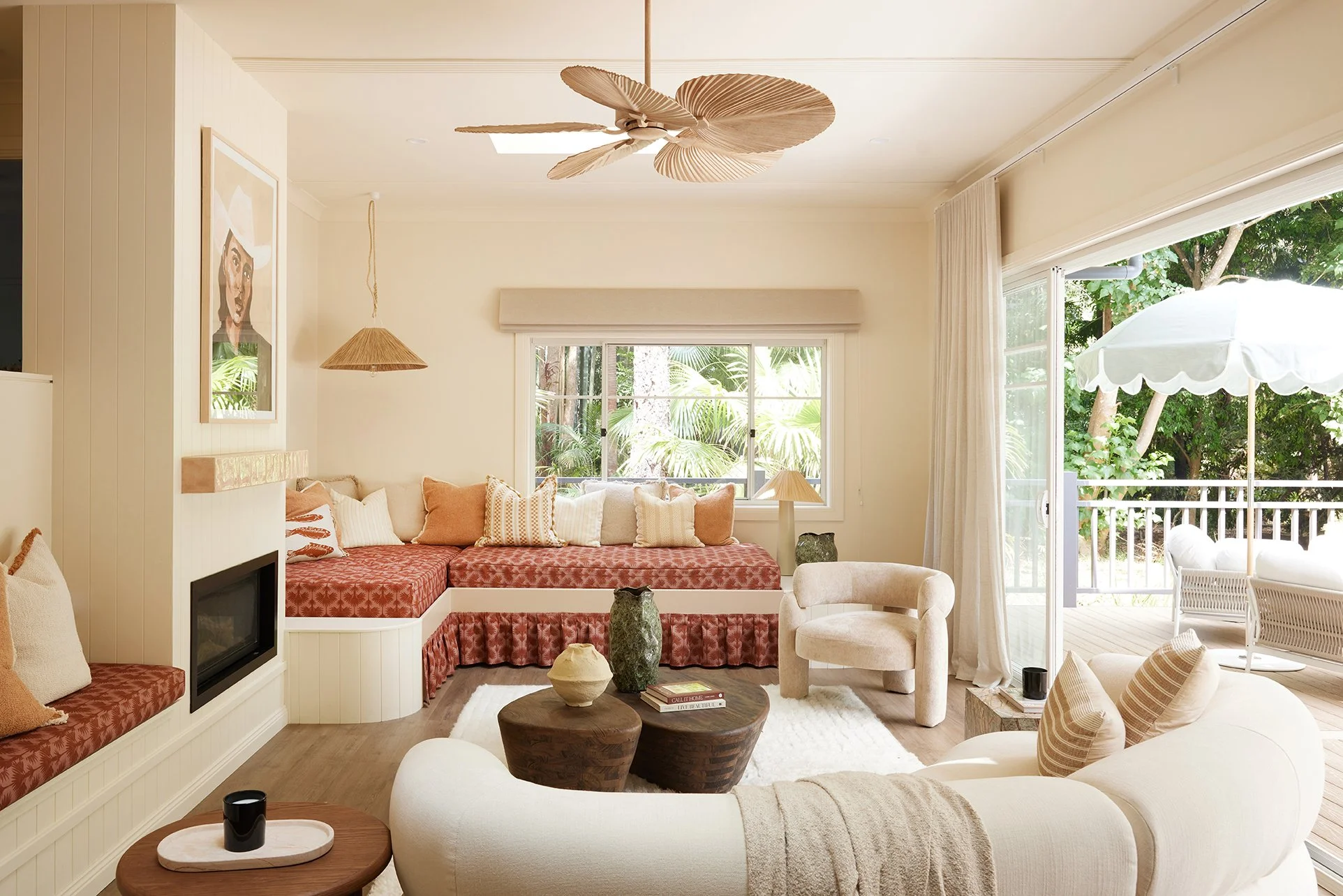
A WARM, COLOUR-FILLED HEART
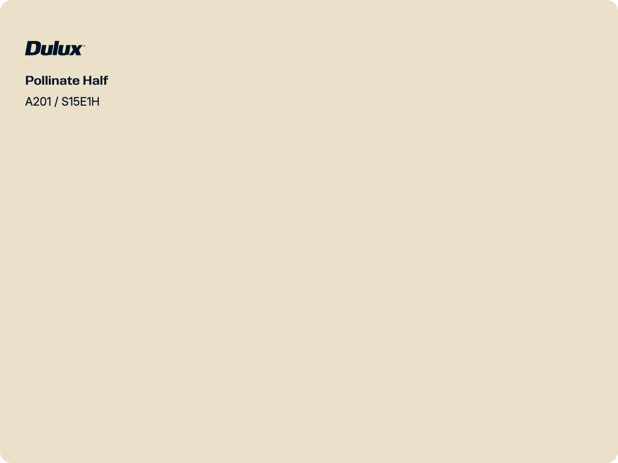
Inside, colour is what ties everything together, and it was important that the living, dining and kitchen flow as one big, light-filled indoor–outdoor zone. To create cohesion, we used Dulux Pollinate Half on the walls, ceilings, trims and doors. It’s soft, warm and has this magical way of making everything glow – even on cloudy days.
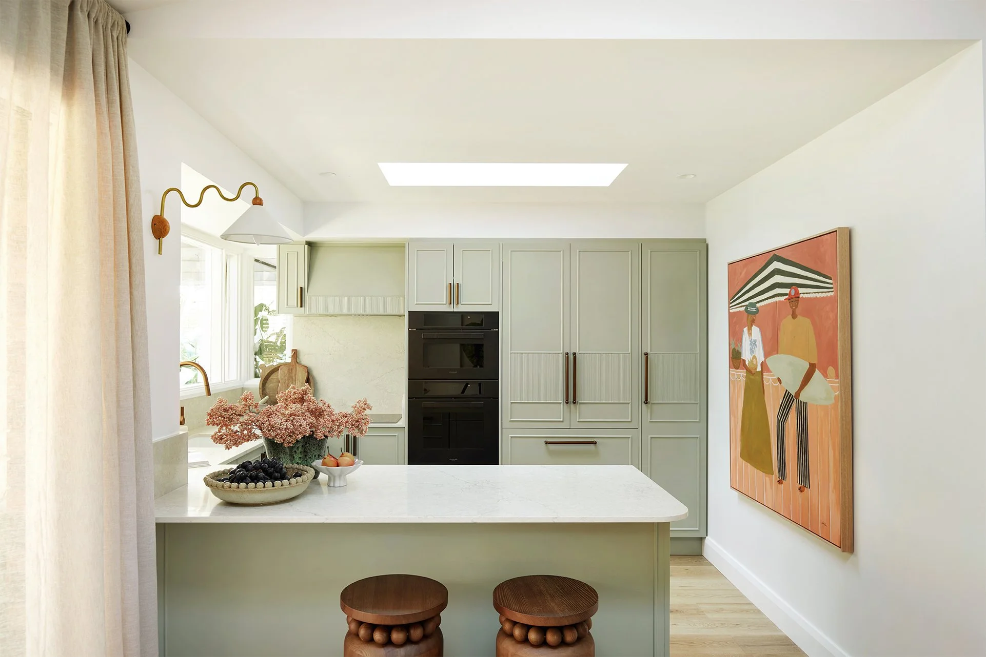
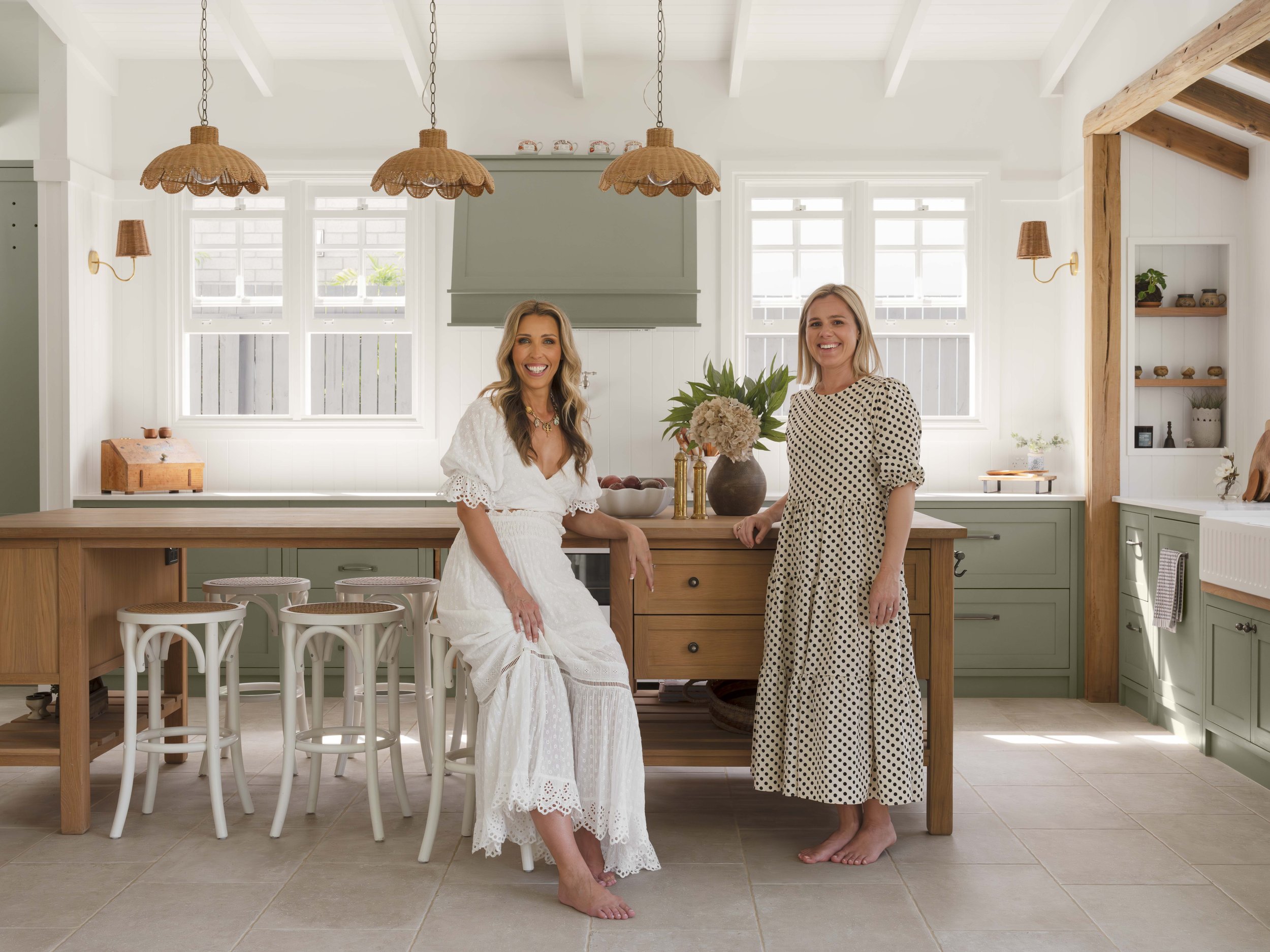
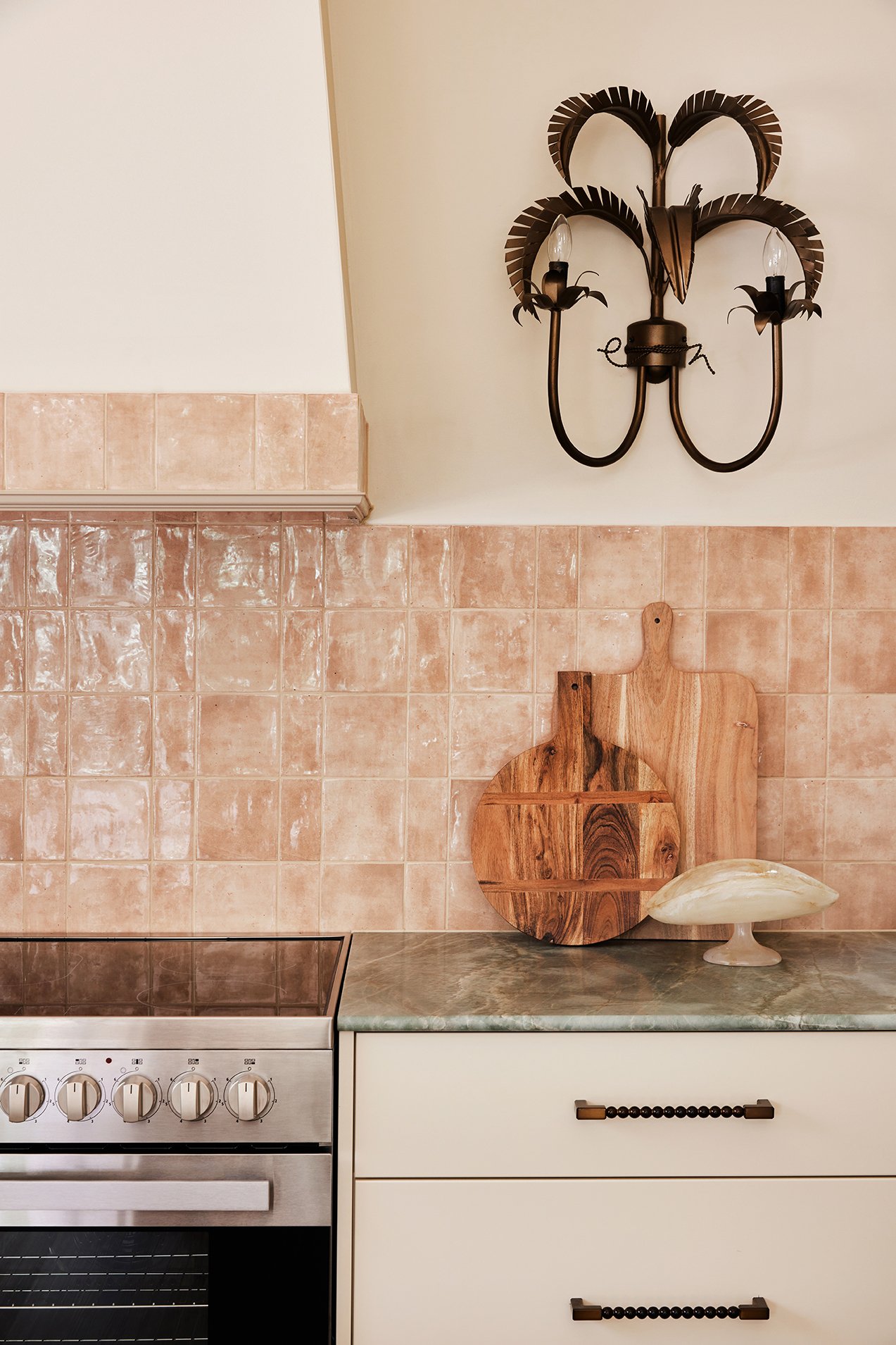
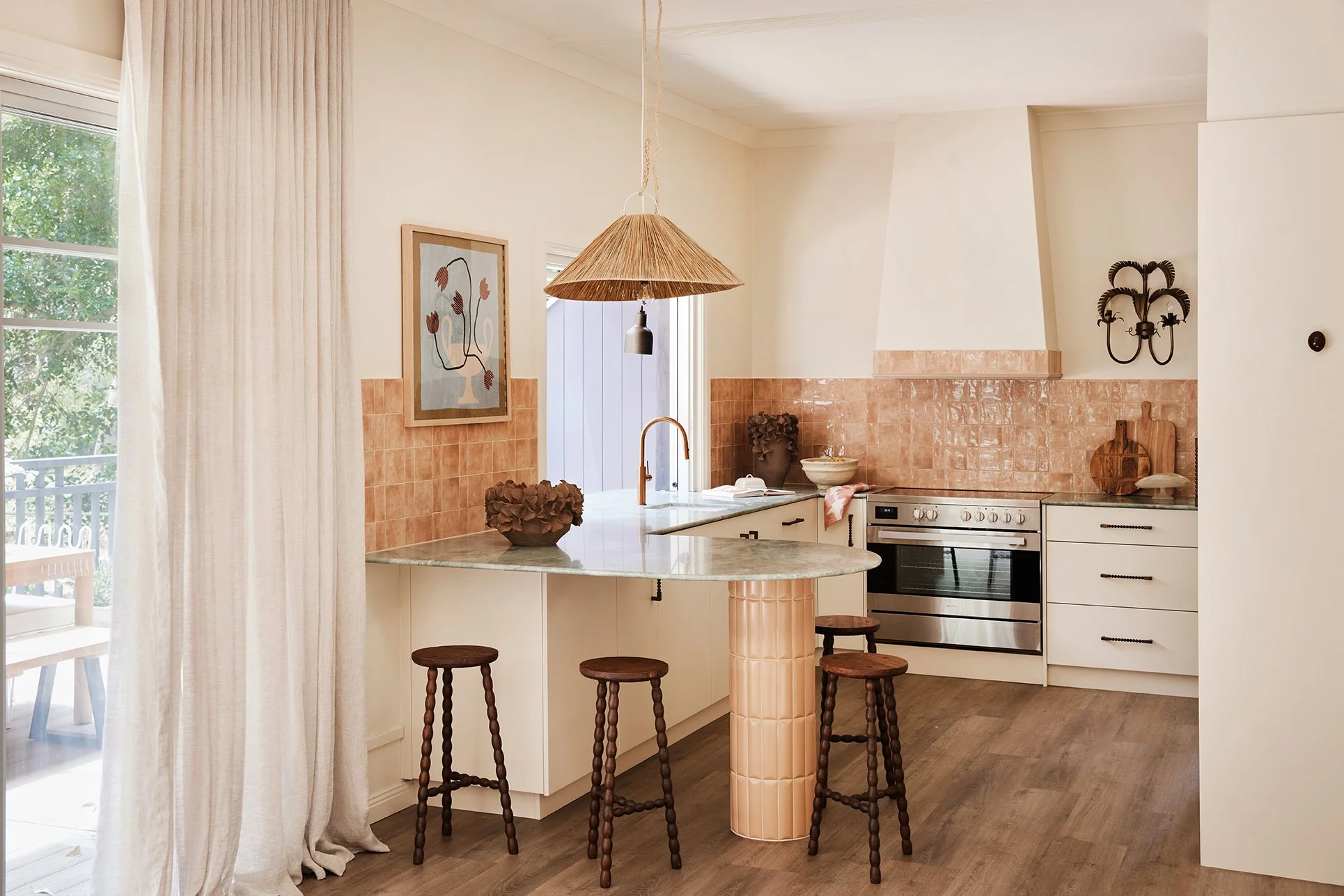
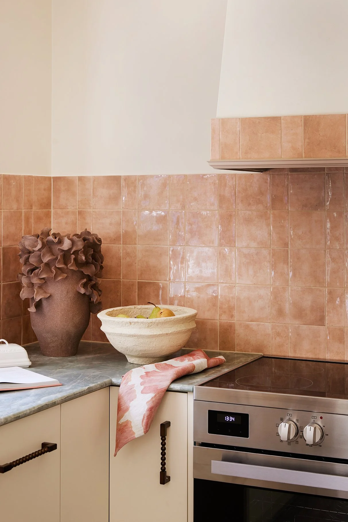
The kitchen is the heart of the home and a real standout. The cabinetry (also Dulux Pollinate Half) is paired with beautiful hardware and incredible green onyx benchtops. The stone brings in natural movement and texture, adding a luxe feel without being OTT.
For the splashback and a feature border on the rangehood, we used the gorgeous glossy ‘Hue’ tiles in the colour Clay from Amber, laid in a mix of squares and rectangles for that perfectly imperfect, handmade look. The warm clay tone works beautifully with the green onyx, so we leaned into it and created another little design moment by tiling the leg of the island in a complementary terracotta tone - this time using the Cushion Subway tile.
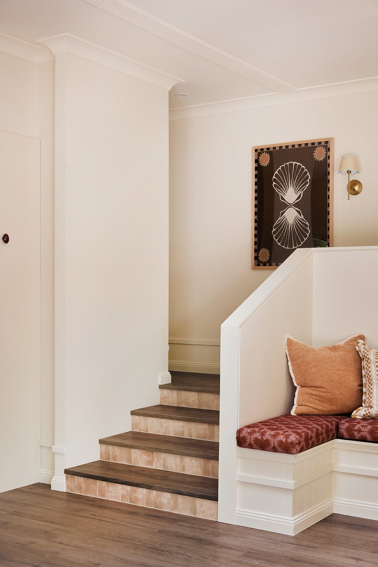
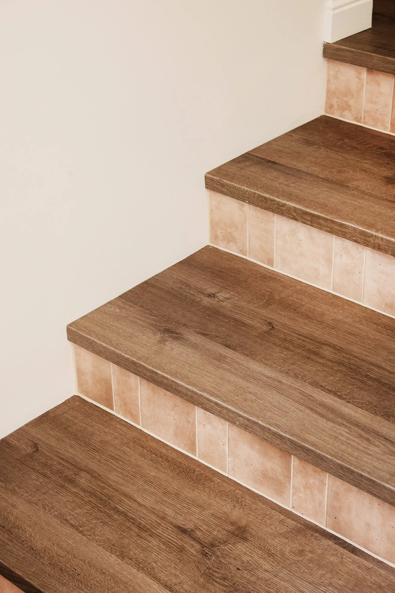
Tiles are one of our favourite ways to add colour and personality to a home without overwhelming a space. They’re practical, durable and such an easy place to be a little bit playful – especially when you take them beyond the obvious spots. Tiled stair risers? Yes way, rosé!
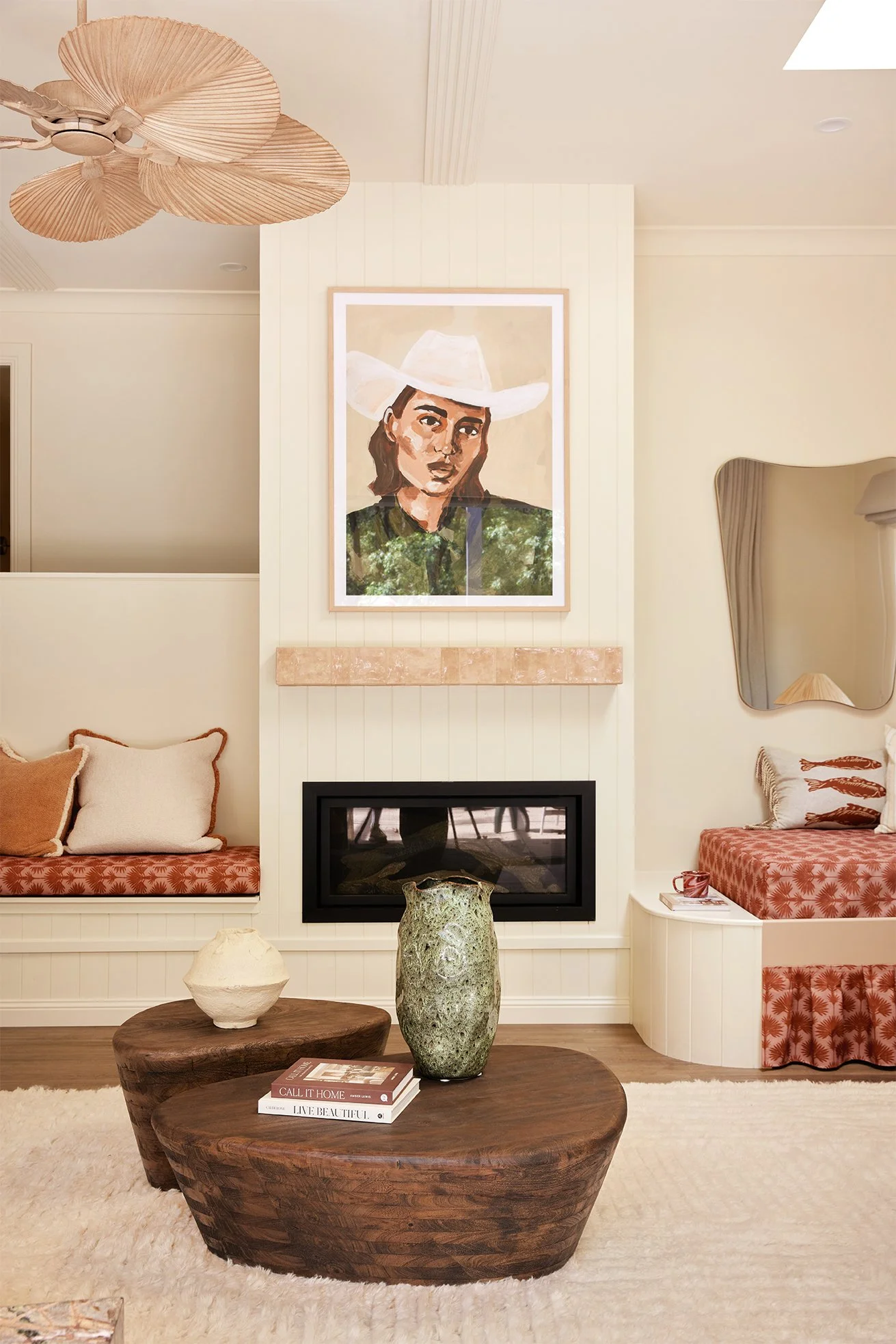
We carried the same Amber ‘Hue’ Gloss tiles used in the kitchen splashback onto the risers, creating a subtle but super-cute colour moment as you move from the living spaces to the bedrooms and bathrooms. We loved this detail so much that, when you’re onto a good thing, you repeat it - this time on the fireplace mantle. It’s these little moments of repetition that help a home feel connected and thoughtfully layered from room to room.
BEDROOMS WITH THEIR OWN COLOUR MOMENTS
Each bedroom got its own colour moment, and honestly… the jury’s out on which one we love most.
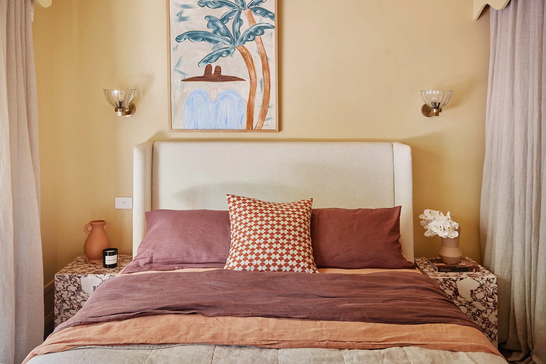
The main bedroom is wrapped in Dulux Dromedary, a warm, earthy orange that instantly makes you want to slow down and stay a while. We used the same colour on the walls, ceilings, skirting, architraves and decorative pelmets to fully cocoon the space. It feels cosy, grounding and perfect for long, lazy holiday sleep-ins.
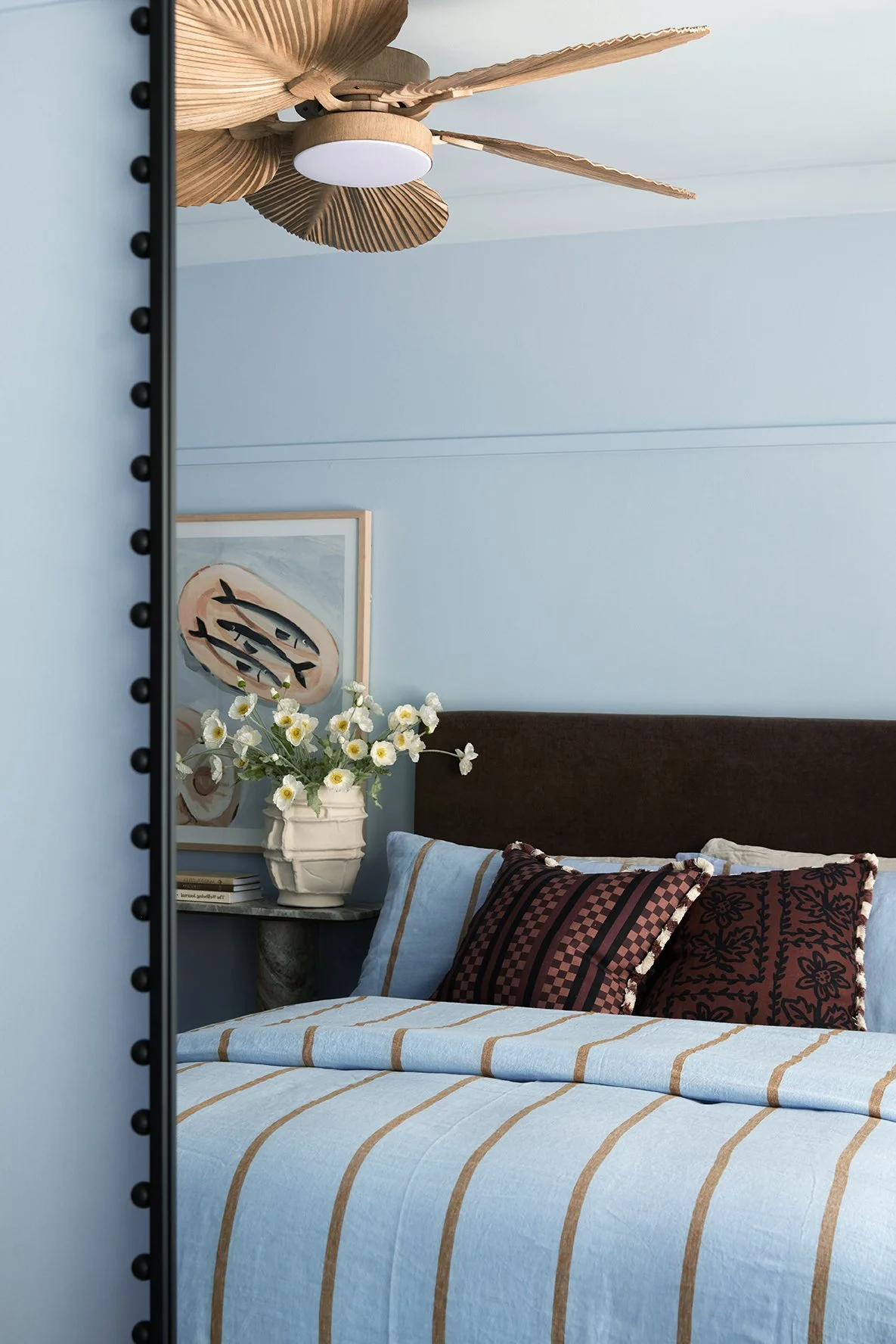
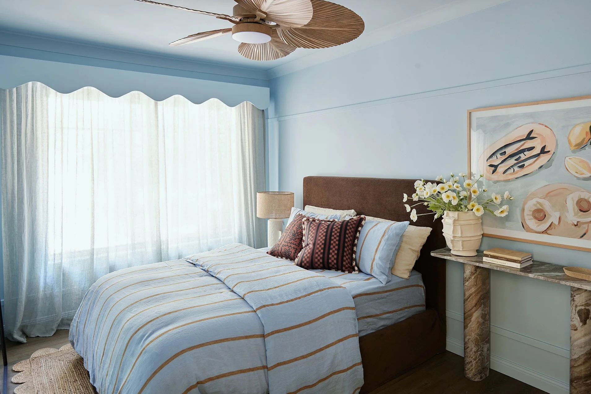
The guest bedroom is painted in Dulux Vanilla Ice Half, used on all surfaces for a soft, calming feel. Paired with earthy styling, it proves once again that blue and brown are a match made in heaven.
The kids’ room is drenched in Dulux Sand Diamond, a gentle golden shade that feels like golden hour on repeat. It’s warm, happy and full of personality – the perfect colour to make a small room glow.
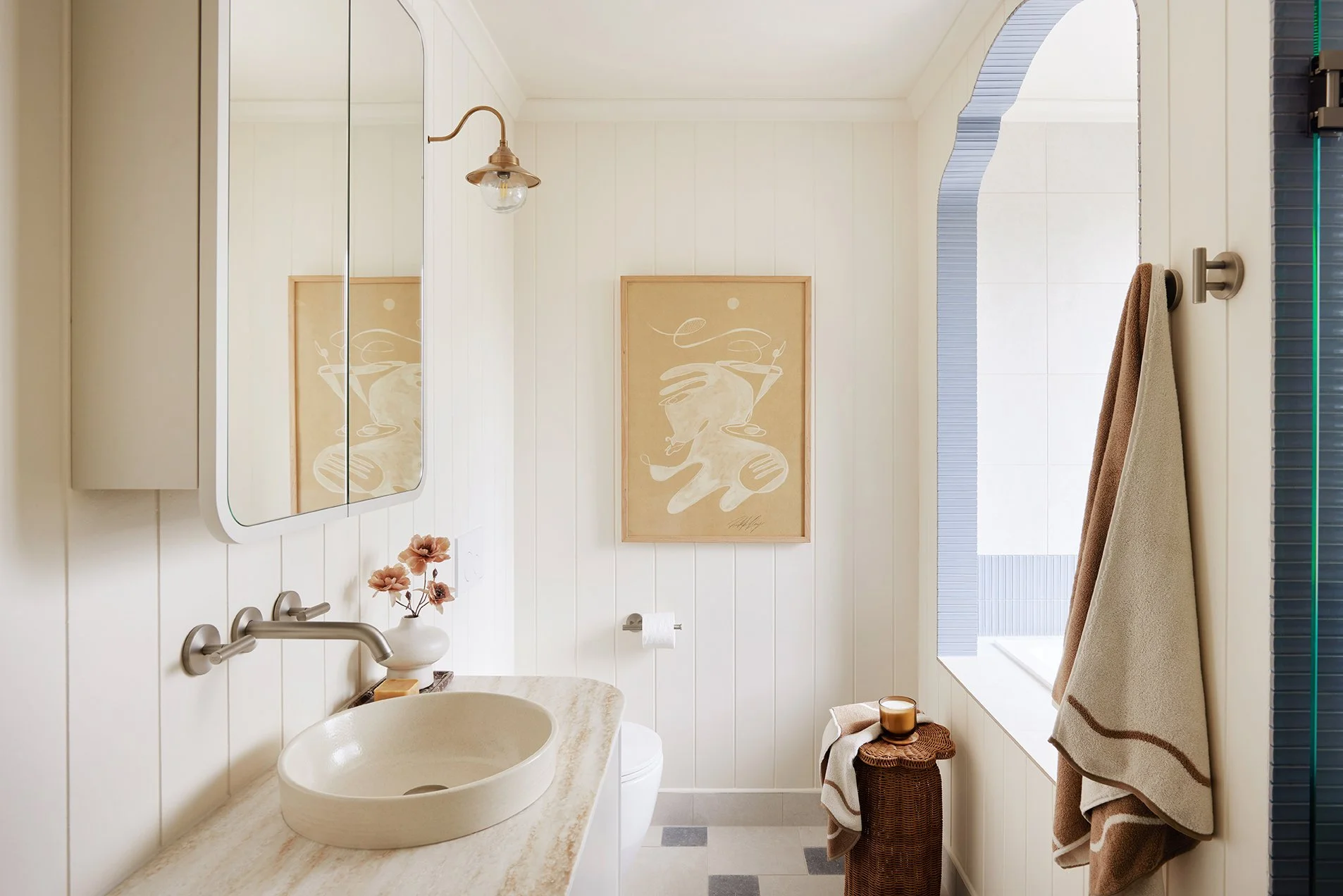
BATHROOMS WITH PERSONALITY
Bathrooms are the perfect place to have a little fun with colour and pattern. They’re compact, practical and ideal for dialing up personality.
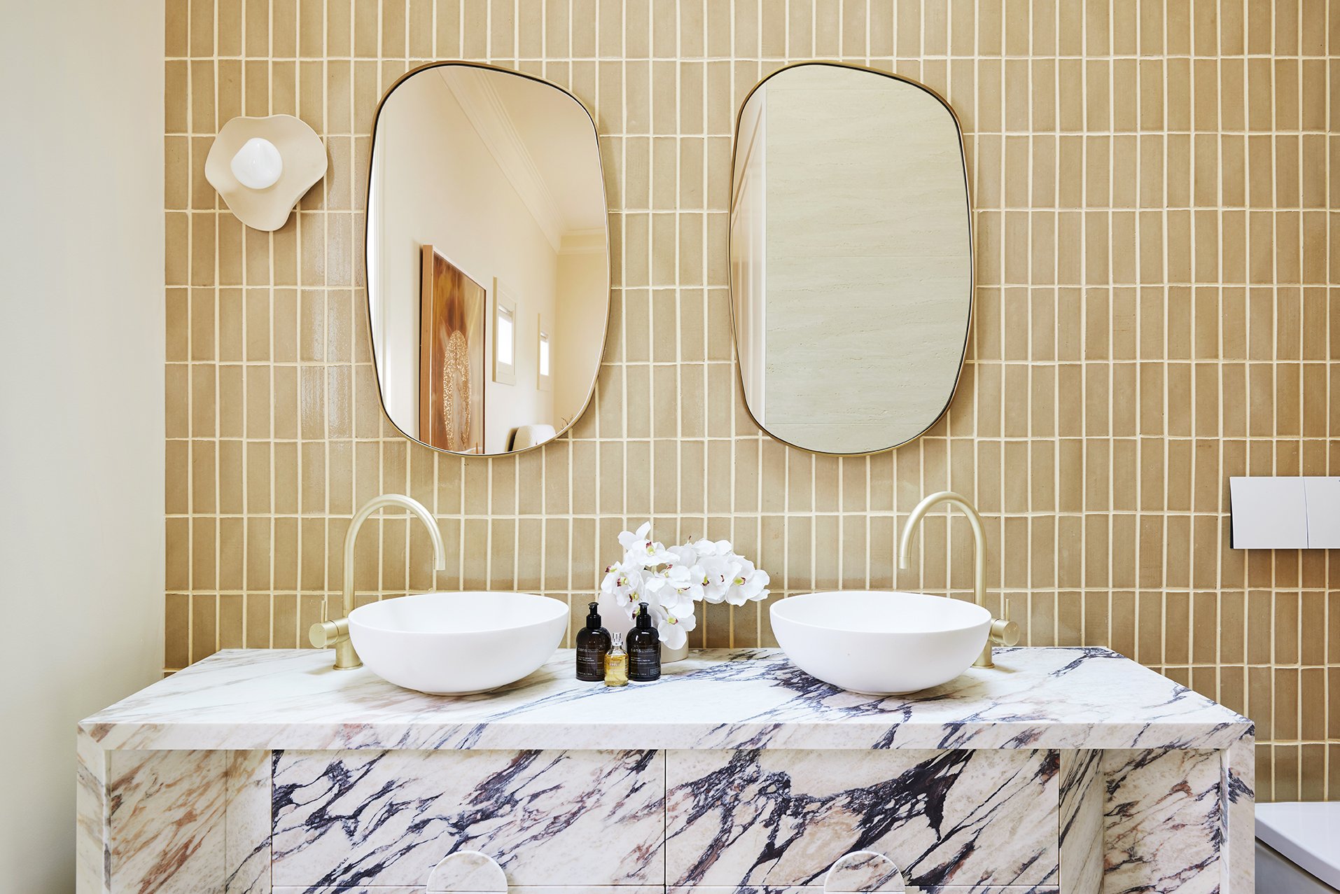
In the main bathroom, colour takes centre stage. We used 200x200 ‘Tiffany’ tiles in Blue and Butter (available in-store at Amber) to create the sweetest checkerboard pattern on the floor. The walls are finished in the same ‘Tiffany’ tile in Butter, keeping the space warm and light, while ‘Hue’ Gloss tiles in Clay add a detail that ties beautifully back to the kitchen and living areas.
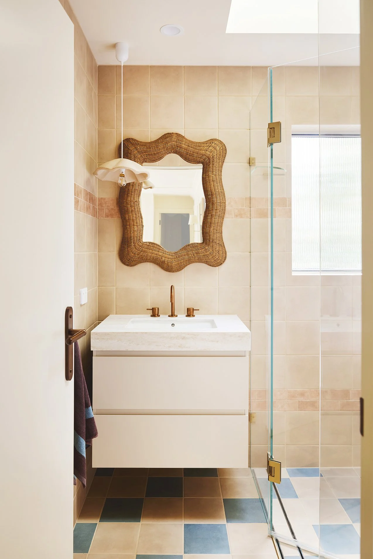
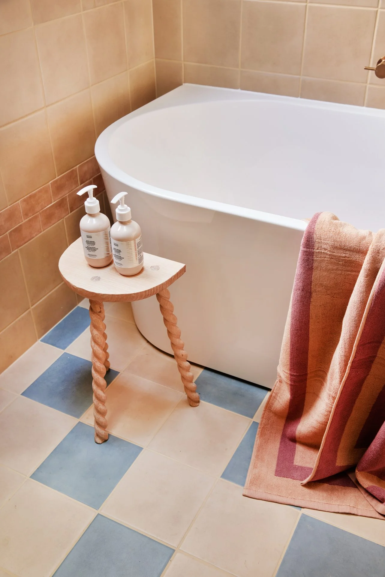
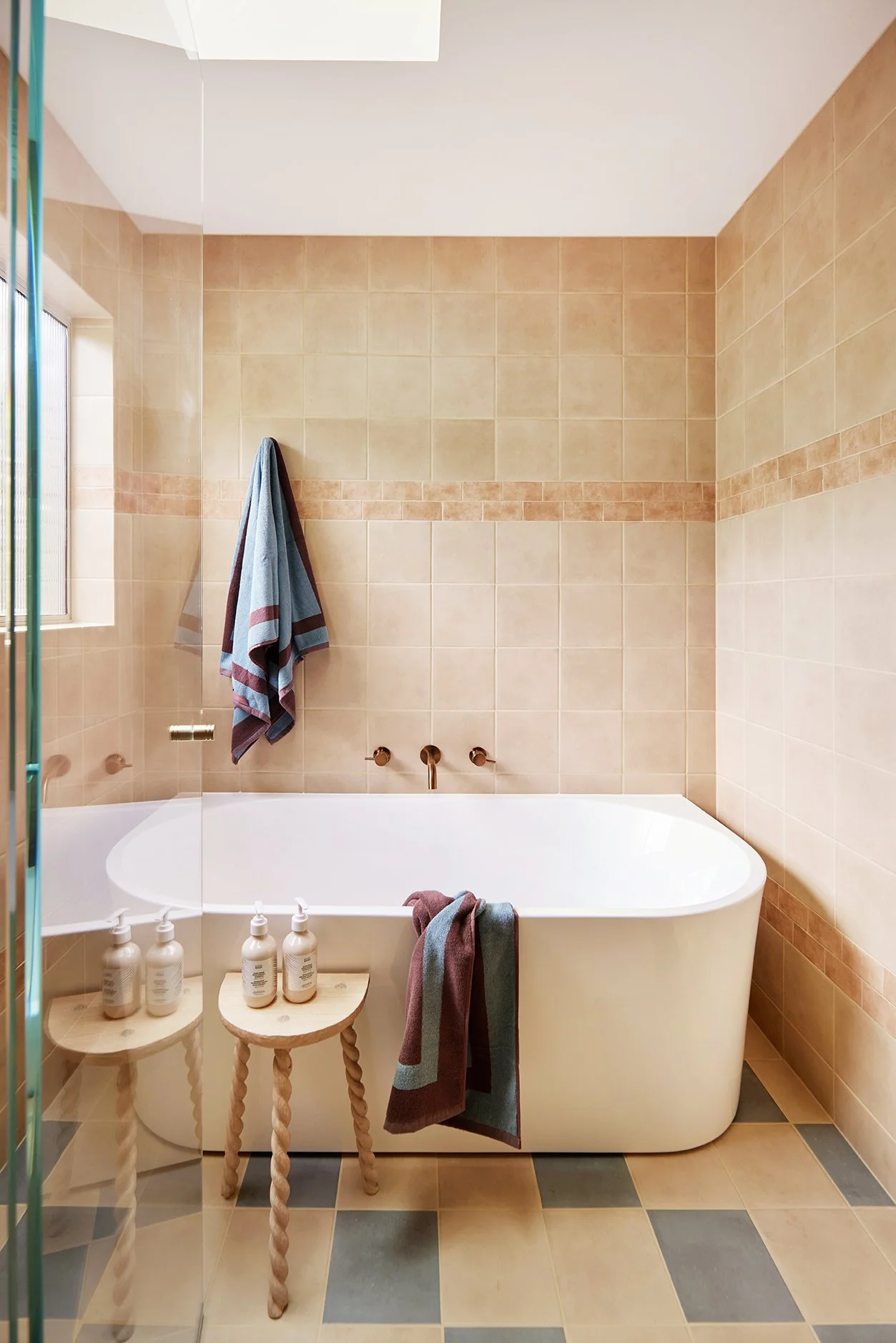
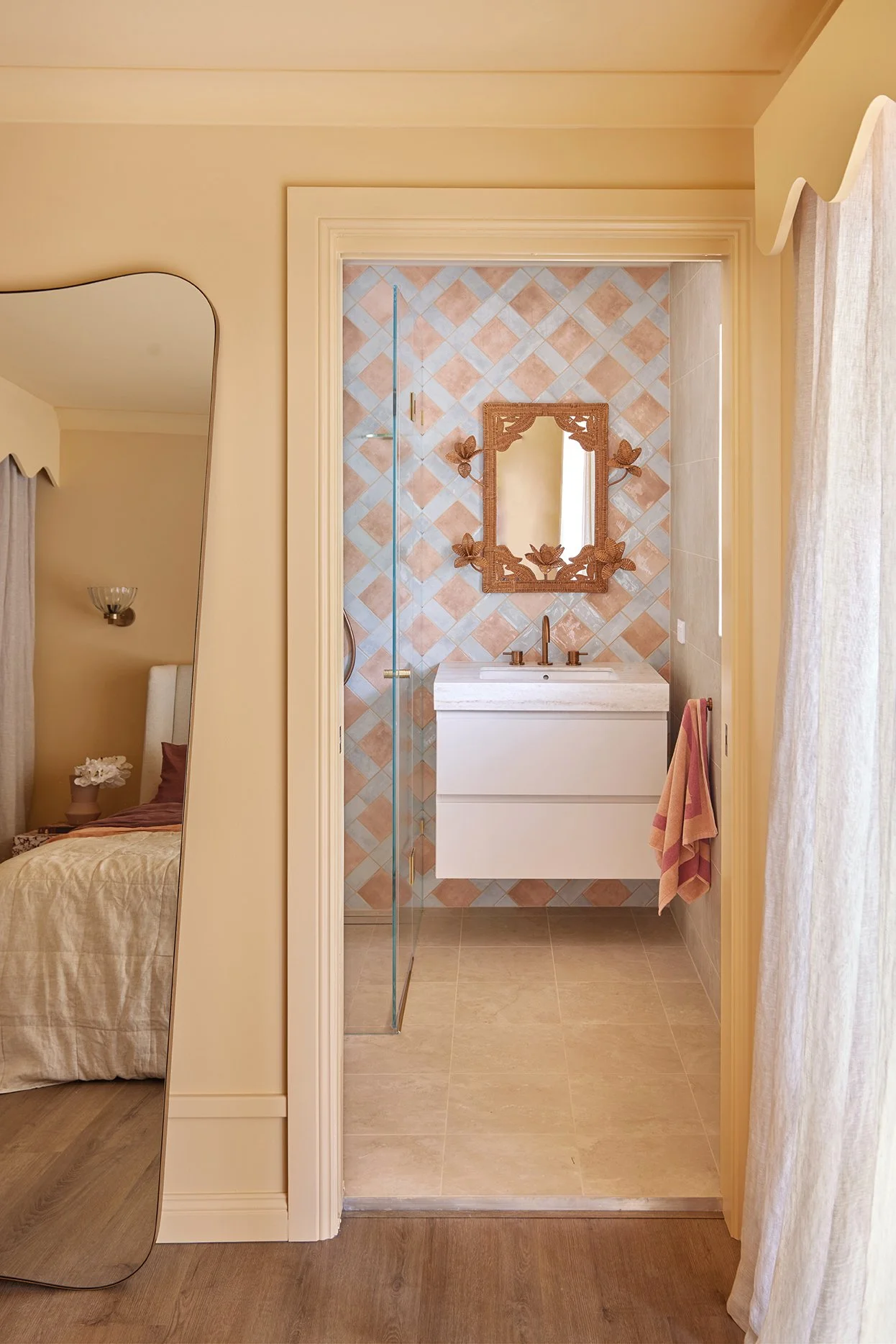
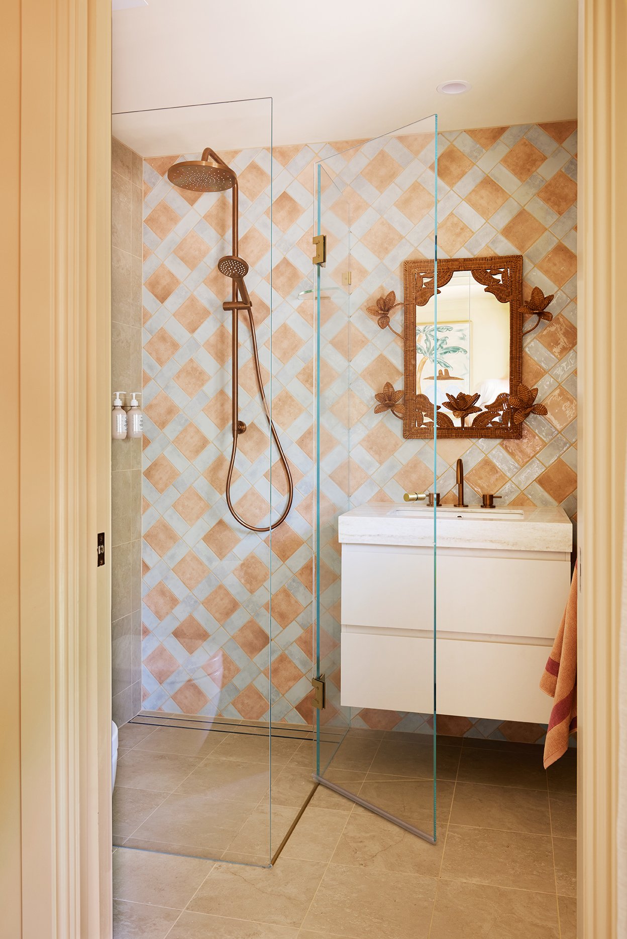
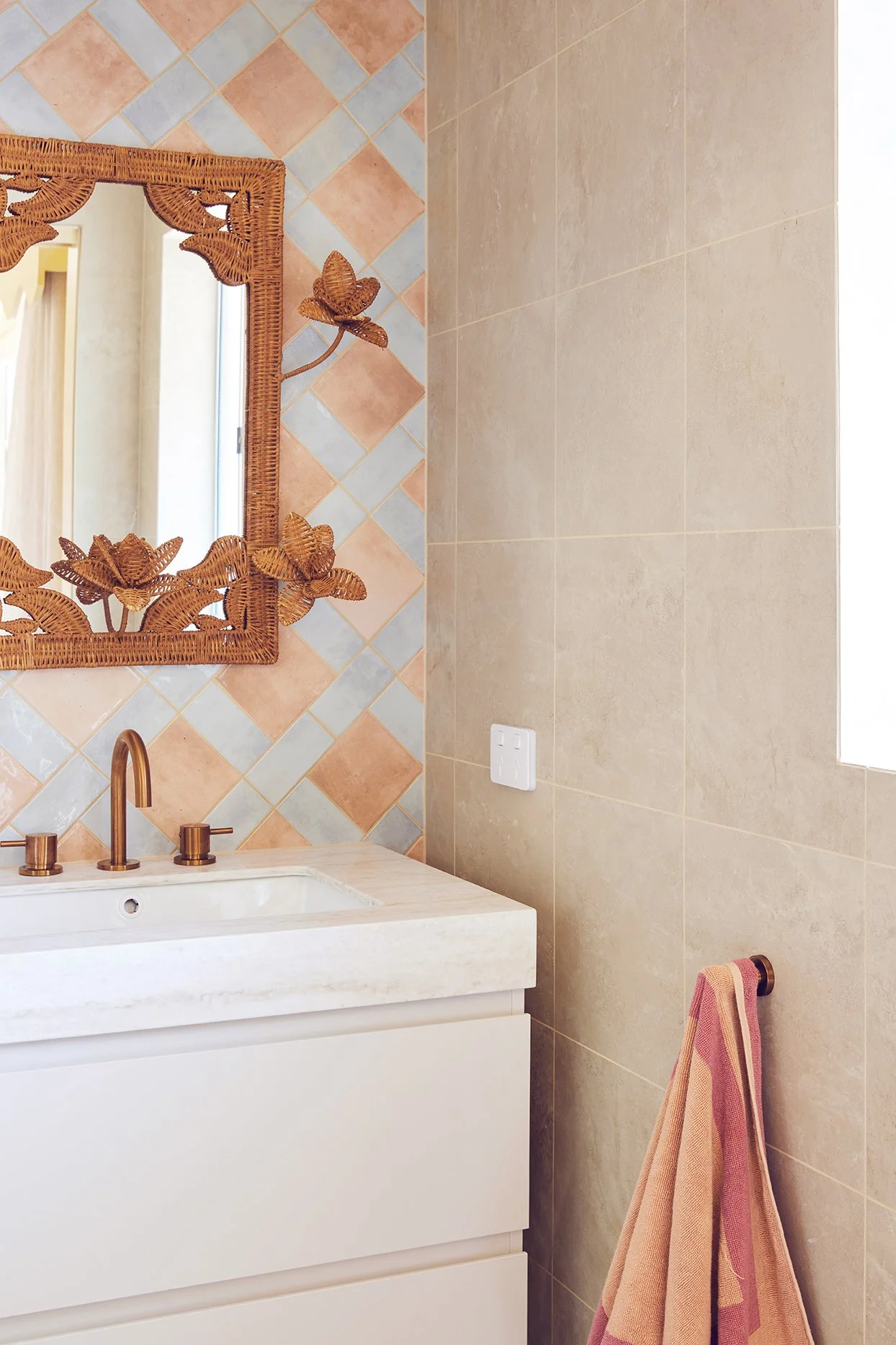
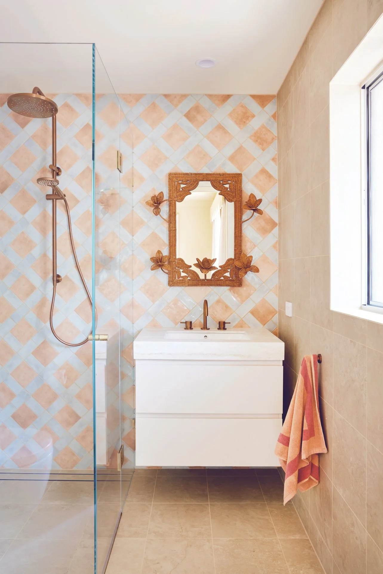
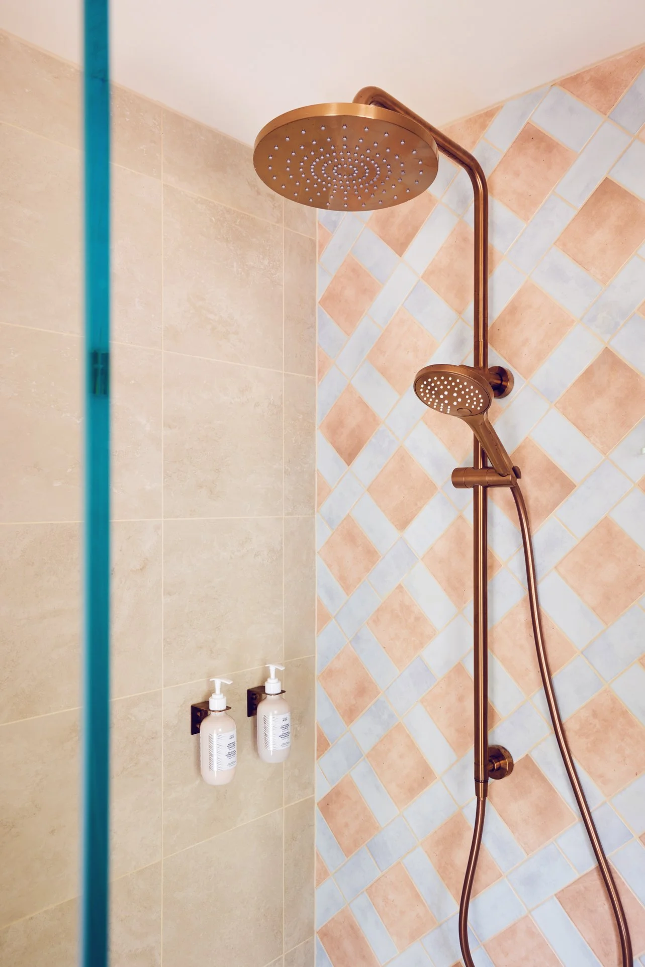
The ensuite packs a punch with colour and pattern. Amber ‘Travertine’ Matte tiles in Ivory were used on both the floor and walls to create a calm, sandy base that feels perfectly at home in this relaxed coastal setting. They give you all the beauty of natural travertine, but in a durable porcelain tile that’s easy to live with – ideal for a high-traffic holiday house. The ‘Hue’ tiles pop up again too, this time in Ocean paired with Clay, adding just the right amount of colour without overpowering the space.
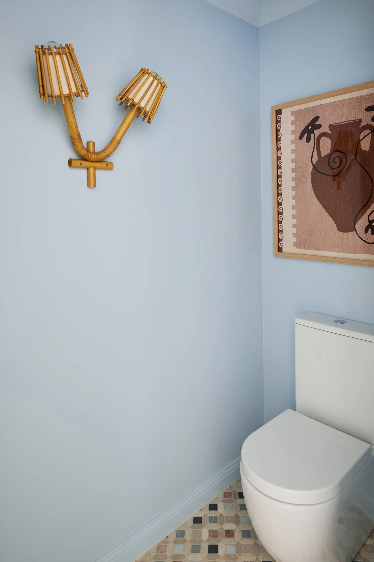
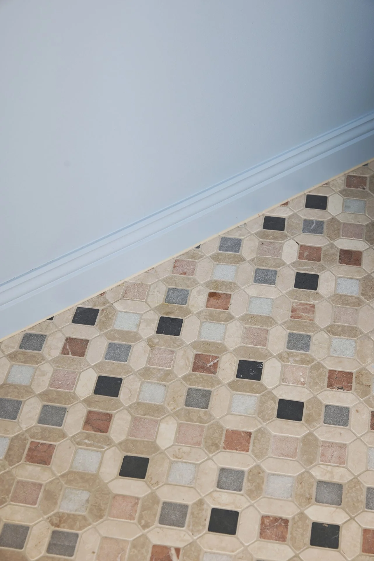
The powder room is where we had a little extra fun. The floor features ‘Zahri Mosaic’ tiles in Natural Multicoloured (available in-store), bringing instant personality and making this small space feel special and memorable.
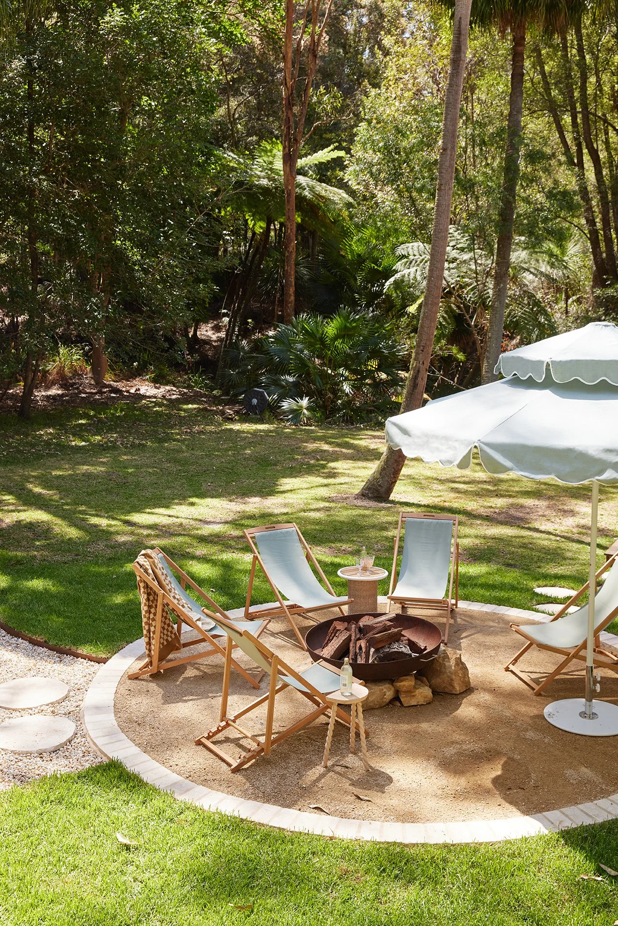
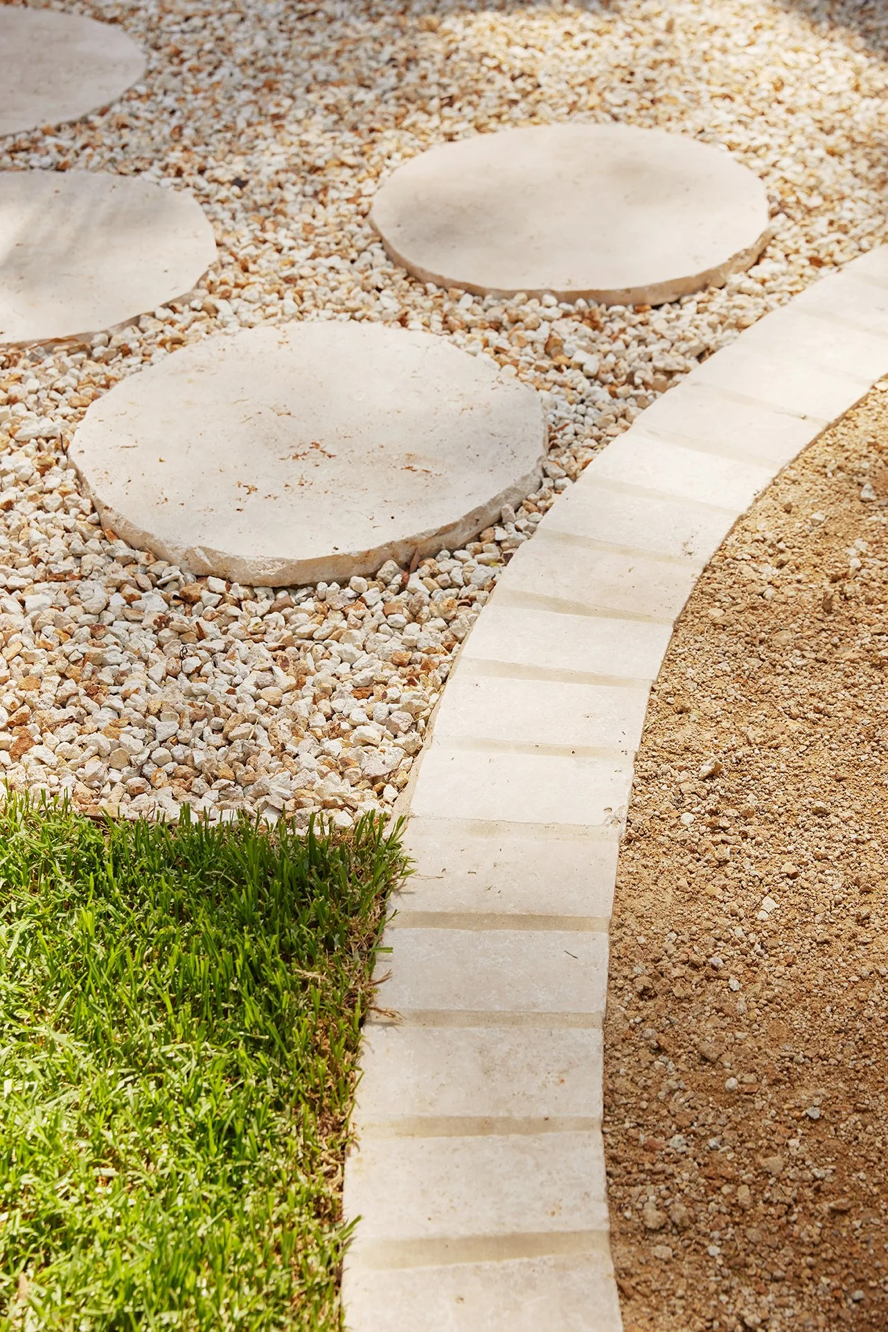
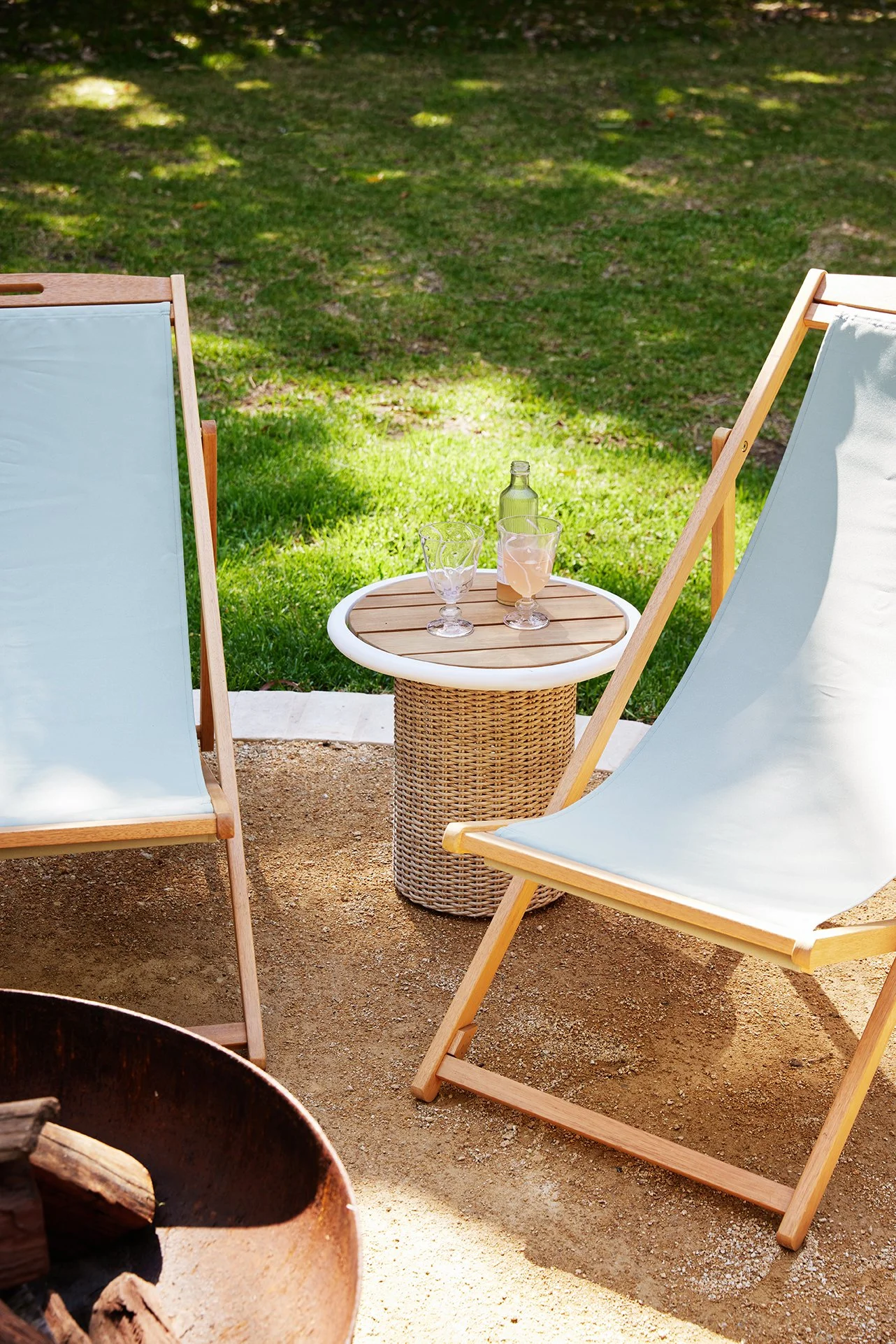
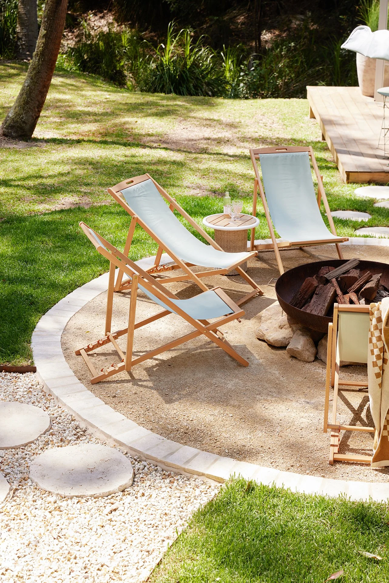
Outside, Travertine Pavers in Ivory and matching stepping stones guide you through the garden and frame the firepit zone. Their natural variation keeps everything soft and earthy, helping the transition between inside and out feel effortless – just as a holiday home should.
A HOLIDAY HOME MADE FOR LONG SUMMERS
Today, The Eclectic Escape is a layered, colour-filled and joy-packed holiday home. Warm, inviting Dulux colours paired with beautifully coloured and patterned tiles from Amber come together to create a palette that feels playful, polished and ready for long summer days, late nights and memories in the making.
And honestly? That’s exactly what a holiday house should be.
WANT ALL THE DETAILS OF THE PRODUCTS WE USED?
You’ll find every product we used linked on our Get the Look pages – consider it your shopping shortcut 😉 You’re welcome!