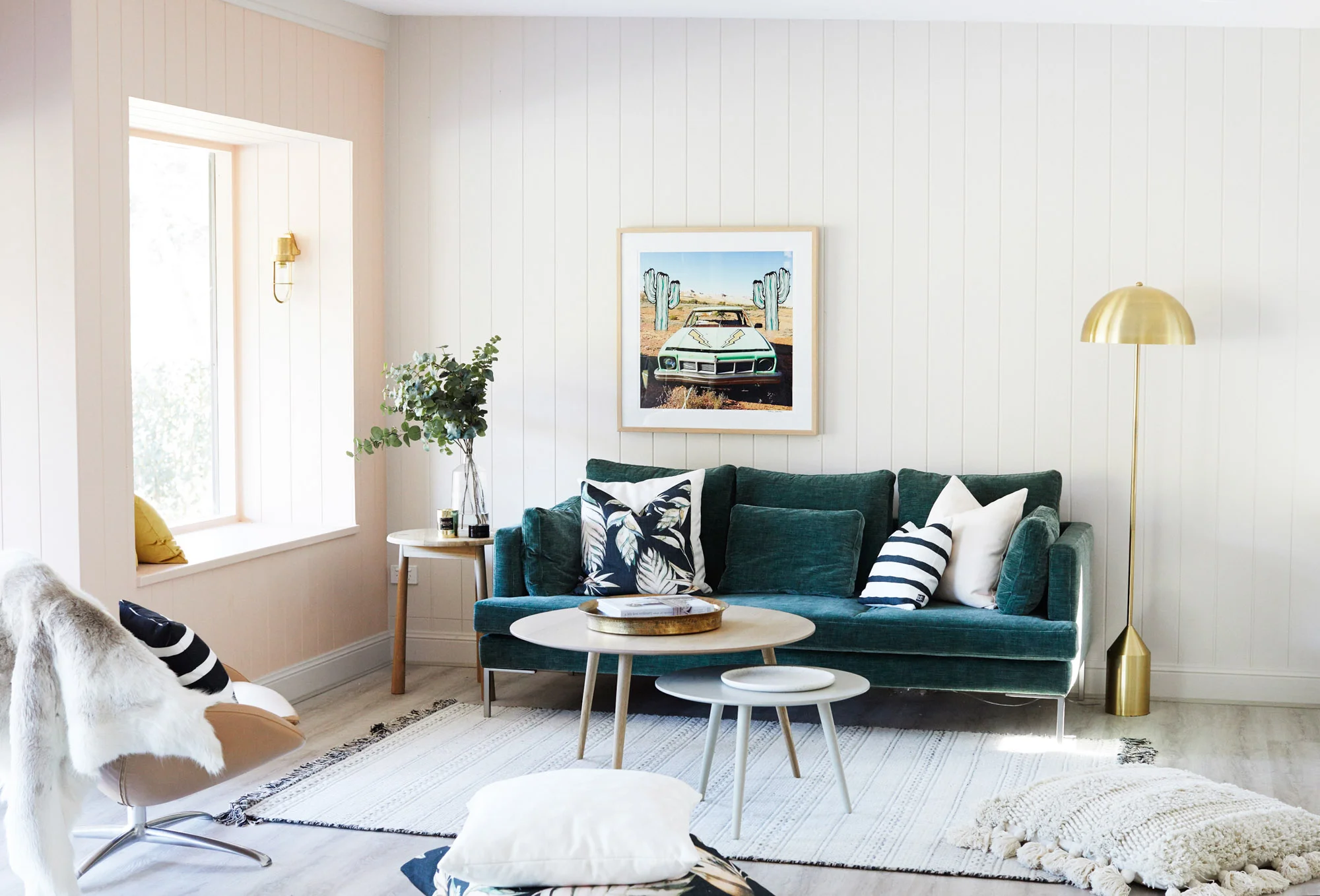
COLOUR US SMITTEN: THE BIG REVEAL OF THE 2027 DULUX COLOUR FORECAST
Colour can completely change the way a home feels.
From the recent show-stopping Dulux Murray Red cabinetry in the Character Semi’s kitchen to the dreamy pink front door at House 5, we’ve seen how the right shade can bring personality, warmth and energy to a home. And there’s plenty more to come, with earthy terracotta and cool sage tones taking centre stage in House 18.
Colour can cocoon or energise, calm or surprise. Sometimes, it can simply make you stop and say: wow. We love how it catches the changing light, shifts the sense of scale and completely changes the way a room feels.
So it always feels like Christmas has come a little early when Dulux reveals its annual Colour Forecast. It’s a glimpse at where colour is heading next but, more importantly, how our homes might feel next.
And today is Christmas morning because, drumroll please... the Dulux Colour Forecast for 2027 has landed.
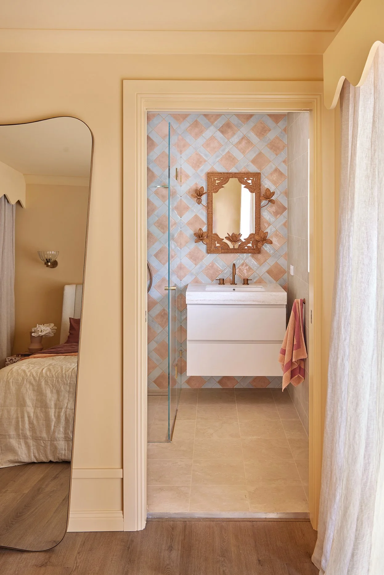
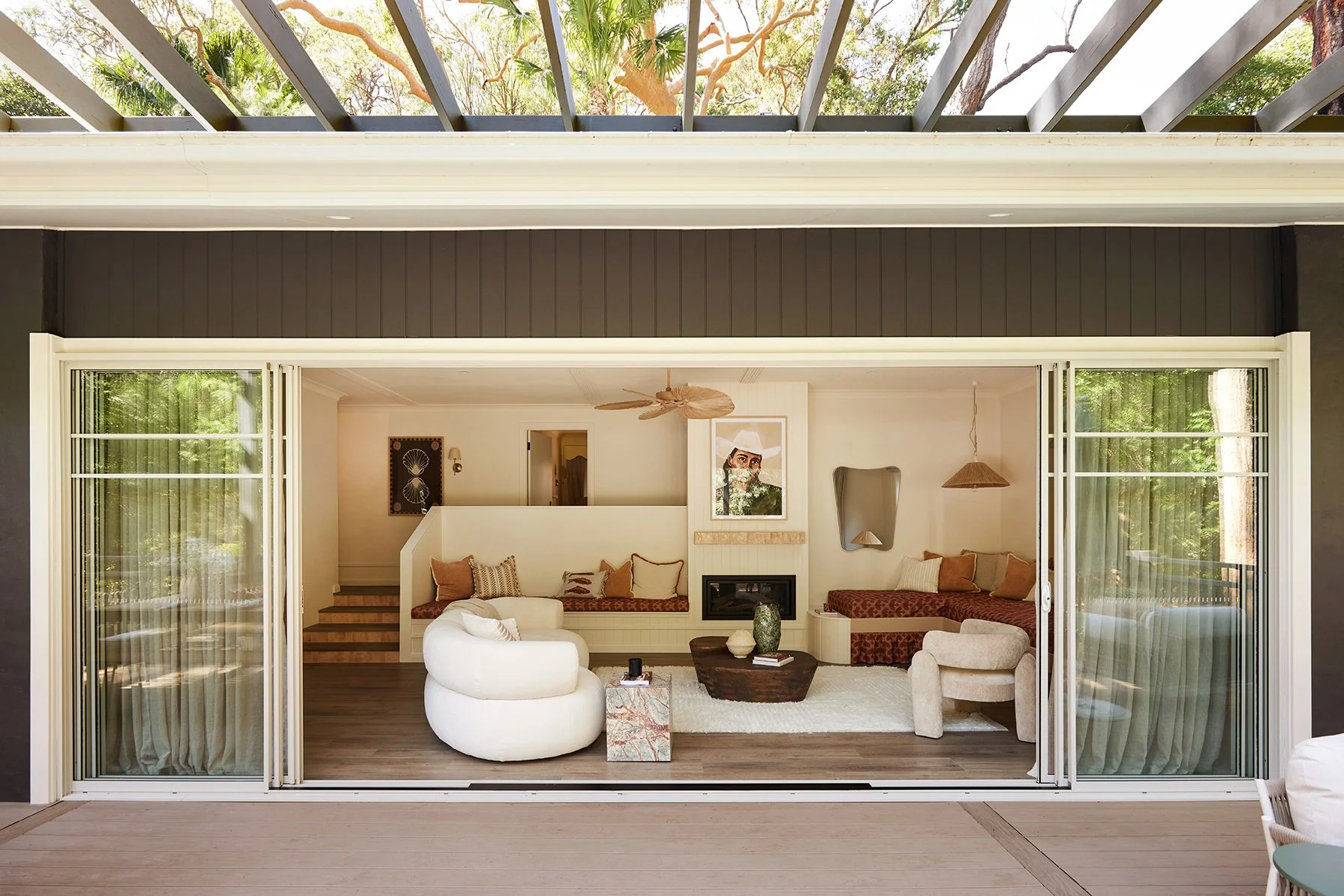
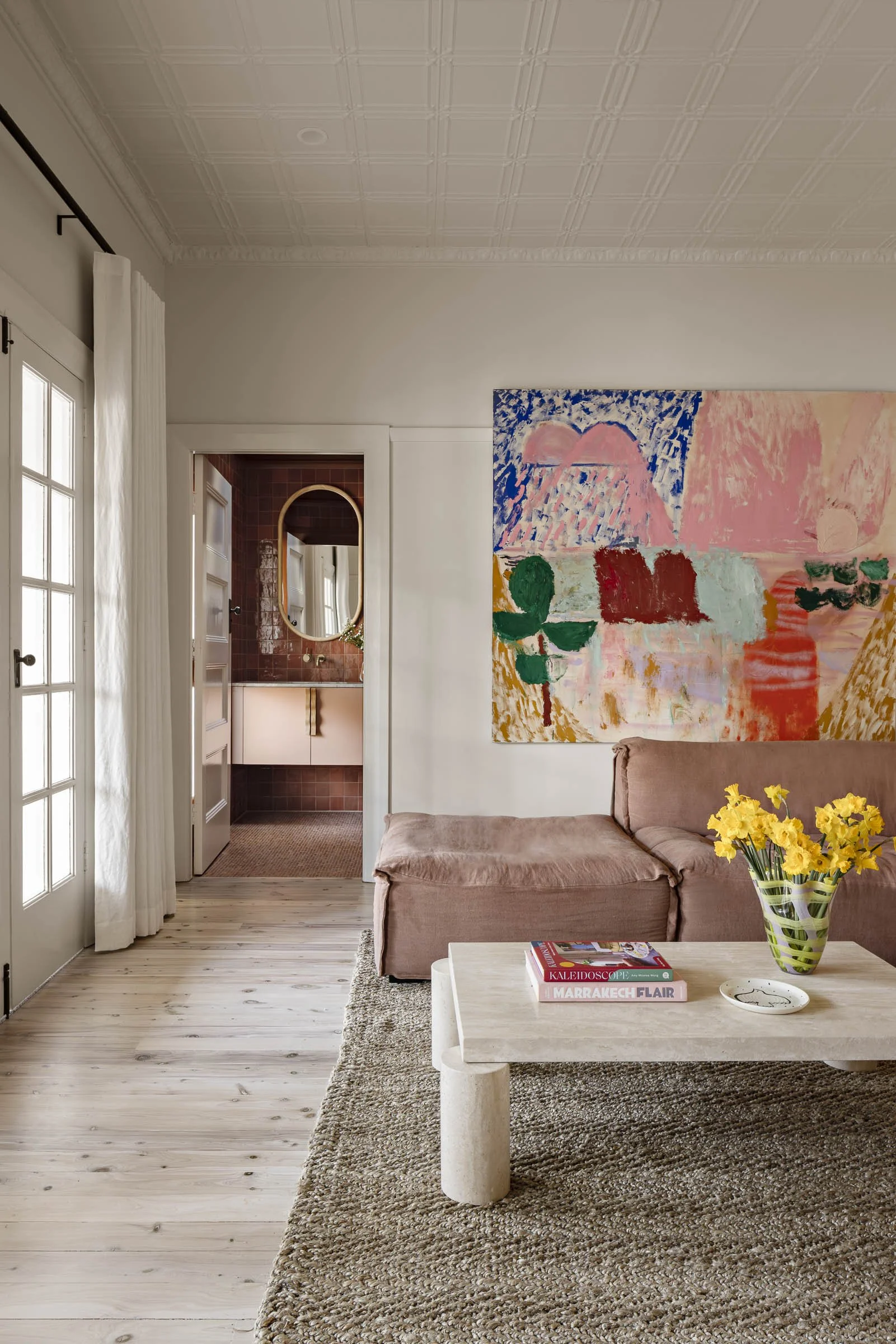
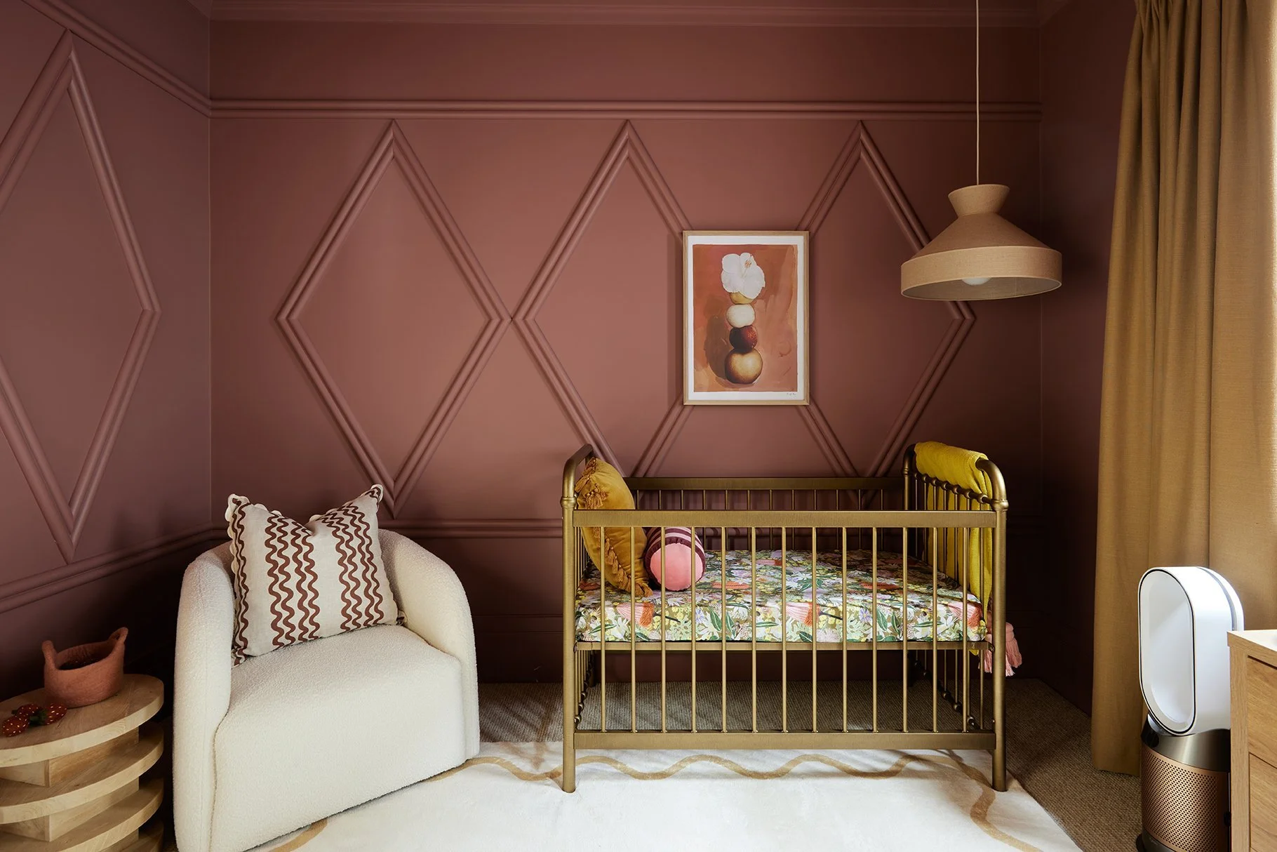
Images: Photographer Lisa Cohen, Stylist Bree Banfield
A MORE HUMAN WAY TO LIVE WITH COLOUR
For more than 25 years, the Dulux Colour Forecast has looked beyond trends to the moods shaping Australian interiors. And for 2027, perfectly curated is making way for something warmer, more personal and properly lived in. Hallelujah!
Less perfection. More personality.
Dulux captures this through three palettes: Play, Treasure and Sensory, spanning nature-led greens, playful blues, warm neutrals, deep browns and flashes of berry and red.
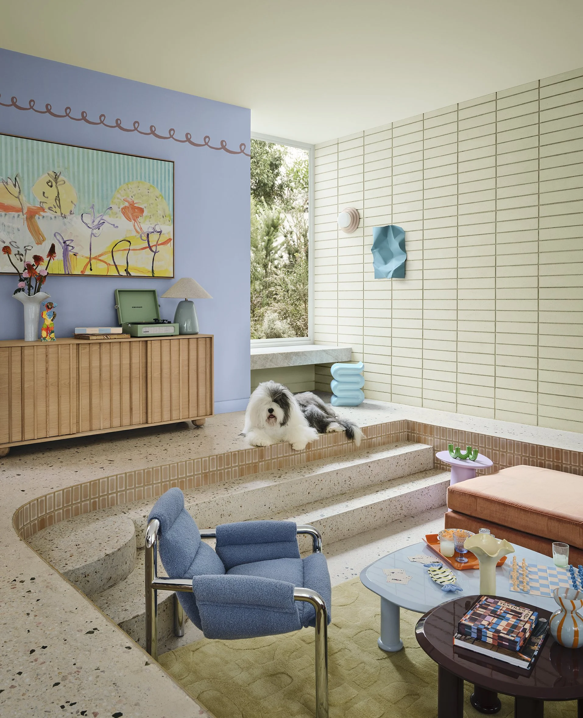
Dulux’s 2027 Play palette
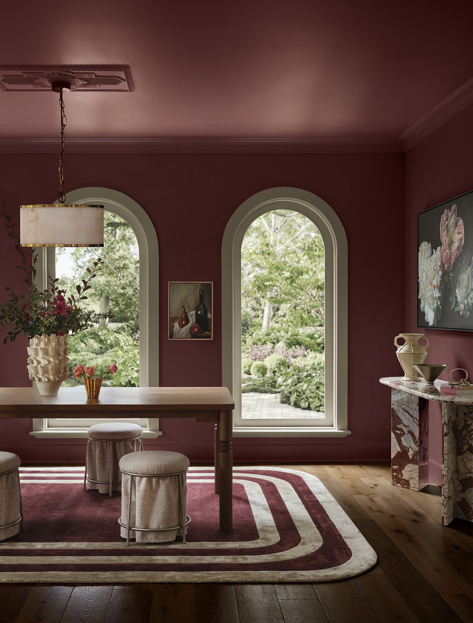
Dulux’s 2027 Treasure palette
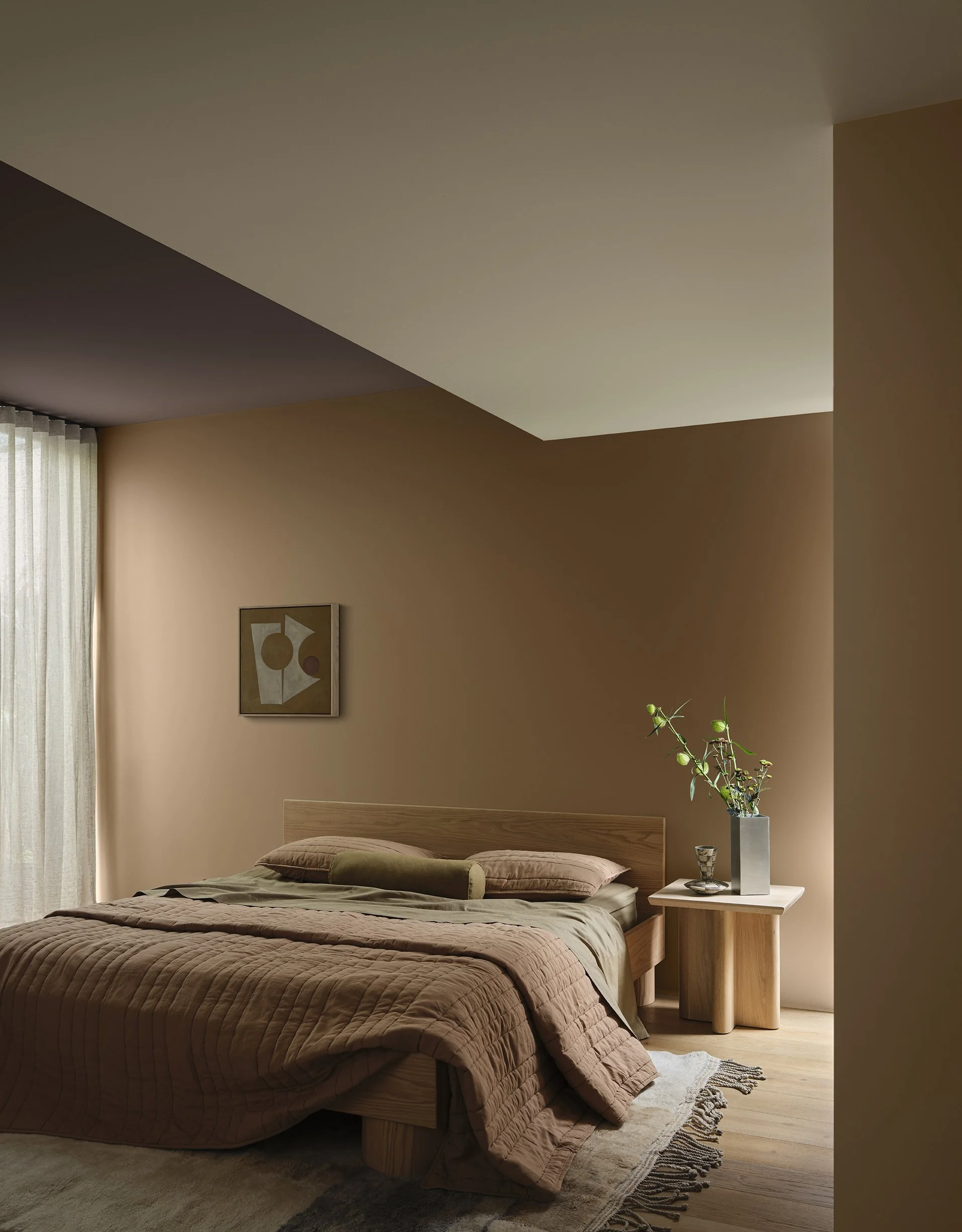
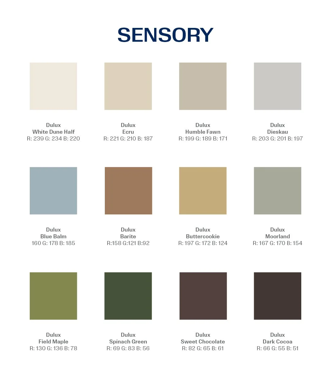
Dulux’s 2027 Sensory palette
It’s an idea close to our hearts. We’ve always believed a home should capture not only how you want it to look, but how you want it to feel.
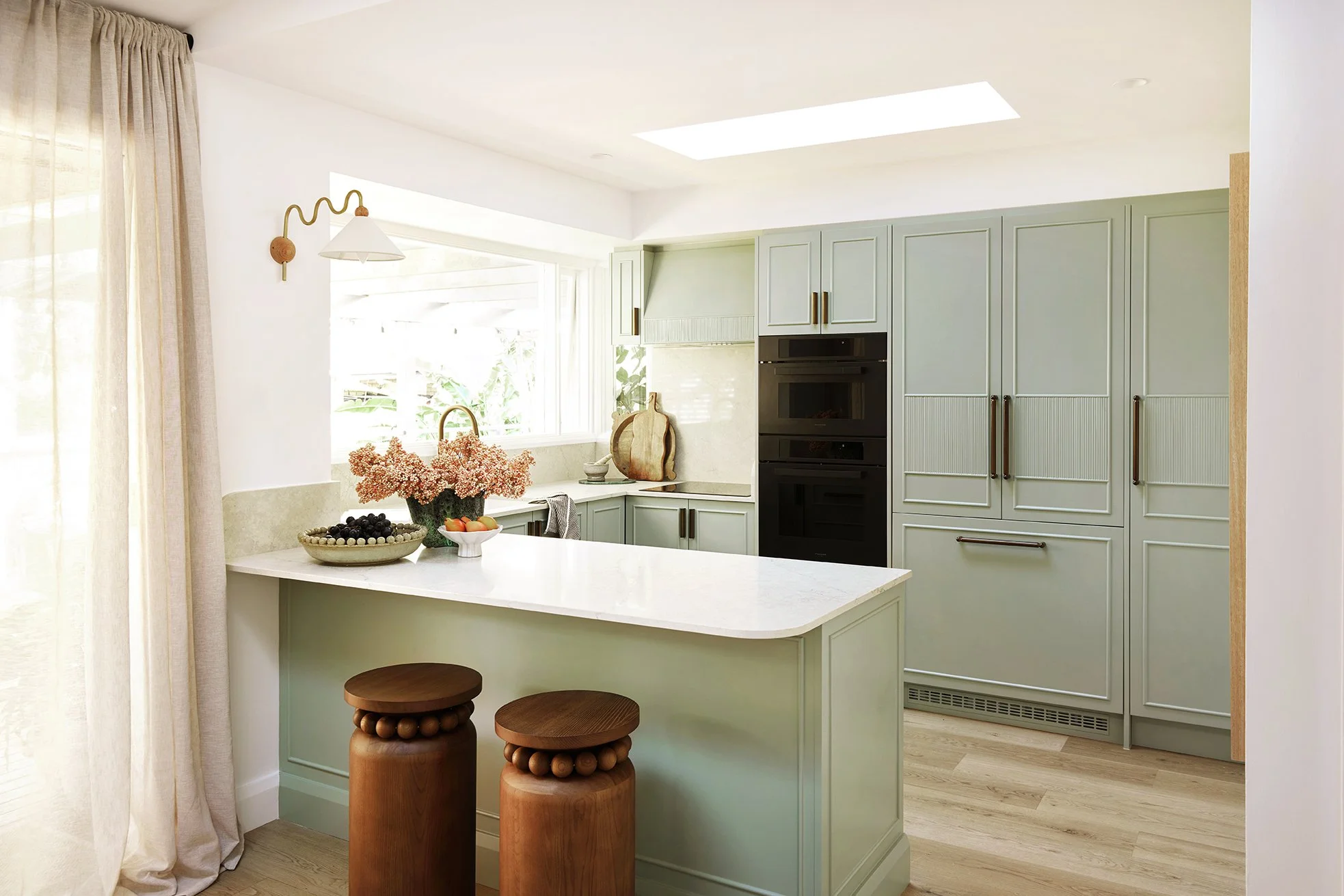
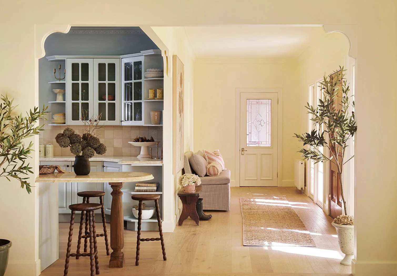
One colour pops up across all three palettes: blue. Dulux sees it emerging as a new neutral, and we get it. We’ve used Dulux Kinder on House 18’s mudroom cabinetry, plus blue on one very special kitchen feature. Nope. Not spilling. You’ll have to wait.
Ultimately, these aren’t colours for homes designed simply to be looked at.
They’re colours for homes designed to be lived in.
Here’s our take…
PLAY
Joyful, optimistic and a little unexpected, Play is a celebration of life; a game on the table, friends dropping in and those imperfect moments that somehow become the best ones.
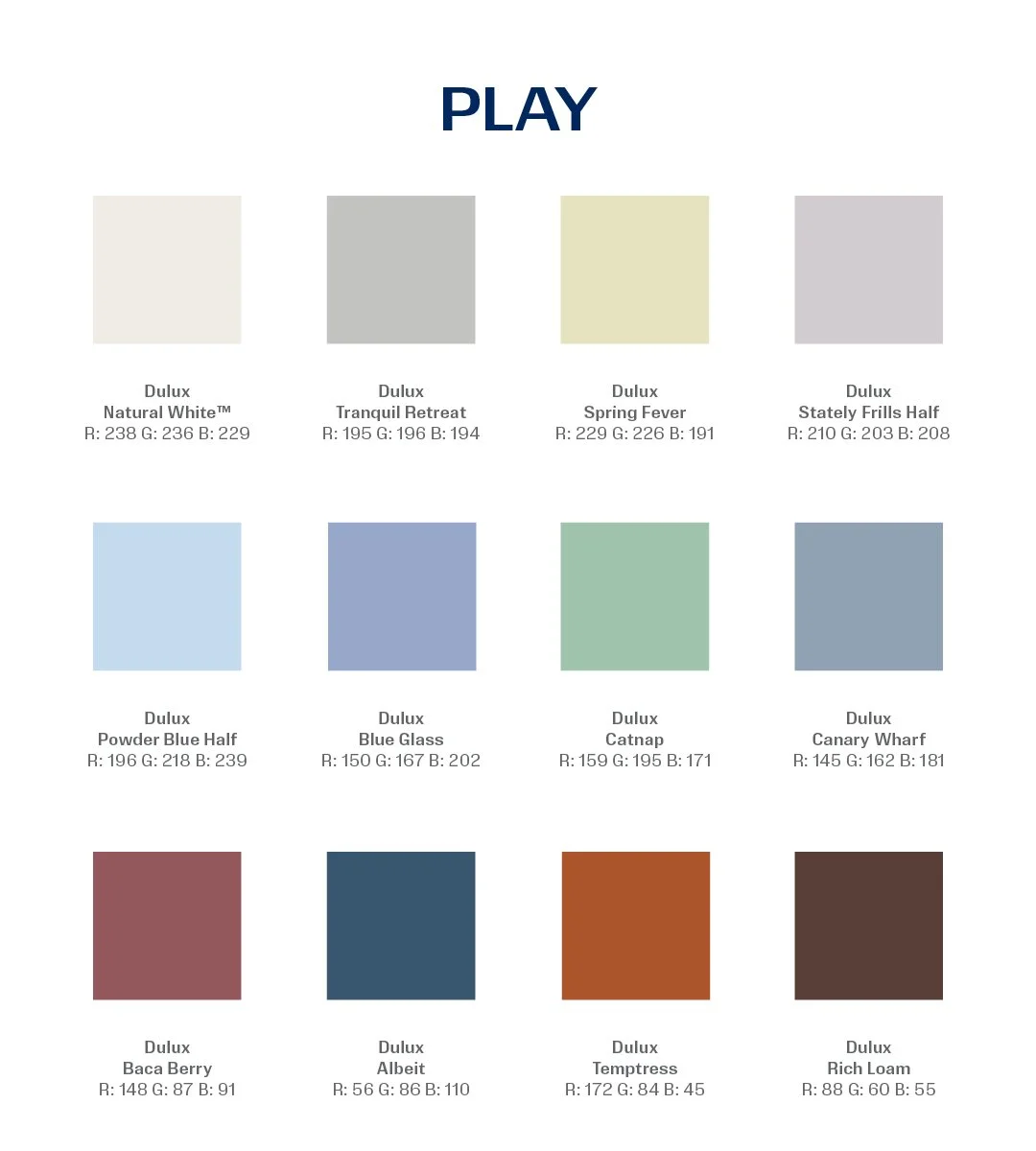
The trick to making Play feel grown-up? Restraint.
You don’t need every colour in one room. A lilac bedroom, powder-blue ceiling or berry-painted piece of joinery can be enough to wake up a quiet scheme.
We can see this palette in a family games room, creative studio or kitchen with one brilliantly unexpected detail. It’s permission to loosen the rules and remember that a beautiful home doesn’t need to take itself too seriously.
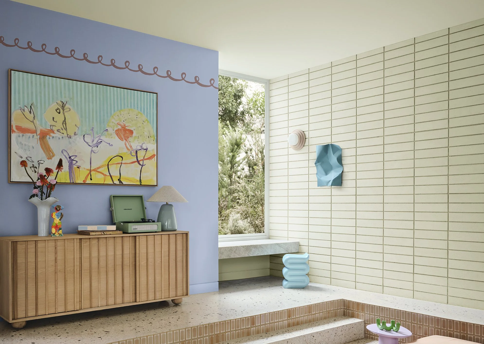
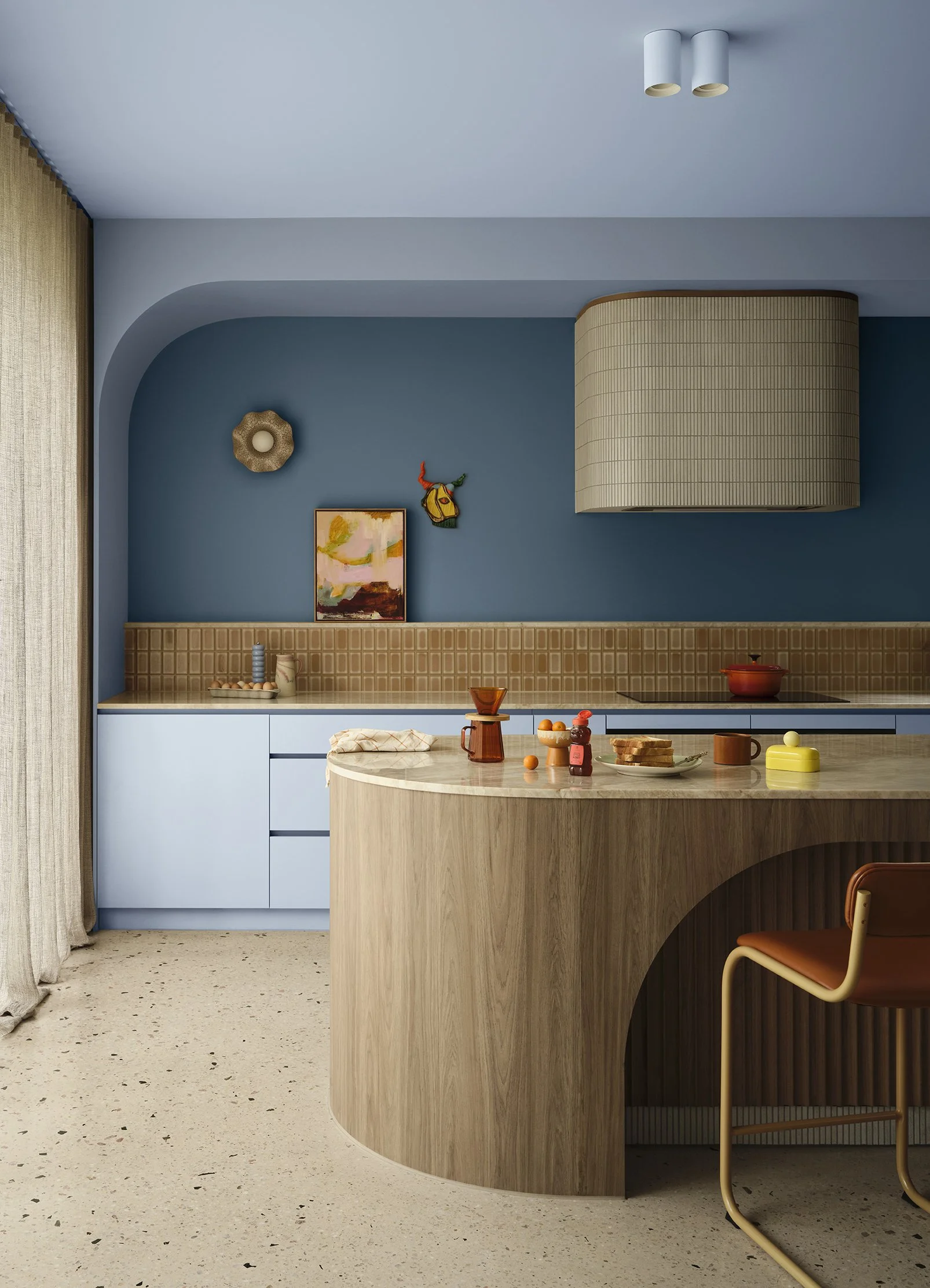
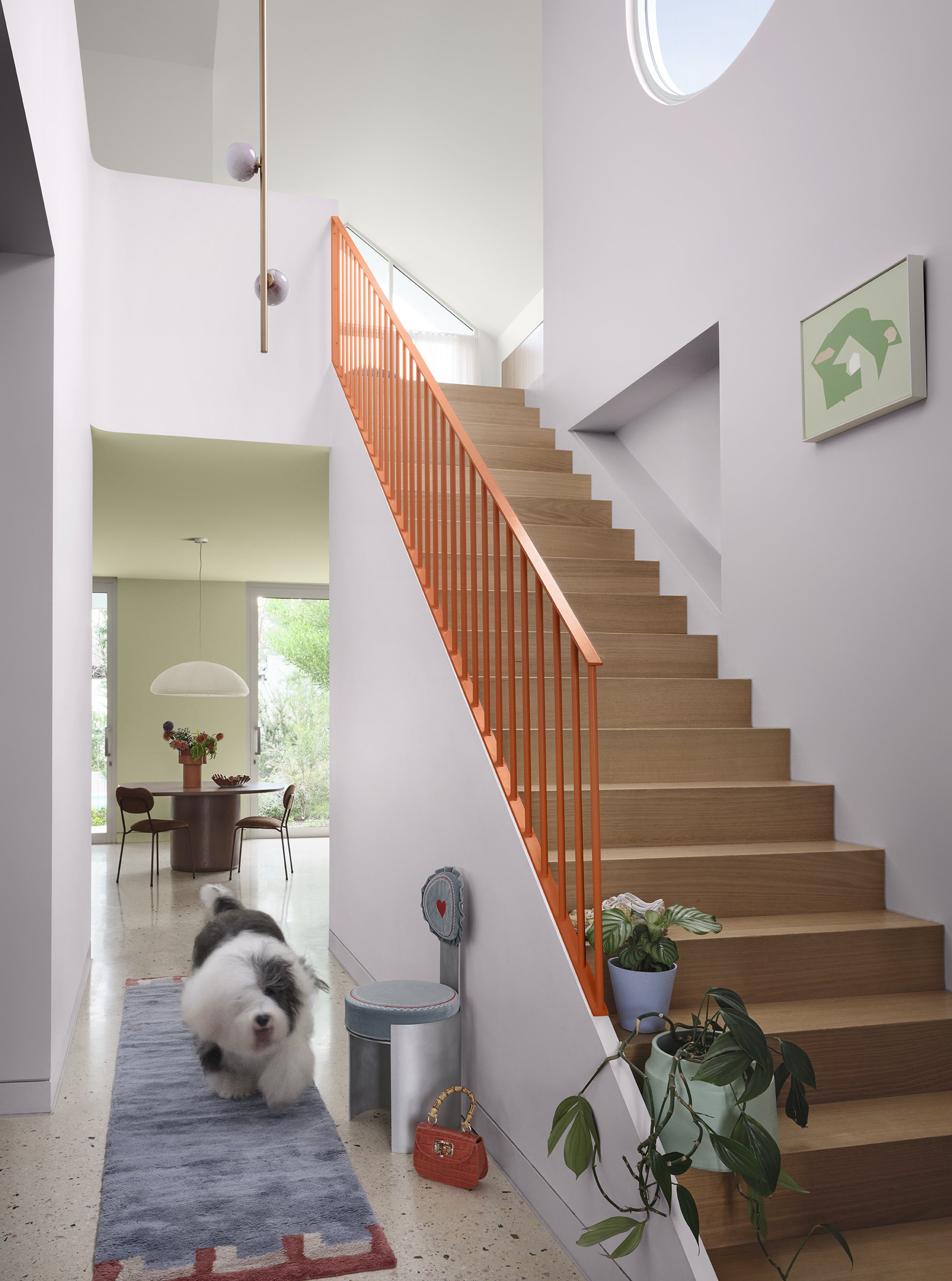
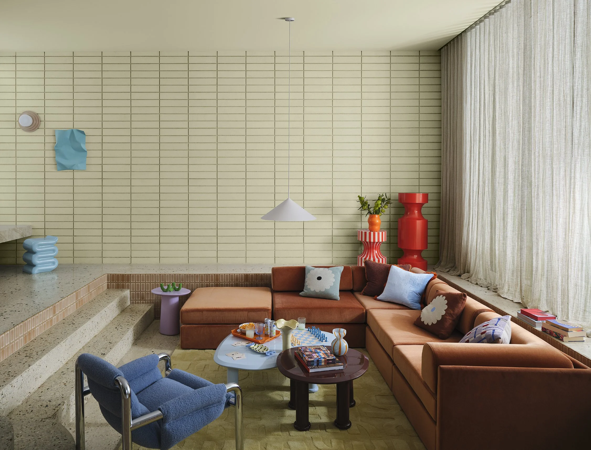
“Packed with soft pastels, Dulux Play is a colourful collection of muted lilacs such as Dulux Stately Frills, calming blues like Dulux Powder Blue Half, spearmint greens including Dulux Catnap, and zesty orange and berry accents like Dulux Temptress and Dulux Baca Berry.
With playful patterns, rubber elements, and imperfect embellishments, Dulux Play creates wonderfully joyful landscapes where spontaneity and diversity reign, echoing our collective journey towards embracing life’s beautiful imperfections.”
TREASURE
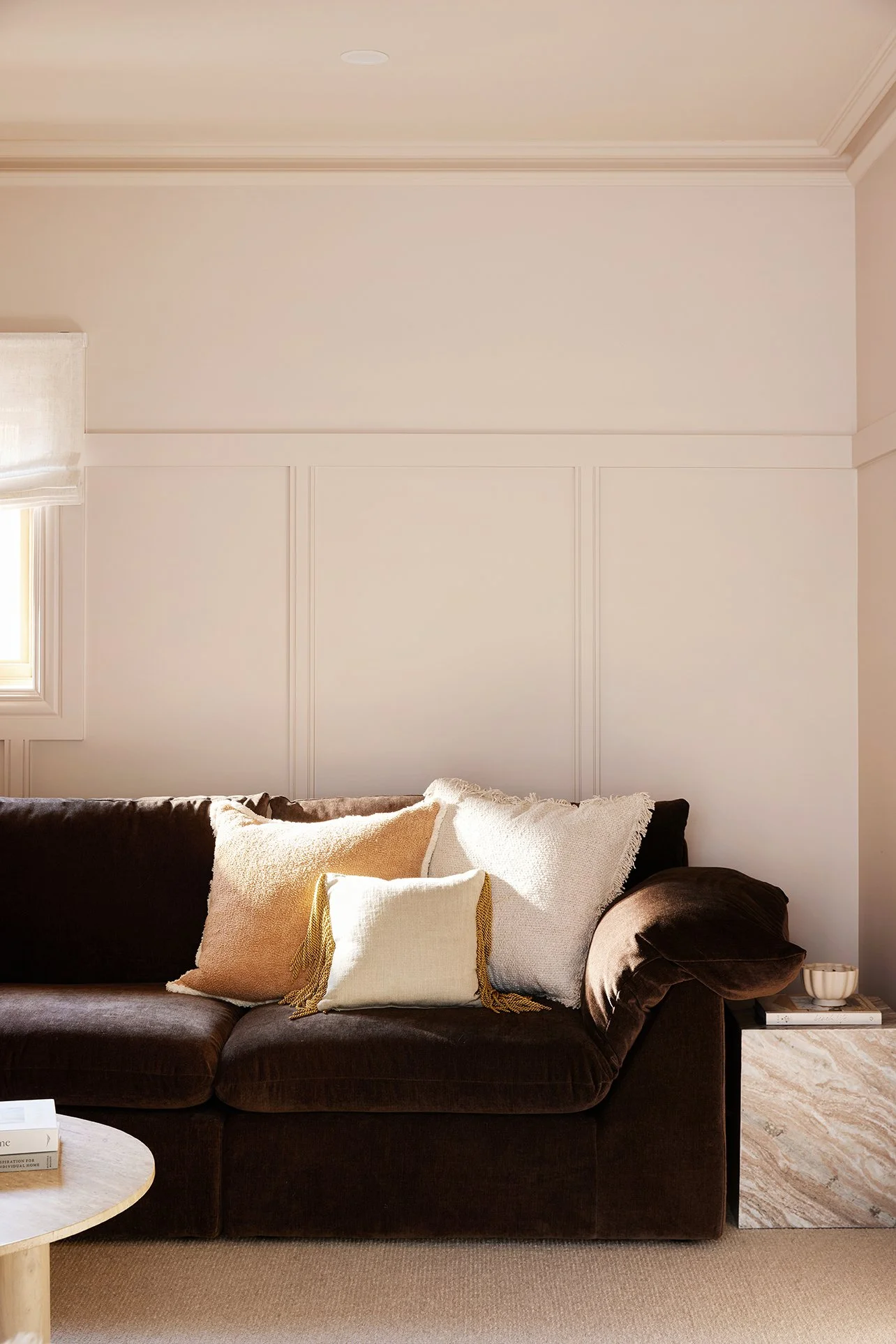
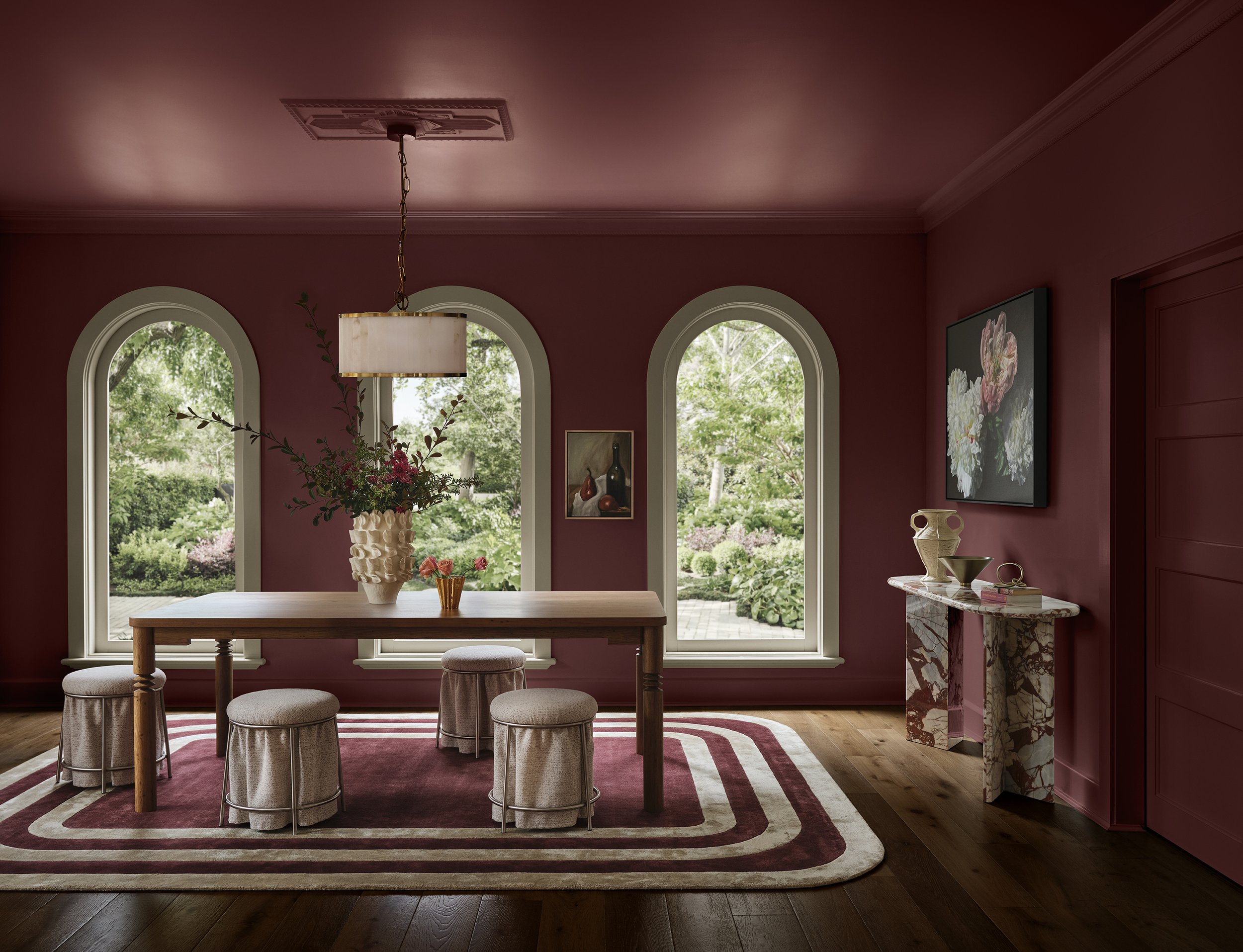
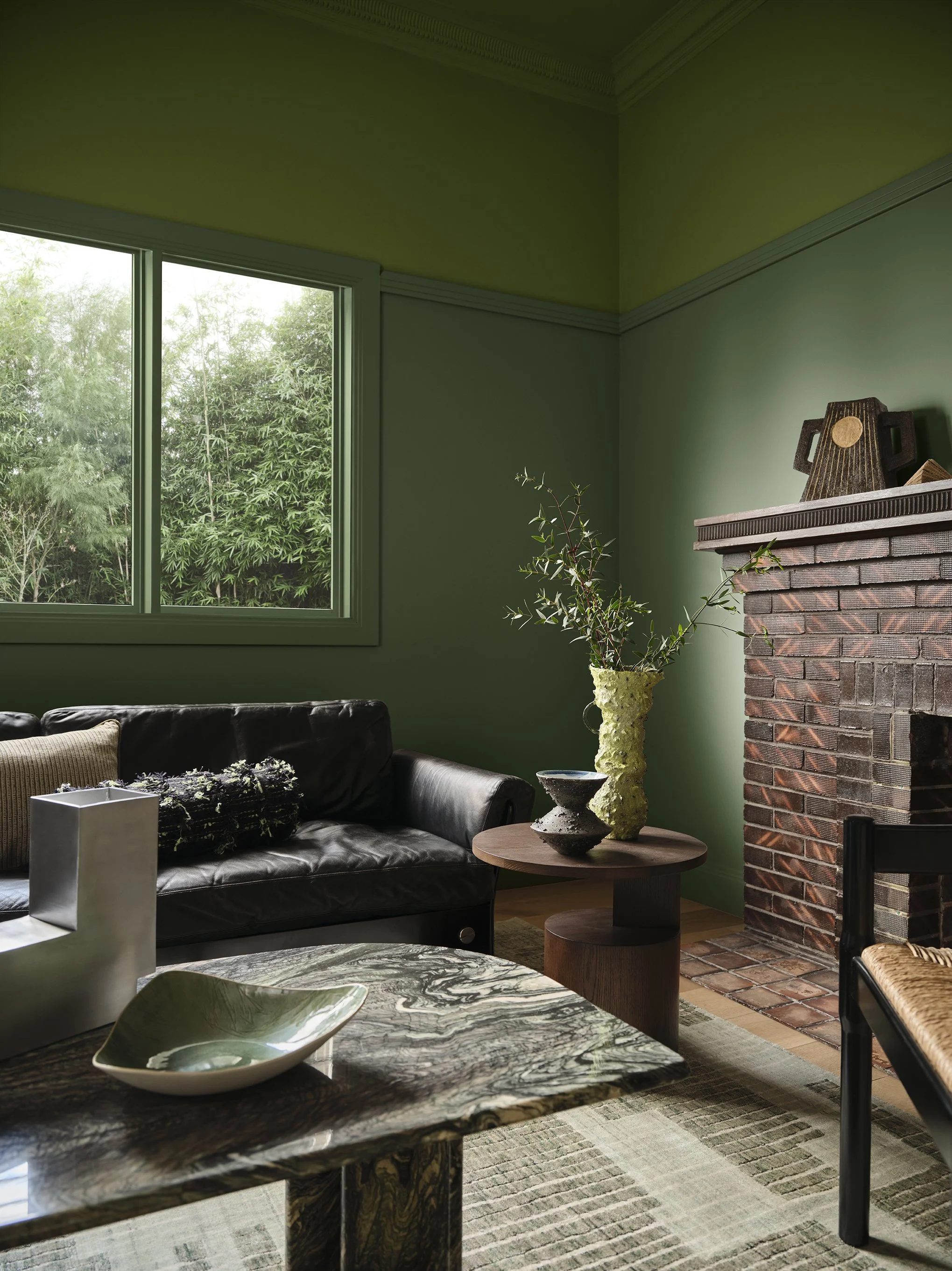
Rich and character-filled, this palette steps away from stark minimalism towards rooms with depth, heritage and personality. These are colours made for layering across walls, trims, cabinetry and furnishings, and for those stop-you-dead-in-your-tracks moments.
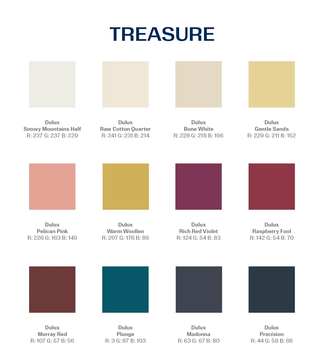
Case in point: Dulux Murray Red is the bold shade we used on the Character Semi’s kitchen cabinetry. Beyond it’s immediate wow factor, this colour brought warmth and depth while still feeling right at home with this heritage-listed property’s architecture.
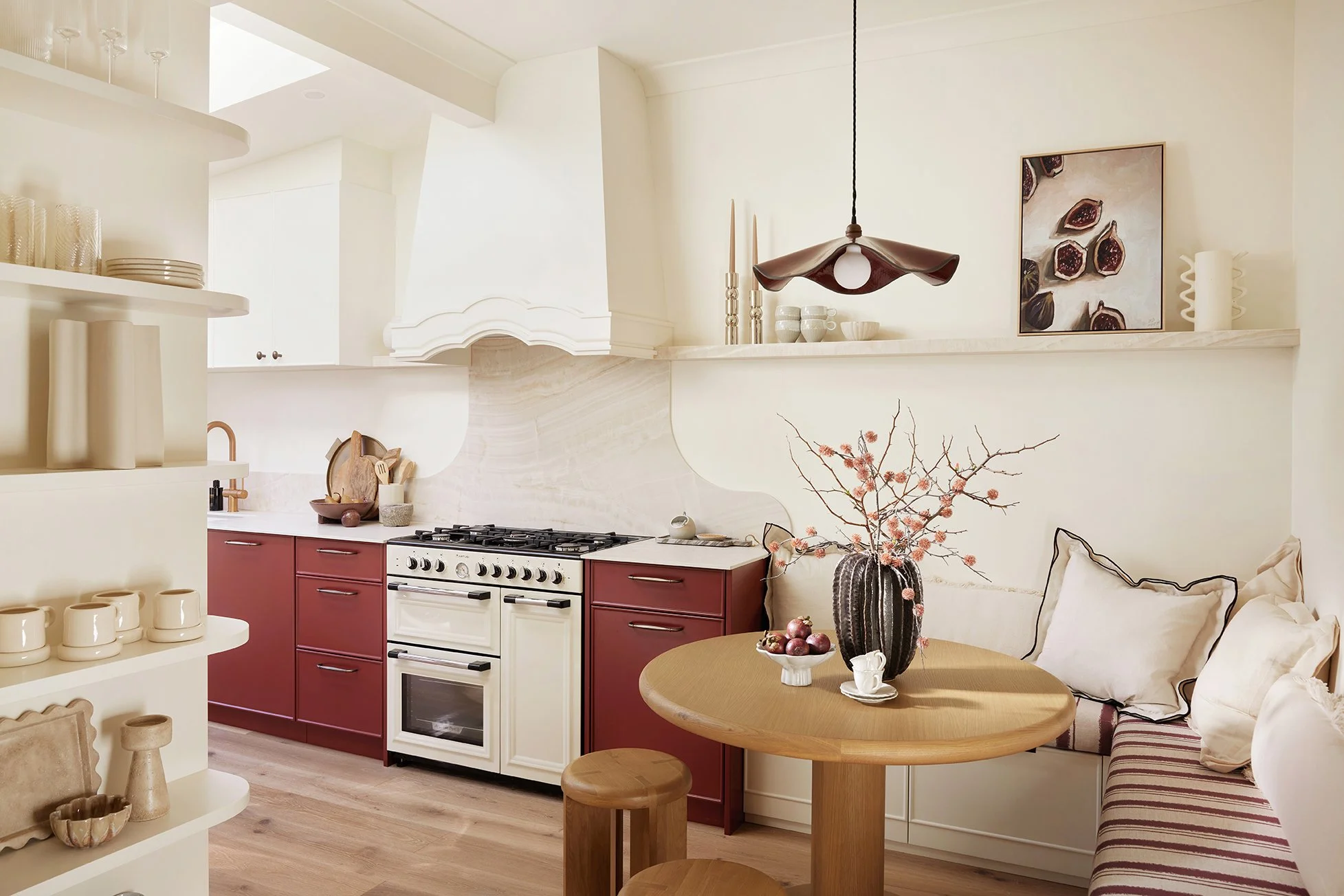
Dulux Murray Red at Three Birds’ Character Semi
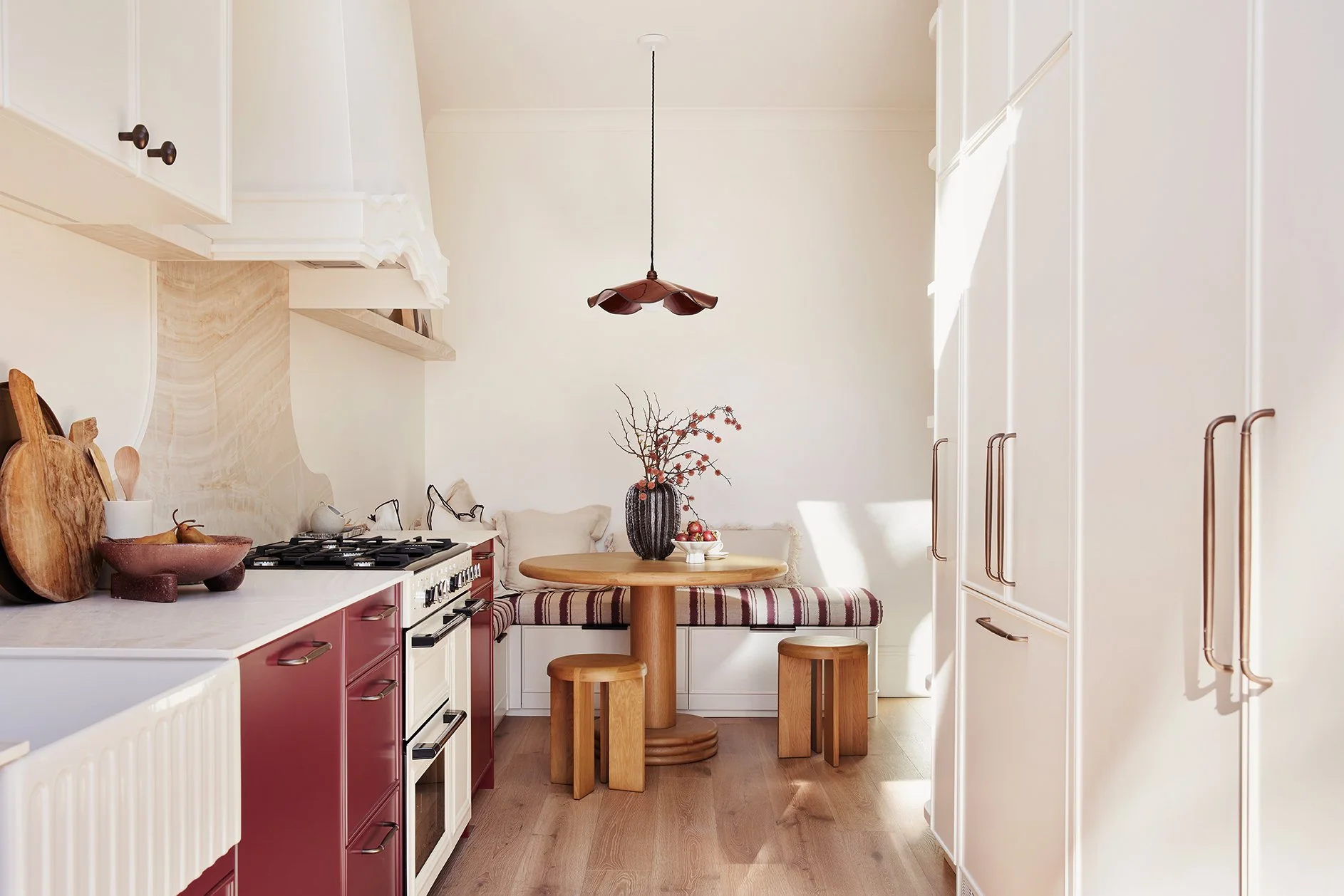
Dulux Murray Red at Three Birds’ Character Semi
There are other old friends here too. Dulux Snowy Mountains Half appears in Treasure, while we used Snowy Mountains Quarter on House 8’s exterior. Dulux Raw Cotton Quarter also features, a close relation to Raw Cotton, which we used on the ping-pong table at Rolling Seas.
Different strengths. Different applications. Same enduring colour families. Proof that fresh doesn’t have to mean fleeting.
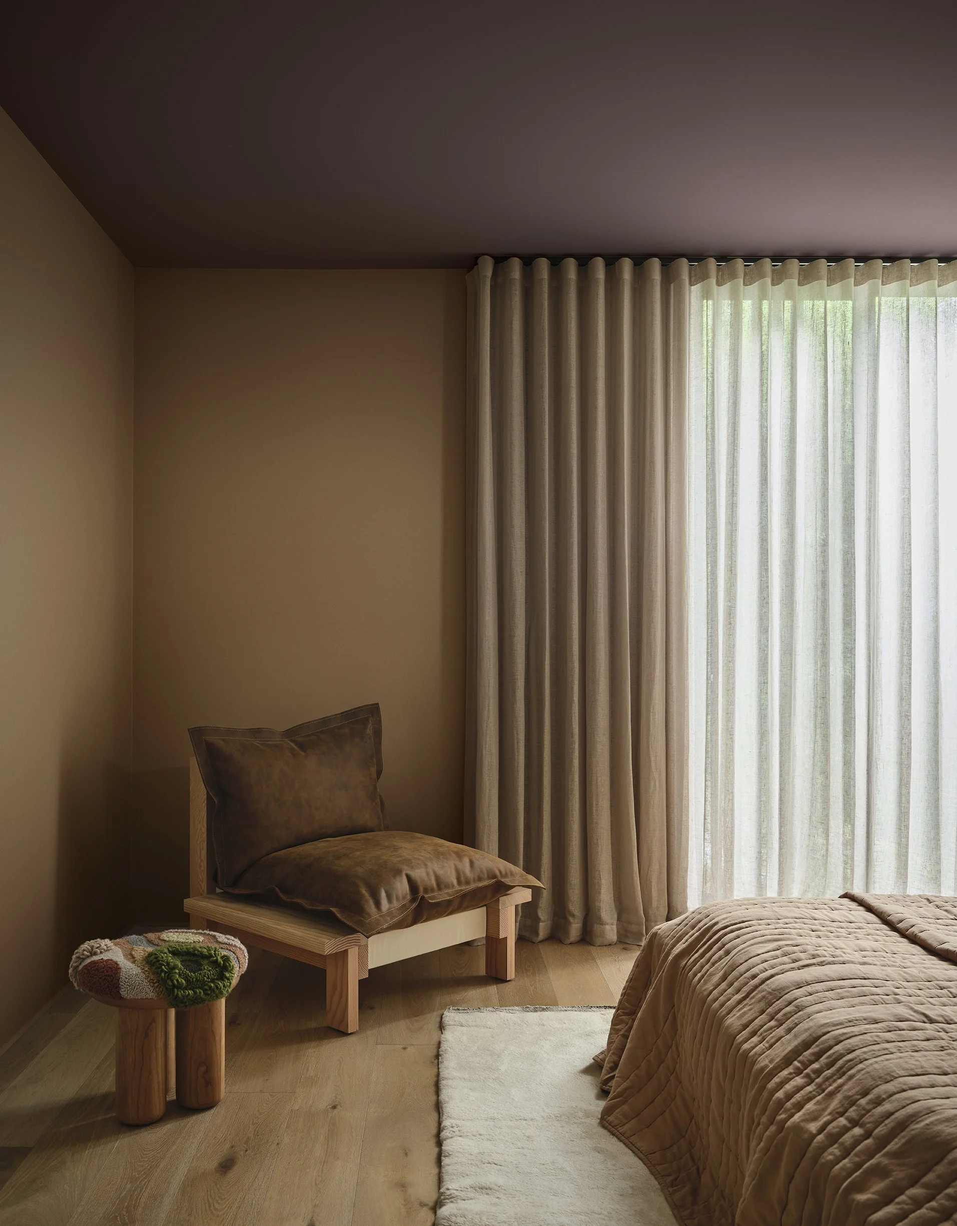
Treasure is made for spaces that invite you to linger. Think cocooning bedrooms, intimate dining rooms and architectural details like doors, fireplaces and joinery that deserve their moment.
SENSORY
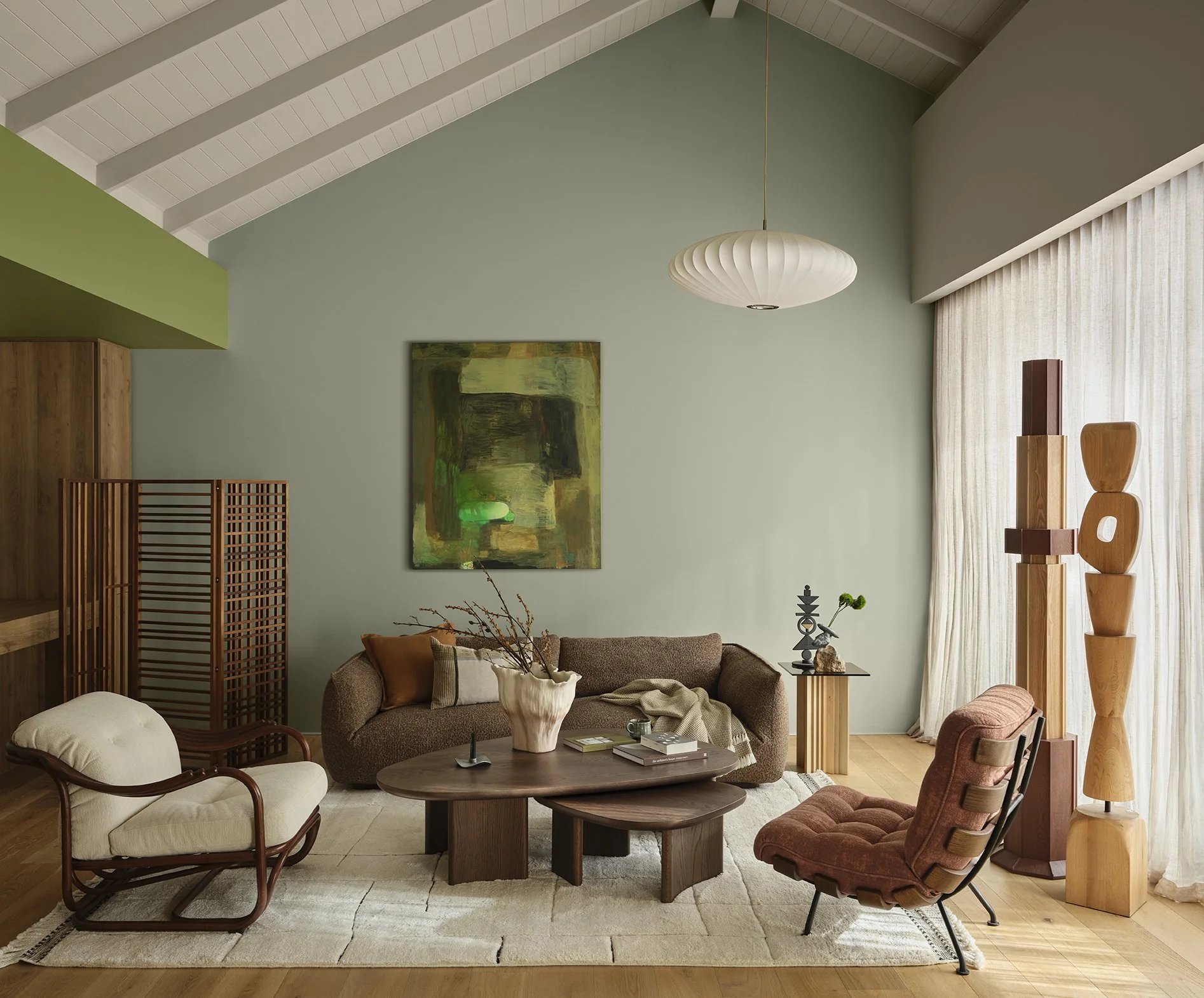
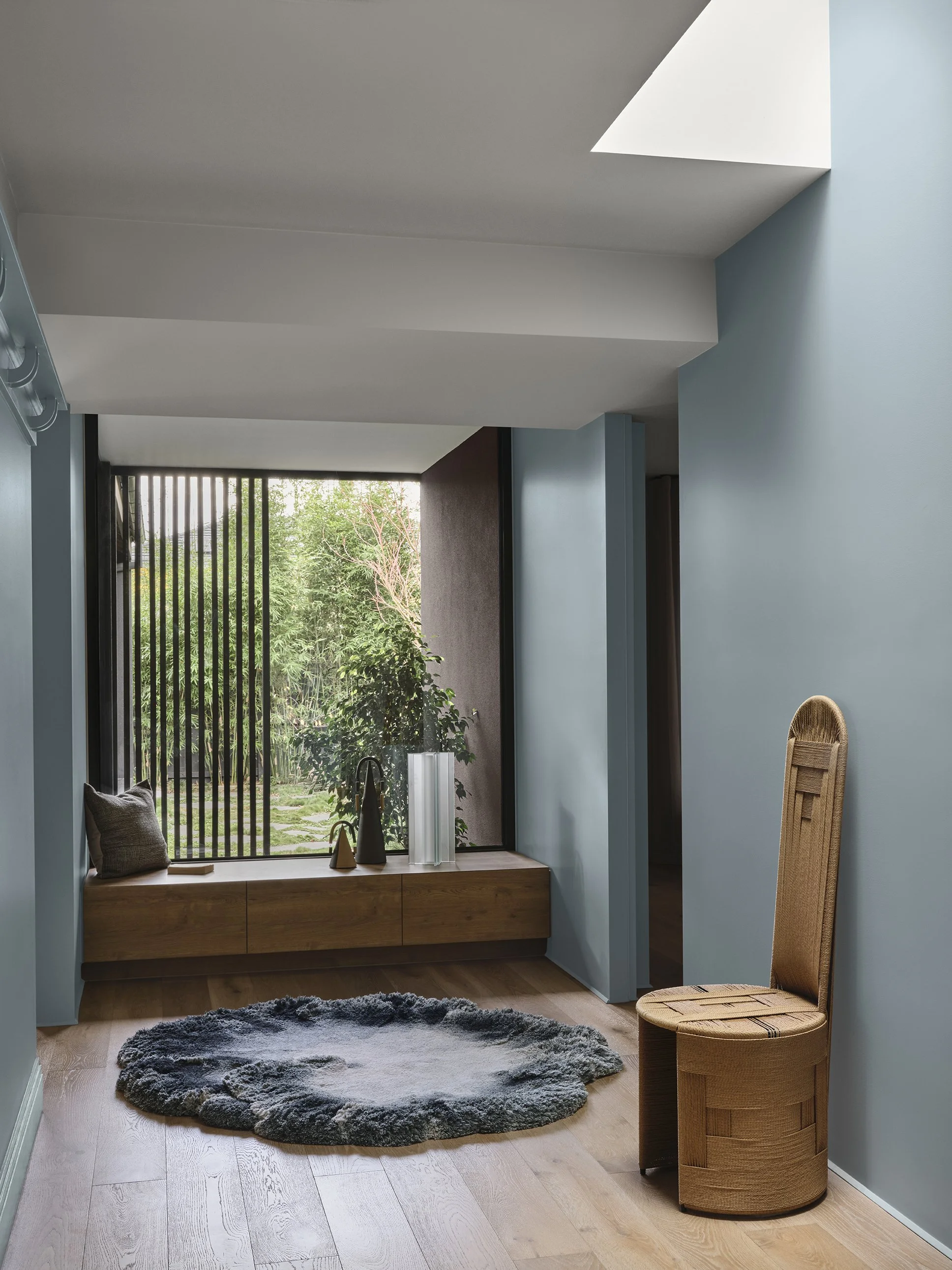
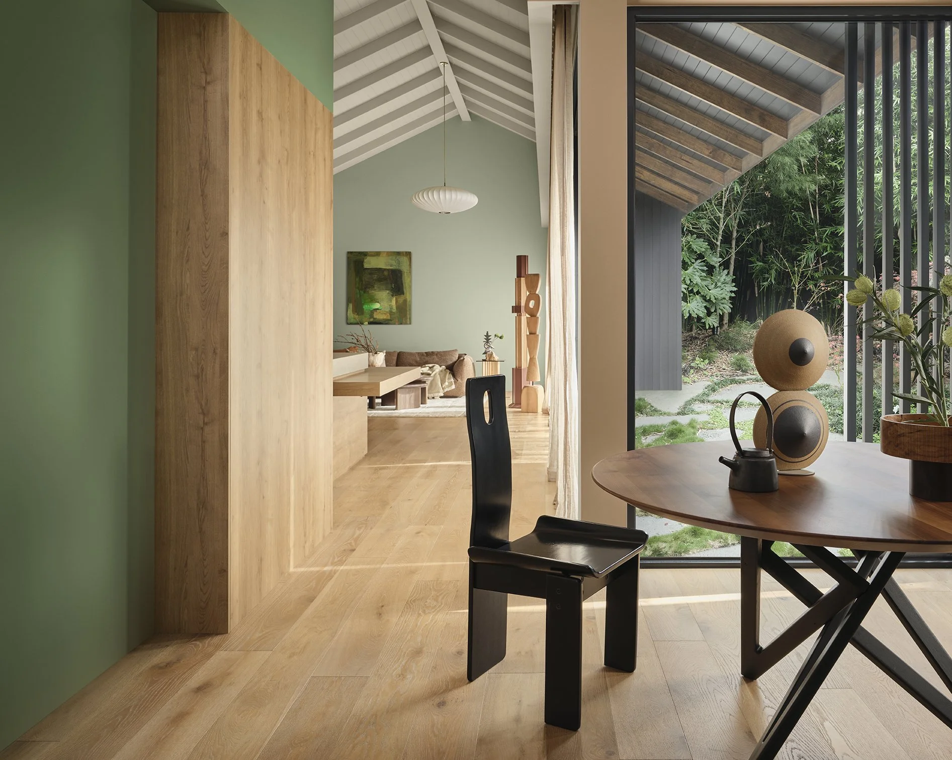
Quietly restorative, Sensory is about slowing down and noticing the beauty in everyday things. Inspired by Japanese influences, natural materials and craftsmanship, it feels calm without feeling cold.
Rather than shouting for attention, Sensory builds atmosphere through diffused light, tactile finishes, timber, linen and objects chosen with purpose.
There are a few familiar faces in this palette. Dulux Ecru, which we’ve used in House 18, sits beautifully alongside its terracotta and cool sage tones. Dulux Moorland appeared in House 17, while Dulux White Dune Half joins the palette after we used White Dune at House 12 and White Dune Quarter throughout House 15.

Dulux Moorland at Three Birds House 17

Dulux White Dune at Three Birds House 12

Dulux White Dune Quarter at Three Birds House 15
There’s something rather lovely about seeing colours we already know and love reflected in the forecast.
Trends don’t make a good colour choice. But when instinct and the wider design world land in the same place? Quite satisfying.
“Dulux Sensory embodies the calming qualities of considered design.
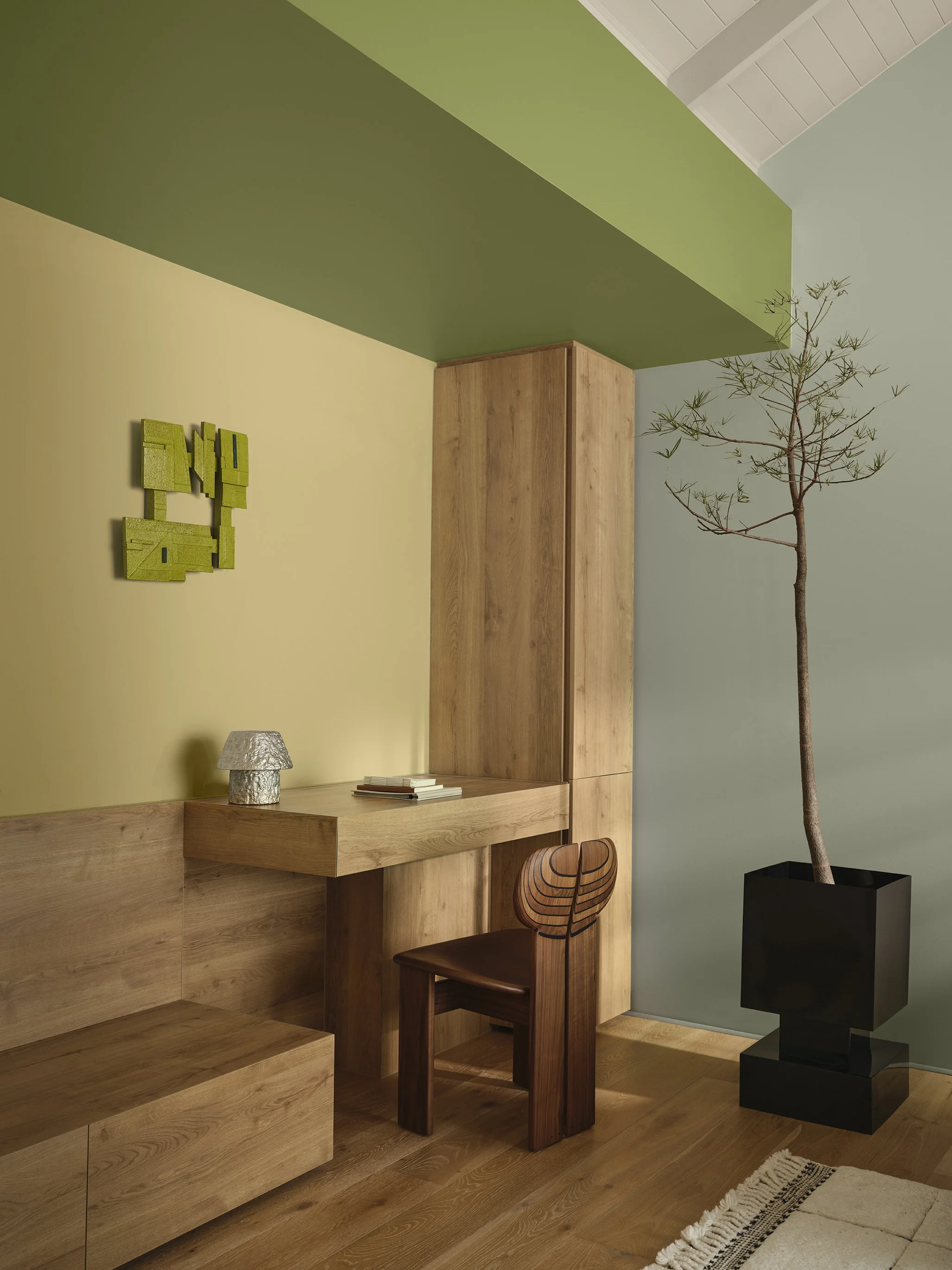
It encompasses natural tones with layered greens such as Dulux Field Maple and Dulux Moorland, warm neutrals like Dulux Buttercookie and Dulux Humble Fawn, and near-black browns including Dulux Dark Cocoa and Dulux Sweet Chocolate, adding depth and serenity to a space.
Softened through tactile textures, organic curves, aged brass accents, and weathered surfaces, Dulux Sensory creates spaces that are rich in craftsmanship, inviting moments of connection through considered detail.”
KEEN TO TRY DULUX’S 2027 TREND COLOURS IN YOUR HOME?
Using colour doesn’t mean painting every surface a different shade. Start with one clear idea and build from there.
If you’re nervous, start small. Our 60:30:10 rule is a brilliant confidence-booster: one dominant colour, one supporting shade and a little pop to bring it to life. Don’t get hung up on the maths; it’s a guide, not a Year 8 exam 😉.
And always test before you commit. Light and surrounding materials can completely change how a colour looks.
Most importantly, choose colours for how you want your home to feel. That’s what we love about Dulux’s 2027 forecast. Play, Treasure and Sensory are all about creating homes that feel personal and full of life.
2027 is looking very colourful indeed.
Want to know more? Read the full Dulux Colour Forecast 2027 here.
Images: Photographer Lisa Cohen, Stylist Bree Banfield
More Like This