
SPOTLIGHT ON COLOUR: KEEN ON GREEN
First published August 2020. Updated February 2021.


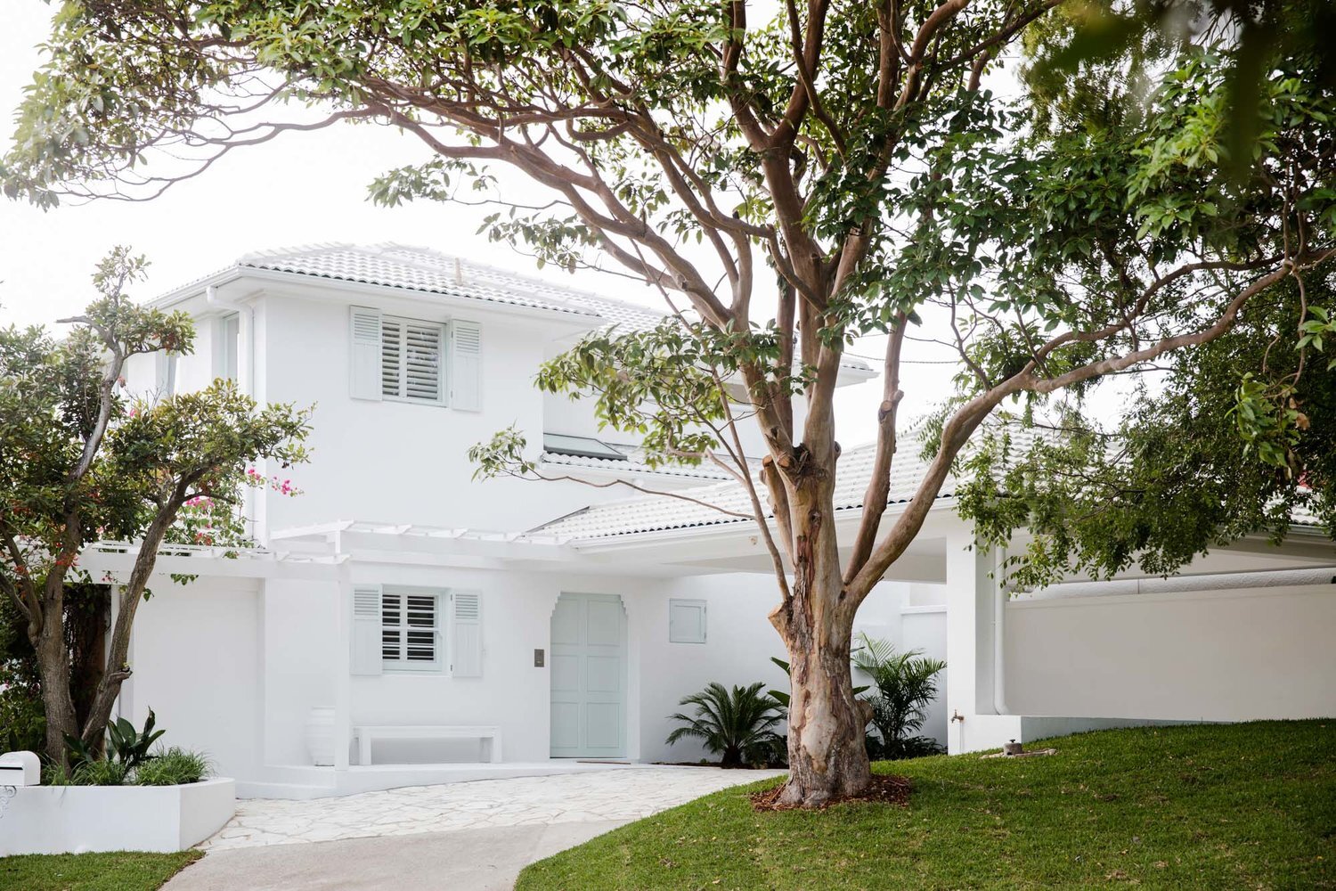
It’s well known that we love white homes but there’s definitely a time and a place for some bold colour choices. When choosing the exterior paint colour for our latest project, House 12, we realised that green is often a colour we gravitate to when we’re straying from white. Apart from just loving how it looks, we like that it’s a subtle nod to nature and is used to represent harmony and safety – and who doesn’t want those assets in their home.
Take a look at how we used gorgeous greens in our houses…
MAKE A STATEMENT
When we’ve wanted to make a statement or create a feature in our projects, it’s often green we’ve turned to. We’ve used it in bedrooms, kitchens, living and bathrooms to bring a beautiful, fresh feel into the rooms.
The key is to combine your bold feature colour with crisp whites, black and neutrals to let the colour be the hero.


SOFTLY DOES IT
If you’re afraid to make a bold statement or prefer a softer colour palette in your home, muted earthy greens are a beautiful way to inject some colour without the risk of tiring from a feature colour. The minty green kitchen we did in House 5 is still one of our faves.
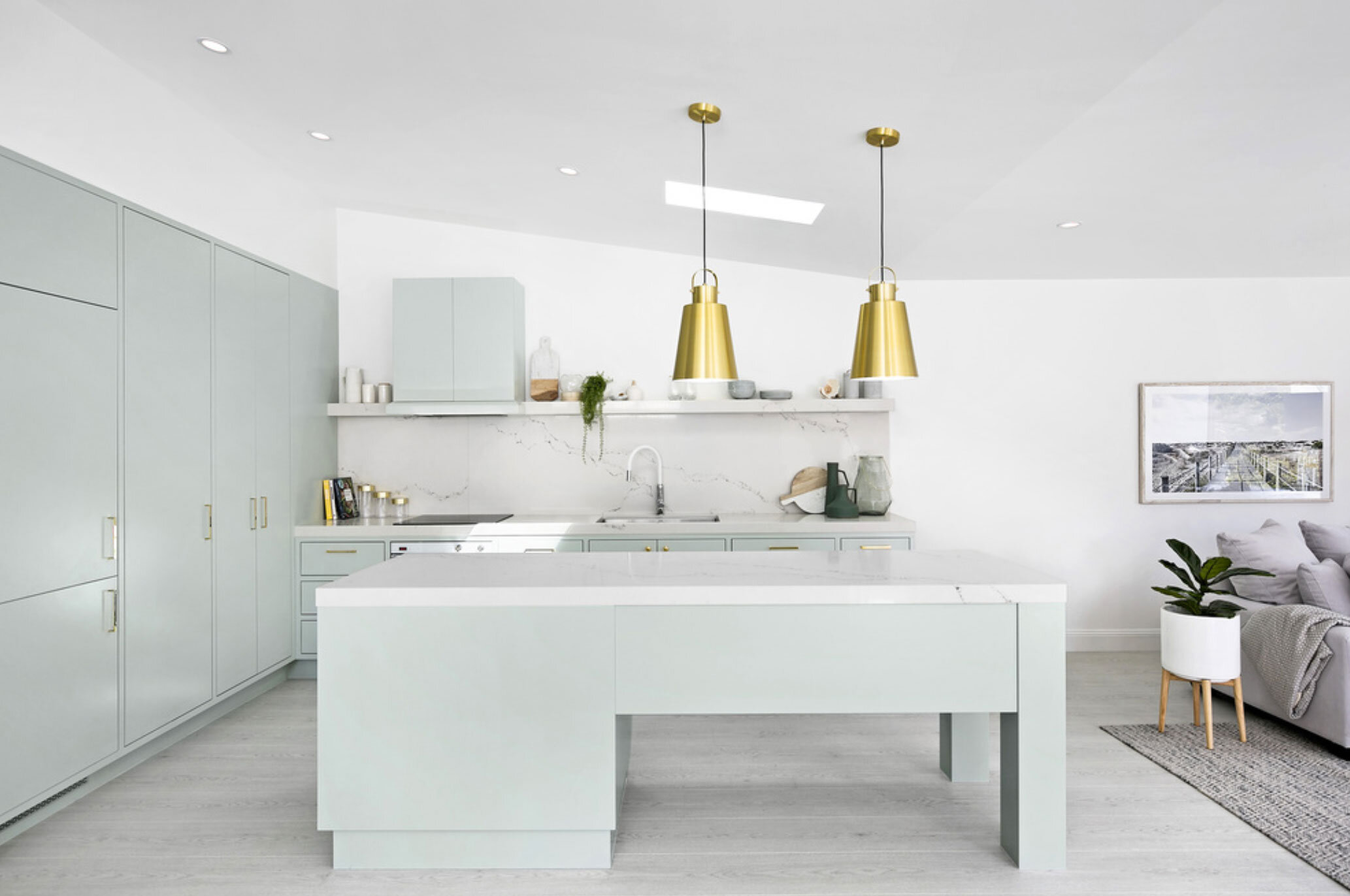

Dulux ‘Mossa’ #bathroommakeover
50 SHADES OF GREEN
One of the things we love most about the colour green is that it’s so versatile. It looks gorgeous no matter what the shade, inside or out, walls or ceiling, paint or tiles.
Do you have a favourite shade of green? Tell us below!

Dulux ‘Pozieres’ #house12


