
GET IT WHILE IT'S HOT: DULUX COLOUR FORECAST 2023
Our friends at Dulux have just released their Colour Forecast for 2023 and we’re super excited to share it with you.
The Dulux Colour Forecast is an annual release based on both local and global trends that are predicted to influence Australian design in the coming year. The team at Dulux look to fashion, furniture and product design, trend reports and Dulux’s extensive networks in the UK, Italy and France and compile their findings into three dreamy colour palettes for us to devour.
“Colour forecasting for interiors is an evolution. While fashion is an important influencer, the shifts in interiors are more subtle and nuanced. The palettes we can expect to see in our homes in 2023 are predominantly warm and nurturing, with nature continuing to be a key driver of trends. Brighter hues continue, however, they are deeper than last year.”
The 2023 Forecast reflects the chaos of the past few years, our desire to bond with the environment and the people we love and provides some needed uplifting inspiration for the years ahead. OH.MY.GREATNESS… wait till you see the final colour palette!
Here’s your first look at what’s trending for 2023…
CONNECT
In a post-pandemic world we’re all craving a little more connection. The Connect palette is made up of dusky greens, muted yellows and burnt charcoal as a nod to the great outdoors. Imagine it in a cosy living room, with a roaring fire and a family toasting marshmallows. Or in the dining room of a country weekender with a group of friends raising glasses of red to good times ahead.
Bonnie’s loving using warmer whites at the moment, like Dulux Whisper White, which features in this palette and sits beautifully alongside these warm, earthy tones.
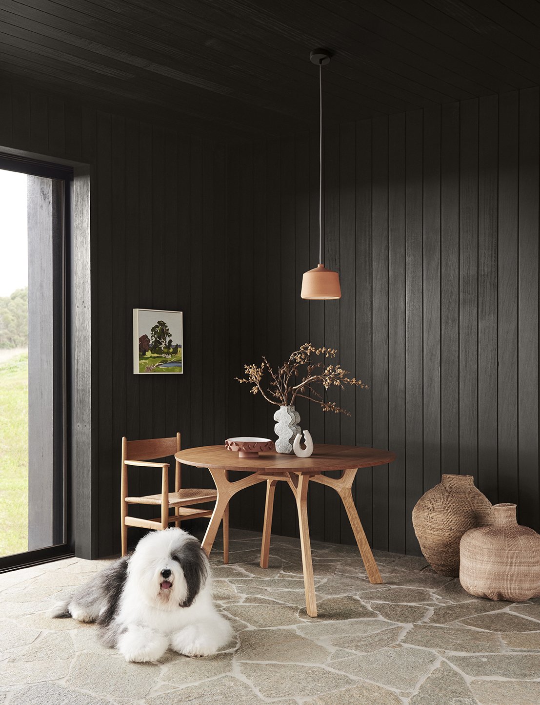
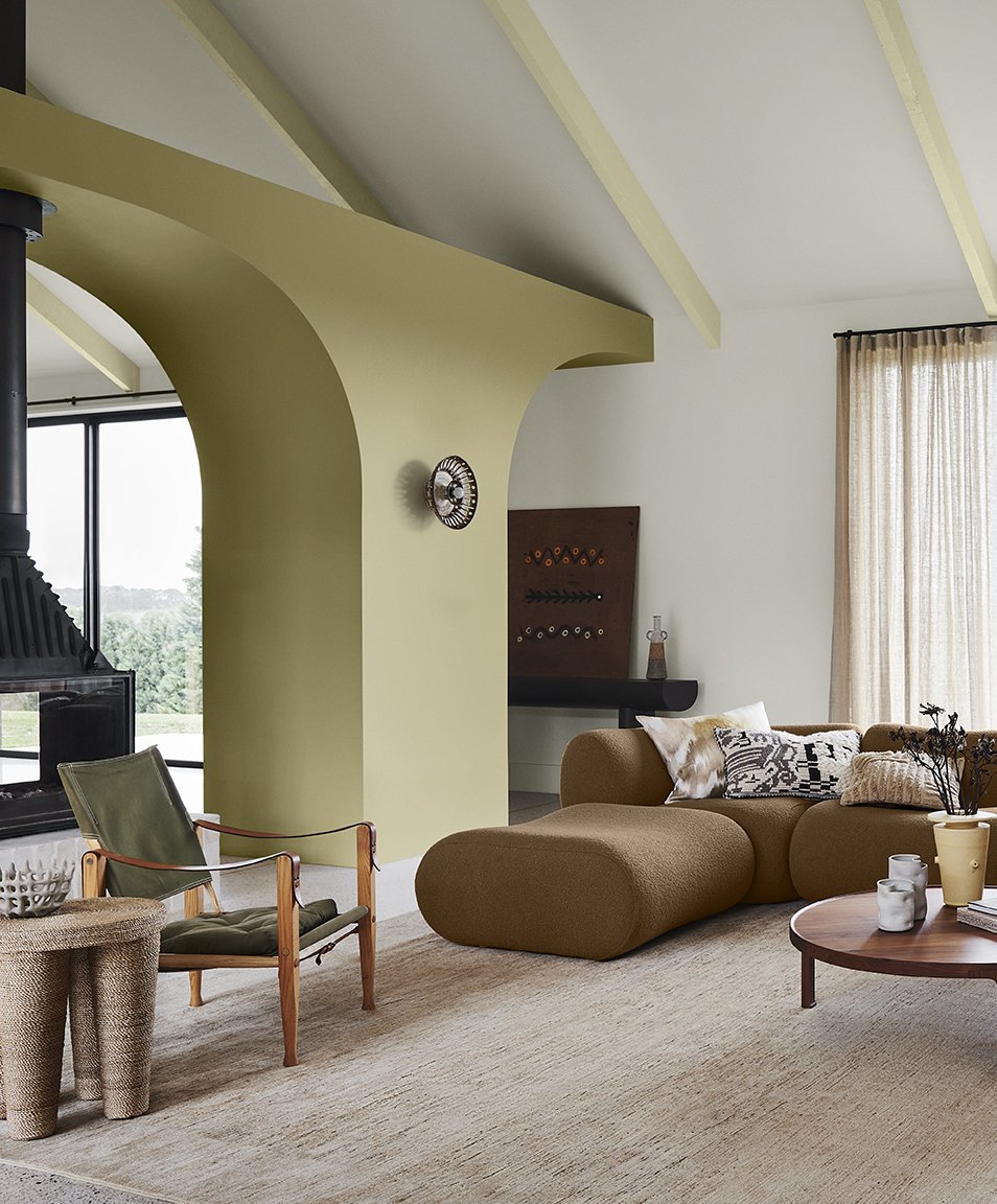
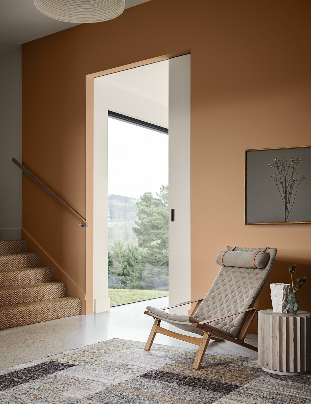
“It speaks of calm, comfort and an honest approach to living, and brings in many of the pastimes we experienced during lockdown, such as hiking, cooking, quilting and gardening. Muddied yellow-green has something of a nostalgic, country-house feel, cinnamon is grounding, whilst rich, purple-brown adds an indulgent and contemporary twist.”

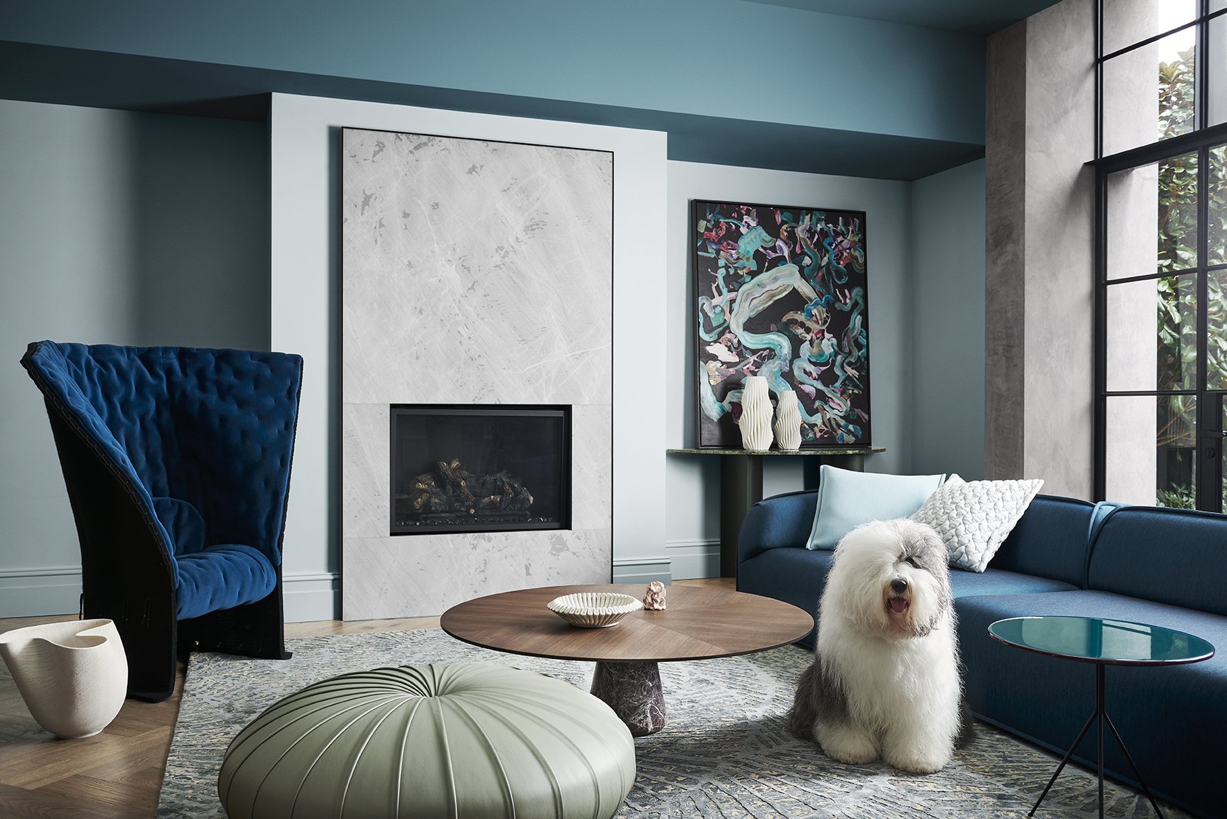
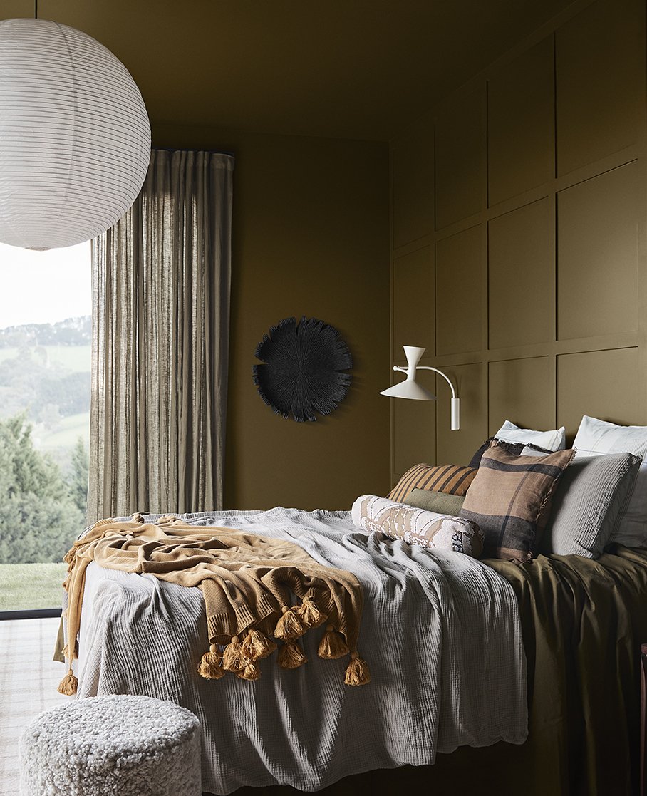
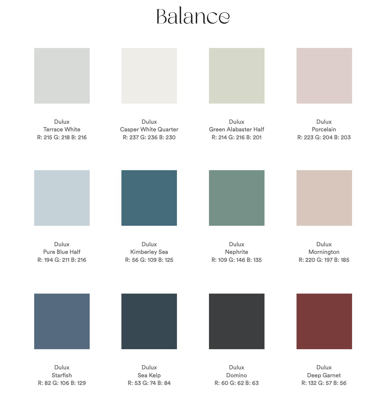
BALANCE
Balance is elegant and understated, inspired by the beauty of the ocean and the shoreline. While the colours are rich, it’s not about indulgence, risk or change. This palette would look amazing in a sophisticated inner city apartment or a terrace home.
Featuring some of our faves, Casper White Quarter and Domino, to offset the marine blues, gentle greens and deep garnet, what’s not to love about Balance?
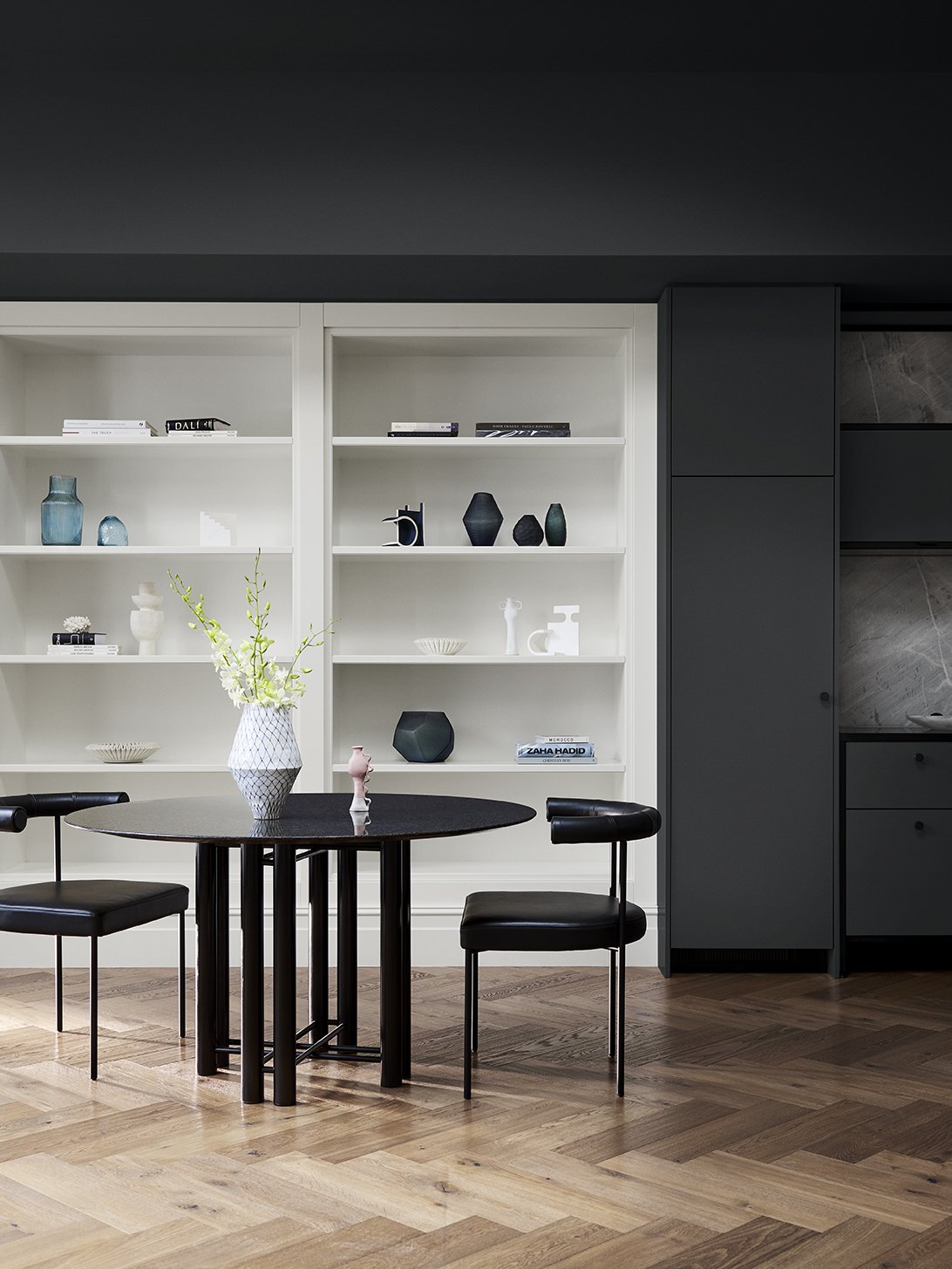
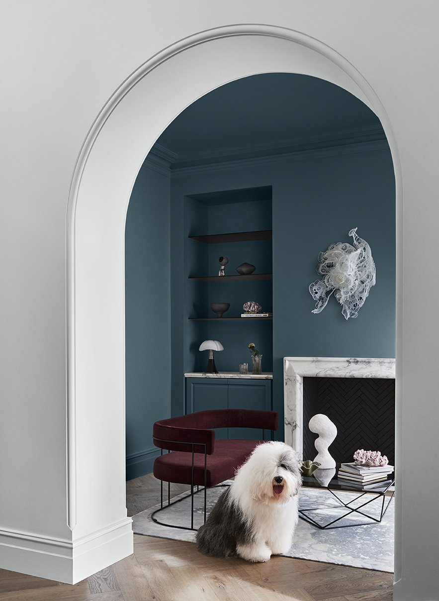
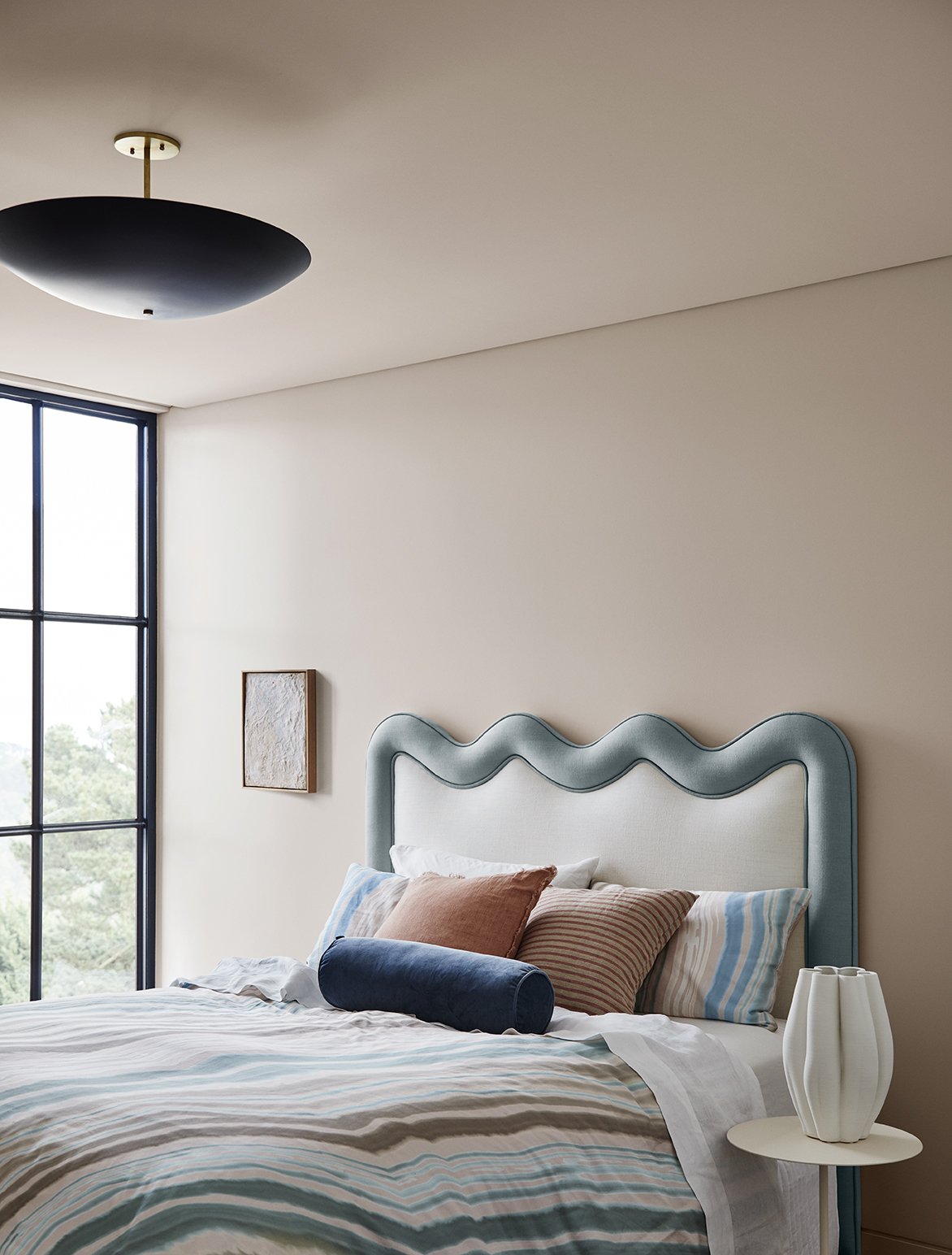
“Balance is very much inspired by a ‘less is more’ philosophy, with minimal detailing and a restrained approach to decorating. Instead, the focus is on immersive colour and the beauty of complex, structured patterns found in nature, such as a simple seashell or fern frond.
Luxe textures, such as velvet and silk, furniture with exaggerated, curved silhouettes, abstract art, and décor pieces with organic shapes and delicate pleating complete the look.”
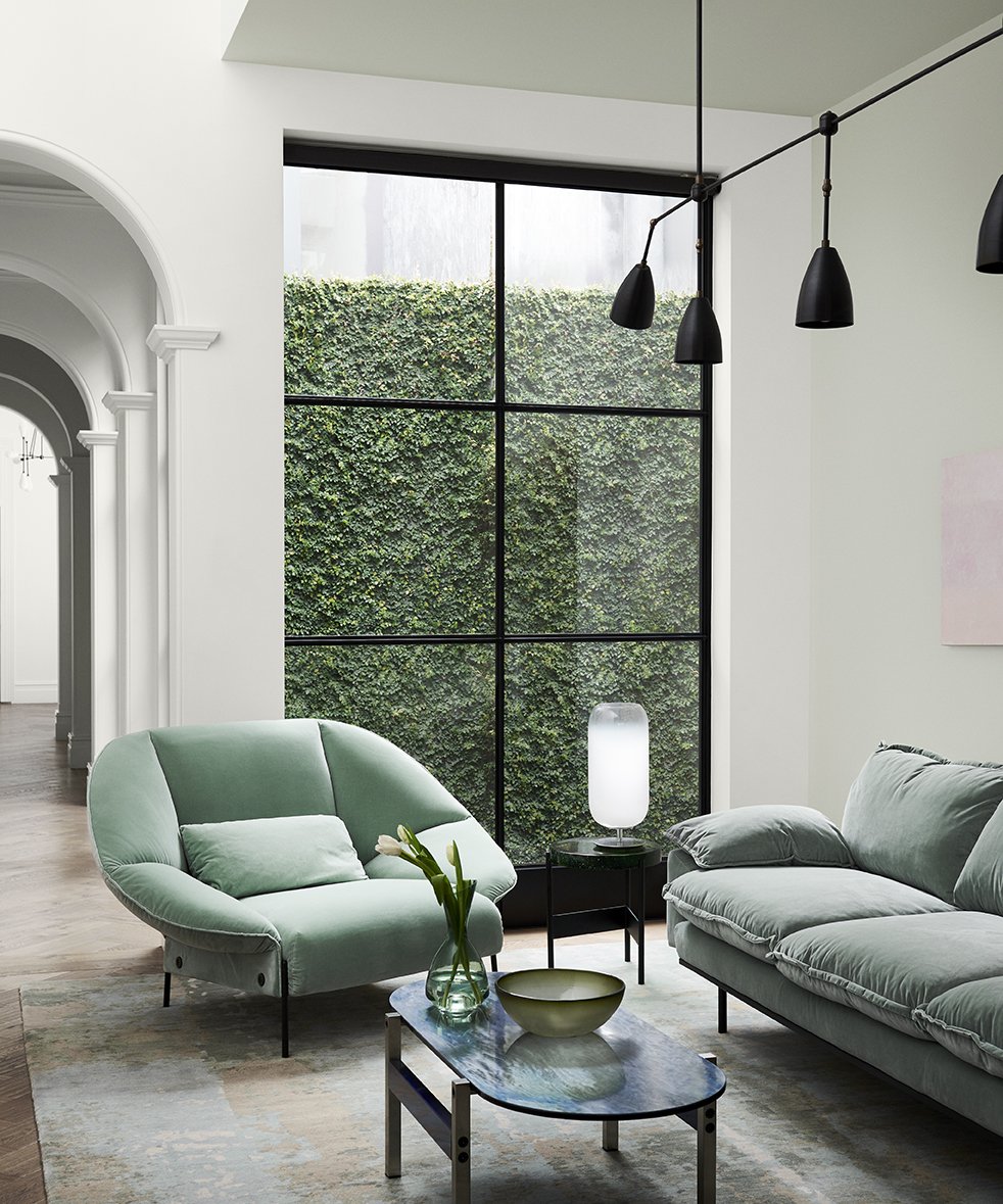
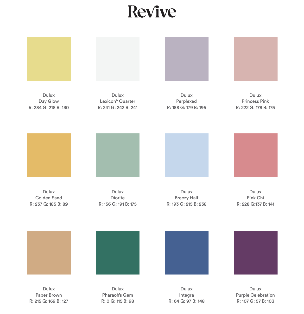
REVIVE
Don’t say we didn’t warn you.. Revive is an actual OMG moment and we’re here for it!
Filled with playful, uplifting brighter colours, such as rose pink, breezy blue, sunshine yellow, emerald, violet and burnt orange, the Dulux Revive palette is an instant mood-lifter and a total vibe. If you’re keen to throw caution to the wind and stop taking things so seriously, you’re bound to find a colour to inspire you in this palette.
You heard it here first, unexpected colour combos, graphic floral patterns and funky furniture are in for 2023.
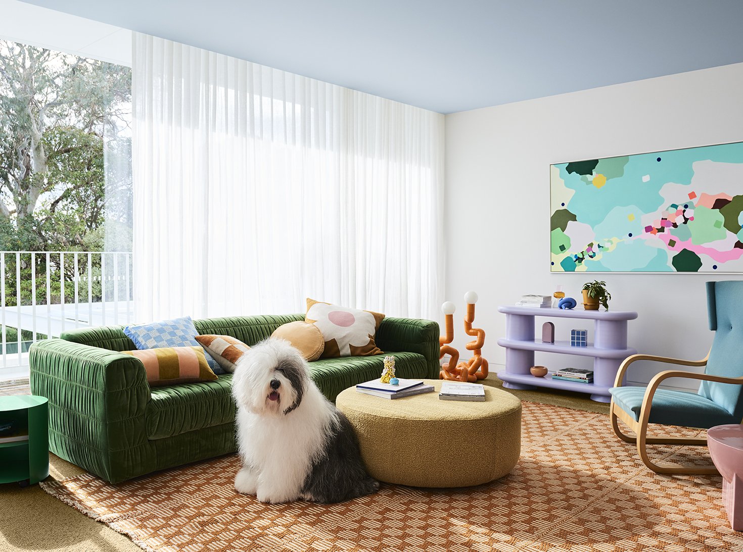
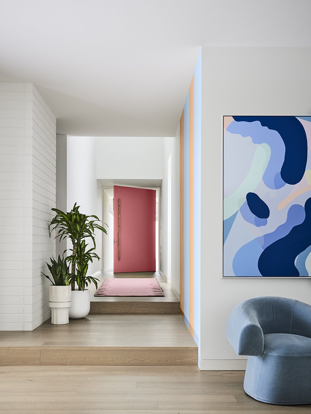
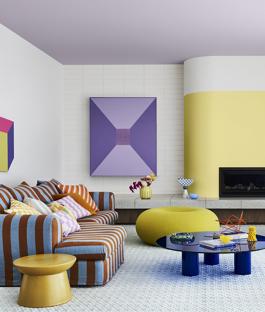
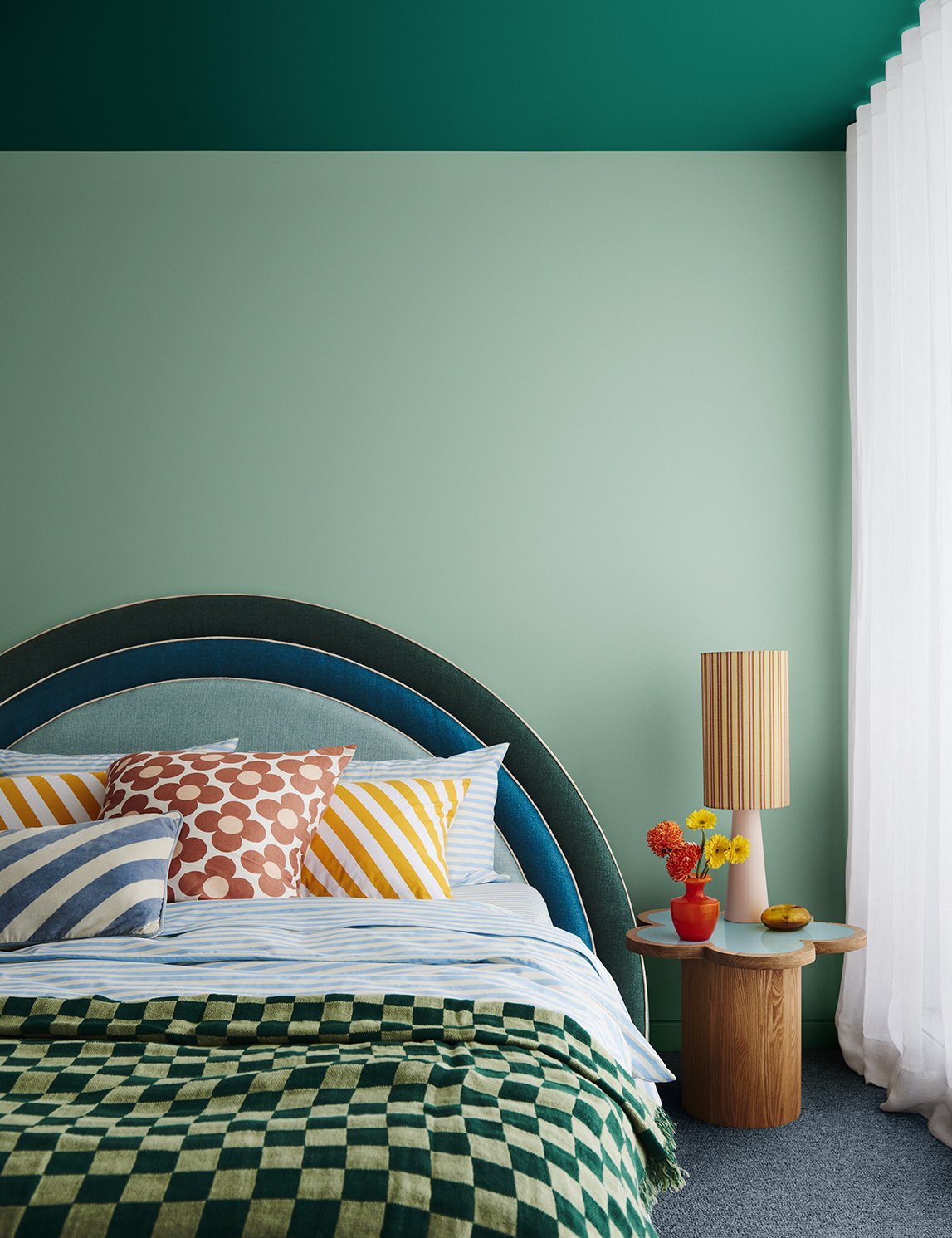
“As we emerge from trying times, we’re looking for lightness and a sense of freedom to revive our spirits. So, when it comes to our homes, it’s out with the rule book, and in with the possibilities to create something truly magical.
Pairing retro influences with futuristic features, such as pixel patterns and digital art, the Revive palette cleverly merges the past and present. And with its colourful, look-at-me accent walls and statement seating, it creates the perfect Instagrammable moment”
KEEN TO TRY Dulux’s 2023 trend colours IN YOUR HOME?
Andrea Lucena-Orr is the Colour and Communication Manager at Dulux and a regular in our Fourth Bird community. If you’re thinking about introducing colour into your home, check out her hot tips:
🎨 To introduce colour, try painting the skirting boards or architraves in your living room, the edge of a door, the back of a bookshelf, a bedhead in your child’s room, or breathe new life into an old lamp base , chair or front door with a coat of paint. You’ll find that colour really makes a house a home – once you get started with paint colours, you’ll never look back!
🎨 Before you start painting, it’s crucial when selecting colours for walls or soft furnishings that you consider other fixtures and fittings in your space that you can’t change easily – it might be carpet, tiles, laminate or stone, and/or curtains and blinds that you will need to ensure work with the new colour(s) chosen.
🎨 For colour surety, simply order A4 stickers or Sample Pots from dulux.com.au in your chosen colour(s) for your space - view these colours in your home’s natural light conditions. Alternatively, Dulux has an online colour advice team and a Colour Design Service if you want a design professional to assist in curating your space.
Do you want to know more? Read the full Dulux Colour Forecast 2023 here.
