HOW TO MIX YOUR MATERIALS
BY BONNIE

Lana may have likened my outdoor area to being “whiter than a blizzard at Thredbo”, but believe me, there was method to my monochromatic madness! You see, for my alfresco area I knew I wanted to incorporate lots of different textures - like tiles, raw concrete, stone cladding, decking and Caesarstone. It’s definitely possible to mix loads of different materials without it looking like Nana’s patchwork quilt - the key is keeping them all in the same colour tones.
And I’d already chosen gorgeous James Hardie Linea™ for the exterior walls and the tiles for my roof – both in white. So, I already had two different materials in the mix before I even got started on the alfresco area!
But seriously, how gorgeous do they look?
Here’s how I mixed 8 different materials for my outdoor area (all in white!) - without it ending up looking like a dog’s breakfast… I think ;-) #ihope
Material #1 - I chose Axon™ Cladding to line the ceiling. It adds texture to what would have otherwise been a plain, Gyprock surface #notverybahamas

Material #2 - The fireplace is clad in limestone which brings a rustic vibe to that zone. But this rustic detail doesn’t compete with everything else as it too is white to mix in perfectly.

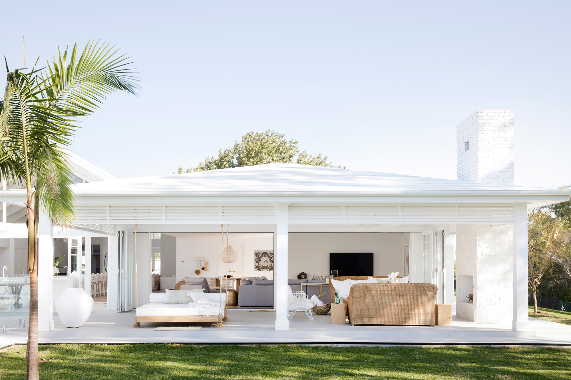
P.S - did you notice that I saved some cash by not cladding all the way up the chimney? Can you see that above the roof line, I left the chimney unclad and just painted the bricks white.
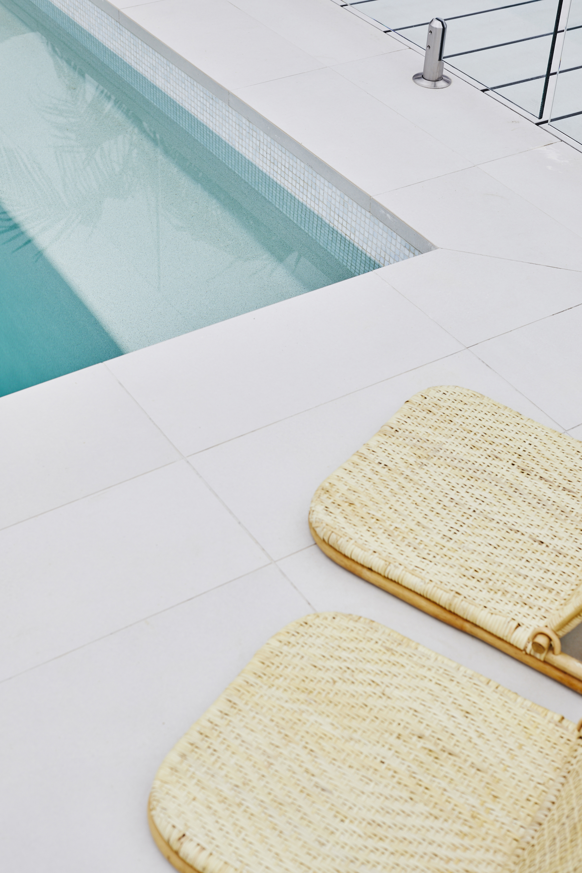
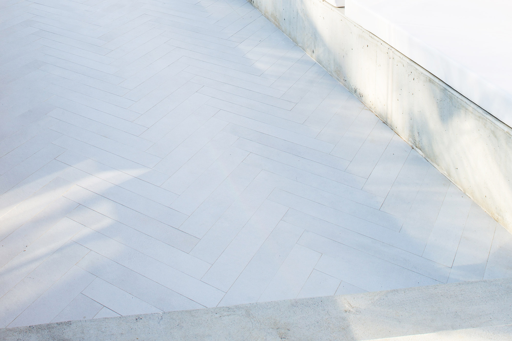
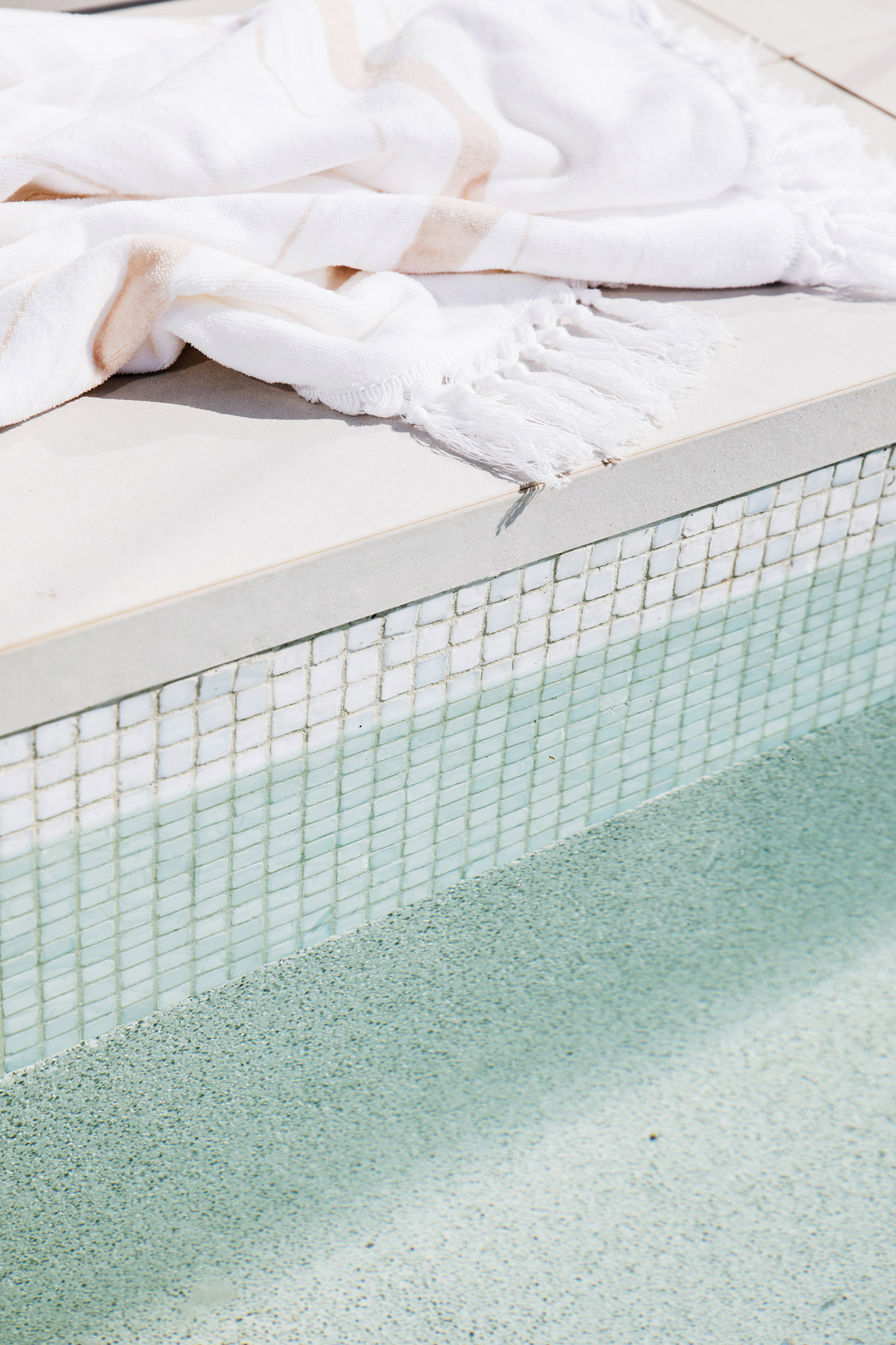
Material #3 - On the alfresco floor and for my pool coping I chose Glocal Clear Structured tiles which look like speckled concrete but they’re actually non-porous porcelain. They’re the perfect blank canvas to show off the other textures and perfect for outdoor use as they don’t absorb water and are slip and stain resistant #poolfriendly #bbqfriendly #droppedwinefriendly
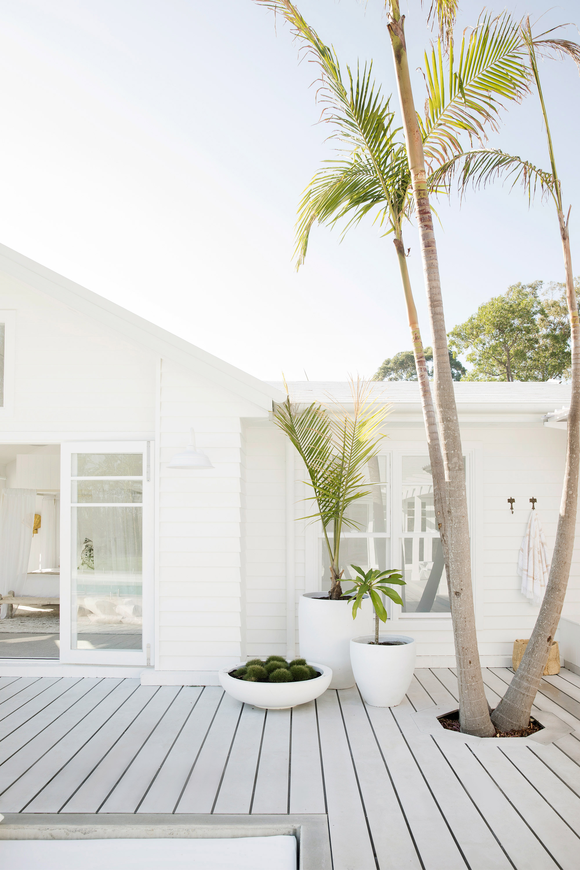
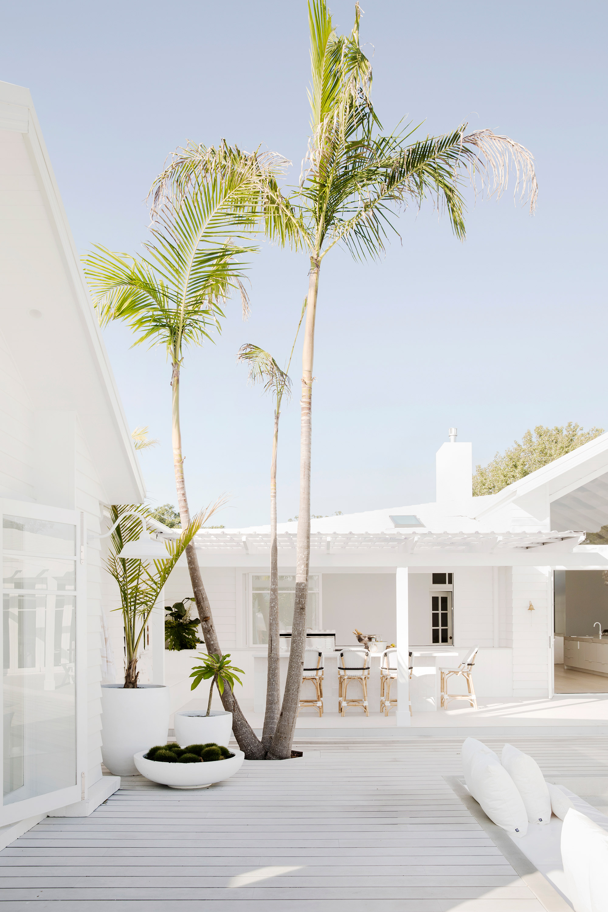
Material #4 - For the decking, I used HardieDeck. I love how coastal it looks - especially when you pop up a few Palm Trees through it. Not only does it scream coastal, it was perfect for my dream home because it:
1. Won’t rot - perfect for surrounding my pool
2. Won’t splinter - we're a barefoot family
3. Fire-resistant - which meant we passed our BAL 40 requirements #winning
4. Termite-resistant - watch Episode 1 if you want to see what those little buggers did to my house last time.
5. Looks good naked - we've always painted our HardieDecks, but on this occasion I chose to leave it raw, with just a clear coat on top. It's original concrete colour matched perfectly with all the other materials I was using #matchmadeinheaven.
Material #5 - The sunken lounge area was constructed from raw concrete, which I love, but I wanted to add a special touch with the floor tiles. To keep some consistency, I used the same tile as the rest of the outdoor floor area but had it cut and laid in a herringbone pattern to make it extra spesh. The soft furnishings are also shades of white that layer together to add softness and detail.

Material #6 - Speaking of special tiles, the Antigua Syracuse tiles we used for the waterline of the pool are just gorge too. They’re a pearly, white mosaic, which helps give me that gorgeous beachy pool colour - and you can see by their name – they're as Carribbean as Kokomo #cocktailanyone
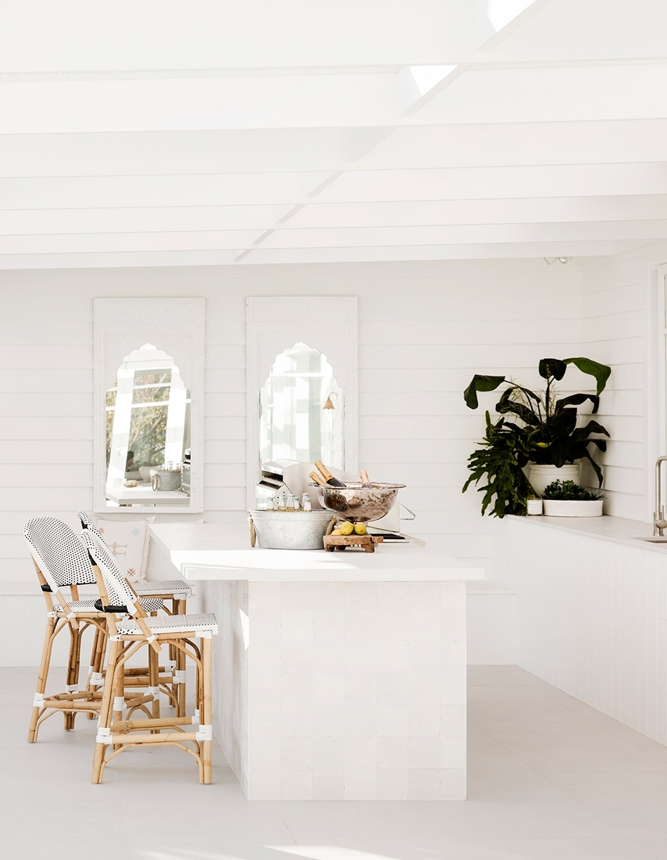
Material #7 - And because I thought I hadn’t mixed enough materials yet, I used not one, but two different Caesarstone colours outside. The indoor/outdoor servery is Statuario Maximus to make that seamless connection with the kitchen but I for the outdoor kitchen, I chose the gorgeous, new Cloudburst Concrete™ for a matt, rough look.

Material #8 - wraps around the base of the outdoor island bench and is actually one of my favourite tiles in the whole house. They're white Zellige tiles and are so beautiful in the flesh.

So there you have it gang - 8 different building materials used within a stone's throw of each other (10 if you count the weatherboard and roof tiles) yet we achieved a seamless look. Colour cohesion was the key.