
HOW WE CREATED TWO VERY DIFFERENT LOUNGE ROOMS
By Lana
Styling can be a daunting task, even for those of us who have a natural eye for it, like Bonnie... and styling lounge rooms can be one of the more difficult spaces to do well - there are just so many questions to answer:
+ How many couches vs stand-alone chairs?
+ Should the couch be pushed up against the wall?
+ How to set it up so that it encourages conversation but also doesn’t close off the space?
+ Where does the TV go so that everyone can see it but it doesn’t stand out?
+ Rug or no rug?
+ How big should the rug be?
+ Coffee table or side tables or both?
+ Are my cushions too matchy-matchy?
Well we (and when I say “we” I mean Bonnie) tackled all these questions at our latest reno and with the help of OZ Design Furniture were able to create two very different lounge rooms that hopefully ticked most, if not all, the boxes.
Here’s how we/Bonnie did it ;-)


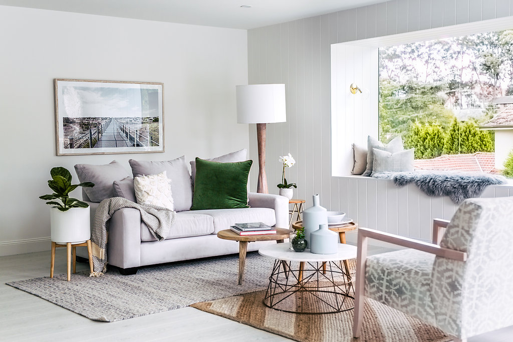
LOUNGE ROOM 1 - GREY & GREEN
COUCH POSITION | We debated about pushing the couch up against the wall under the artwork but that wasn’t necessary due to the large size of the room (a luxury we’re not used to). We wanted to anchor the conversation in the middle of the room so brought the couch off the wall, giving someone just enough space to walk around the back.
COLOUR-MATCHED OCCASIONAL CHAIRS | These were custom-made by OZ Design as per Bonnie’s choices – which is a great benefit of buying stuff from OZ D, they can make the furniture using fabrics, colours and timbers of your choosing. And I’m not talking about basic, boring fabric choices like just your beige, cream or ivory. I’m talking about Grace Garrett textiles! In any colour you want! Literally, we had the Grace Garrett fabric colour-matched to Taubmans "Misty Lake" (the colour of our kitchen) – now that’s cool! By the way, that wasn’t special treatment for Three Birds, you can do the same at any OZ store.
DOUBLE RUG | We’ve fallen in love with the idea of two rugs and once you’ve gone there, it’s hard to ever go back to just one floor covering. In this lounge room we laid the two rugs in an L-shape to add interest, texture and more effective zoning of the space. The unsymmetrical rugs also gave the otherwise formal lounge a more relaxed and homely feel.
COFFEE TABLE CLUSTER | In this space we opted for three different coffee tables all bunched together in the centre of the room. Sounds crazy, but looks great! It’s also super-practical if you want to move them around the space. And as was the case with the double-rug, the mismatched coffee tables give off a seriously chilled vibe.
THE 'JANDA' | The what!? That’s the name OZ Design gave that gorgeous timber buffet with the herringbone doors. Totally swoon-worthy so we found the perfect spot for it adjacent to the dramatic picture window.

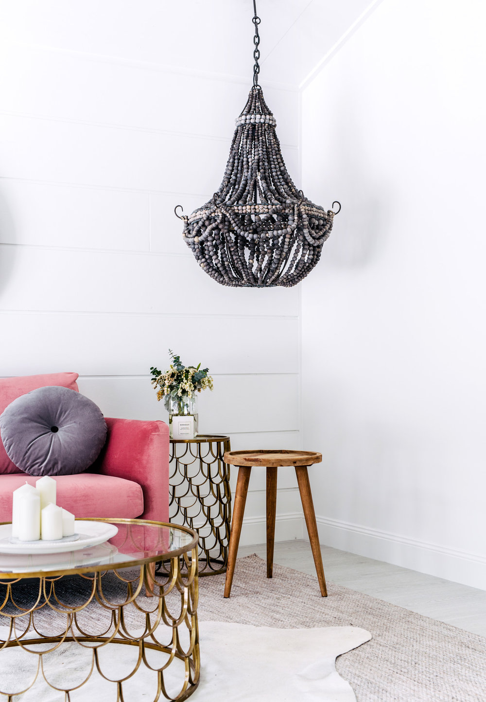
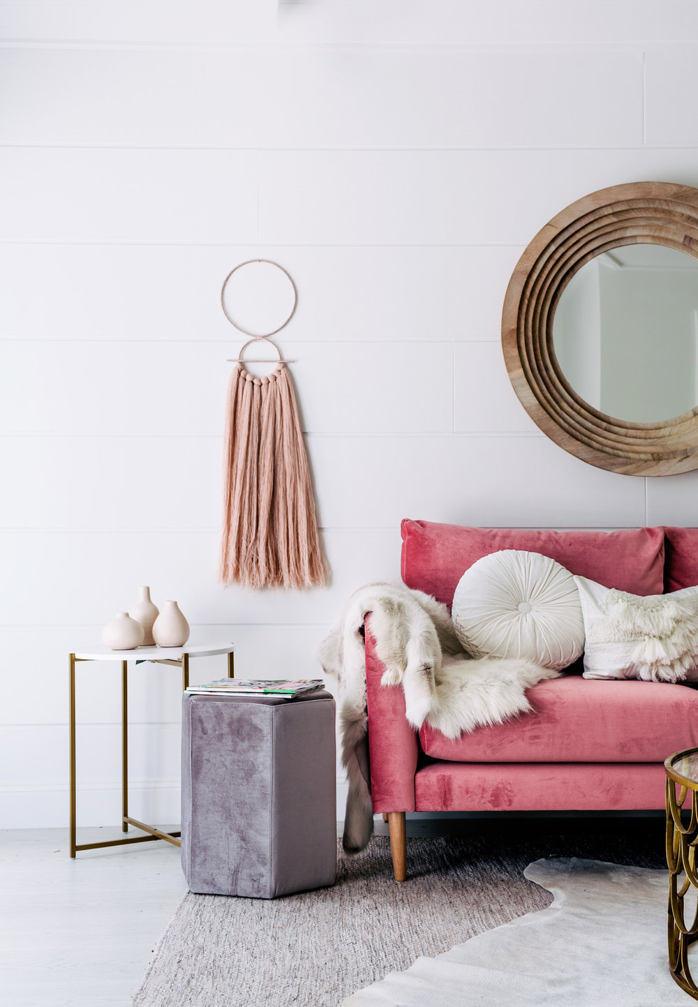
LOUNGE ROOM 2 - ROUND TOWN
PLUSH BLUSH | Without a doubt the hero of this room is the Charlie sofa which Bonnie designed and OZ Design made. She chose the Mystere Blush fabric, timber legs and it looks pretty as a picture in this space. PS - Did you know you can win this exact sofa? We’re giving it away to one lucky person!
CIRCLES AND SCALLOPS | We were in a “circles & scallops” mood when we styled this room. From the round timber mirror to the button pillows... from the beaded chandelier to the pink tassle wall hanging… curved edges are everywhere. And how about that scalloped coffee table with matching side table!? W.O.W. It was love at first sight when I saw them.
THE TV THAT'S NOT THERE | I’ll be honest... we hate styling a room with a TV in it. They’re just so big, black and ugly... especially when contrasted with so many other beautiful and feminine things. As a result, we often choose to style our houses without a TV, but we always agree with our agent where we would put a TV if a potential buyer were to ask. In this room we would put it on the wall behind the large cane chair. We also justify the absence of a TV by convincing ourselves that people’s viewing habits are unique so we prefer to leave the decision of where to place the TV up to them. Who knows, perhaps they’d prefer to replace that gorgeous mirror with a huge TV screen and turn the couch around!? Eeek… I don’t like the sound of that at all!

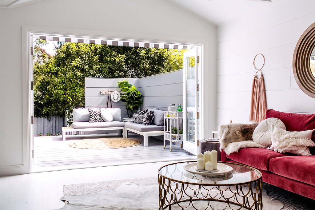
CLAD WALL | I know this isn’t really a styling point, but we consciously used the same James Hardie Stria™ wall cladding inside and out of this lounge room. Do you see how it continues from inside to the outside privacy screen on the deck? This was intentional to help connect the two spaces. We had planned to paint them the same colour for an even greater connection... but didn’t for some reason. I can’t remember what the reason was but I’m sure it made sense at the time ;-)